Love Letters: A Gallery of Type
Curated by Luise Poulton, 2016
Exhibition poster designed by Scott Beadles, 2016
Digital exhibition produced by Lyuba Basin, 2020
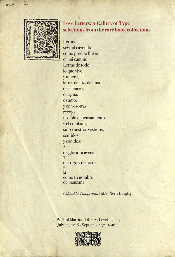
Love Letters: A Gallery of Type
EARLY PRINTERS
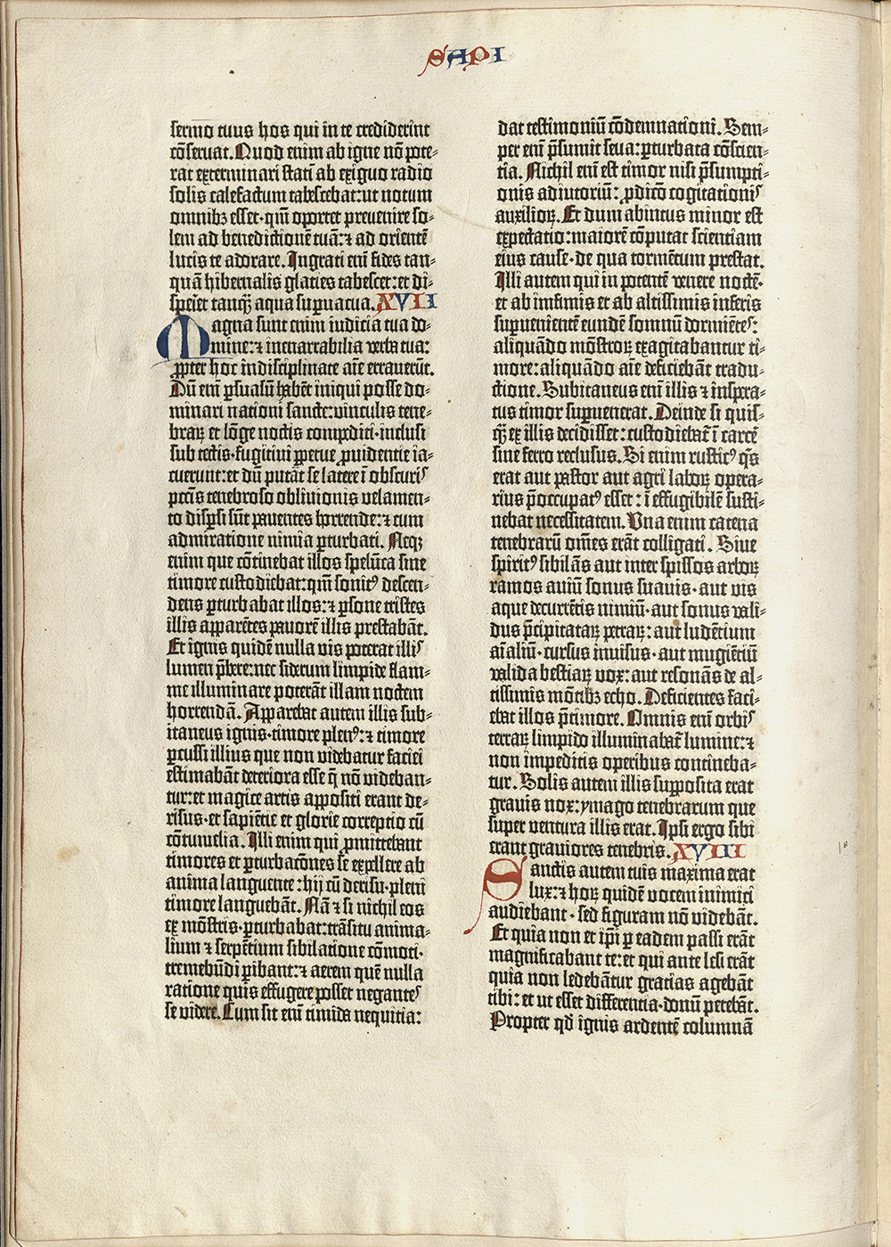
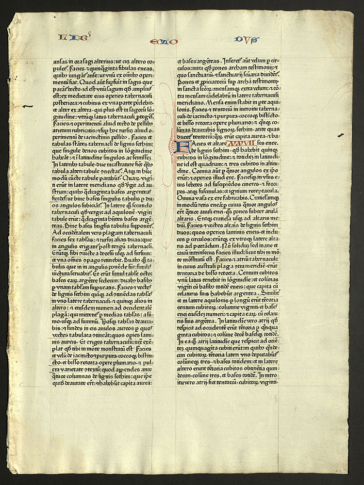
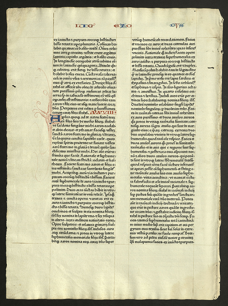
A NOBLE FRAGMENT BEING A LEAF OF THE GUTENBERG...
New York: Gabriel Wells, 1921
Z 241 B581 1921
A leaf from the Old Testament, Samuel, 2nd, XXII-XXIII. Latin.
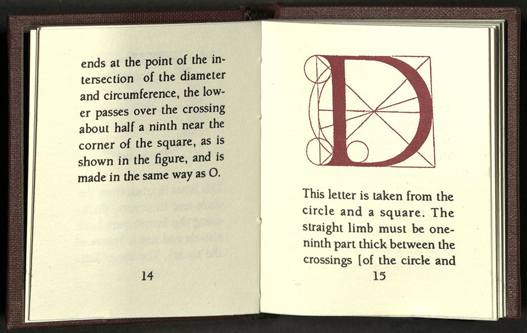
The first book printed from movable type, the Biblia Latina or 42-line Bible (in reference to the number of lines in a normal column) was based on medieval manuscript design. The type was developed after a book-hand used in western Germany during the fifteenth century to write liturgical works. Known as “textura,” this formal upright and angular hand features letters that have pointed feet and almost no curvature.
The first font of type, made by goldsmith Johann Gutenberg, consisted of nearly three hundred characters, including variant forms of letters, ligatures, and abbreviations to simulate as much as possible manuscript conventions.
Gutenberg’s choice of the Bible as his first printed publication was a good business decision. All copies sold before they were off the press.
Forty-eight full copies are known to exist, thirty-six on paper and twelve on vellum.
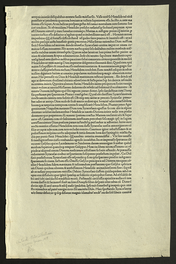
SAMPLE PAGE FROM NICOLAS JENSON
[Venice]: [Nicolas Jenson], [1478]
Z 232 J54 S35 1478
Leaf from undetermined work printed by Nicolas Jenson (ca. 1420-1480) in Early Roman type. Text is Latin. From the Kenneth Lieurence Ott Collection.
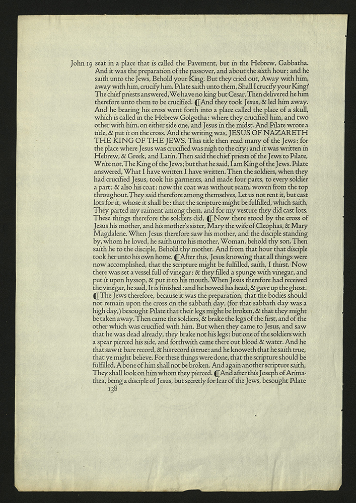
THE 1462 FUST & SCHOEFFER BIBLE
Eberhard Konig (b. 1947)
Akron: Bruce Ferrini; Evanston: Hamill & Barker, 1993
Z 241 B585 K66 1993
A leaf from the Fust & Schoeffer 1462 Bible.
In 1457, Johann Fust and Peter Schoeffer completed printing their first book, the first printed book to identify the names of the printers and the date of its printing.
Initials in red and blue with red and blue flourishes in the margins.
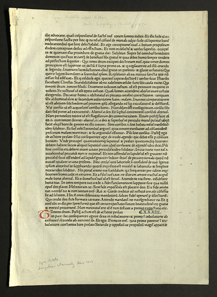
SWEYNHEYM & PANNARTZ AND THE ORIGINS OF PRINTING...
Edwin Hall
McMinnville, OR: Phillip J. Pirages, 1991
Z240 S965 H35 1991
A leaf printed by Conrad Sweynheym and Arnold Panartz, ca. 1470.
Sweynheym and Pannartz set up the first press in Italy, at the Benedictine Abbey of Subiaco, near Rome, in 1464. The first types were roman in style, but influenced by the German gothic textura types of Gutenberg and Schoeffer. In 1465, Sweynheym and Panartz set up shop in Rome and began printing with a type more fully influenced by the Italian humanists’ bookhand.
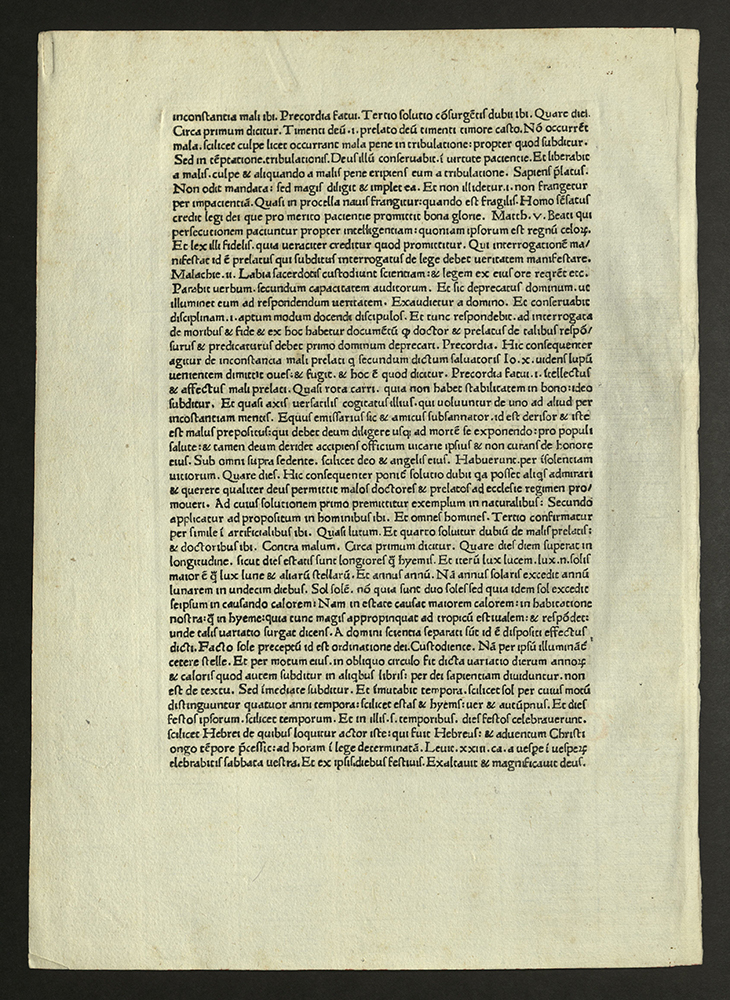
SAMPLE PAGE FROM A VOLUME PRINTED BY SWEYNHEIM & PANNARTZ
[Rome: Sweynheim & Pannarts, 1472]
Z232 S965 S35 1472
From the Kenneth Lieurance Ott collection.
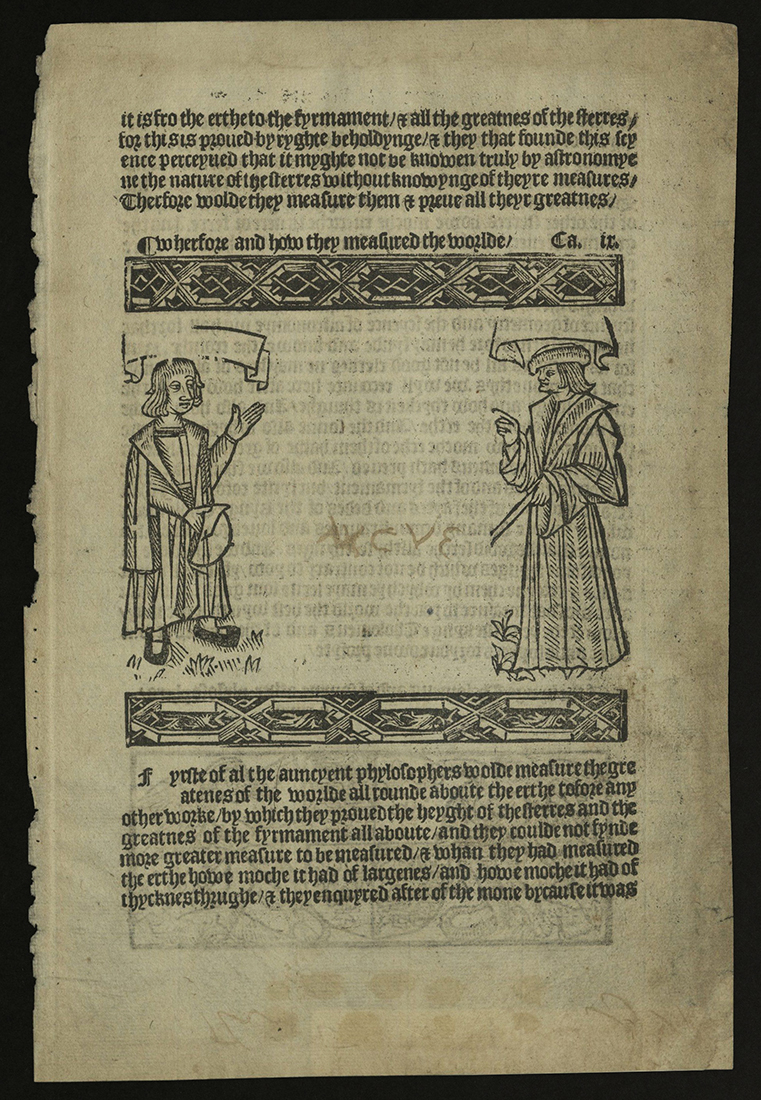
LEAF FROM THE MIRROR OF THE WORLD
William Caxton (ca. 1422-1491)
London: W. Caxton, ca. 1490
Z232 C38 M5 1490
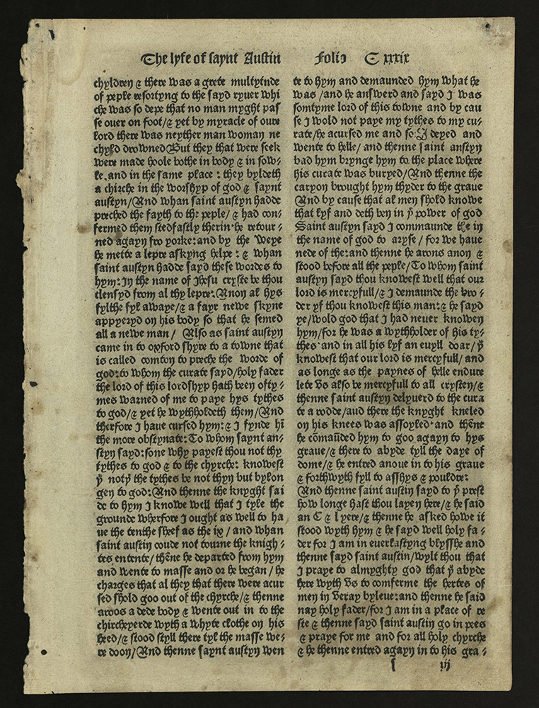
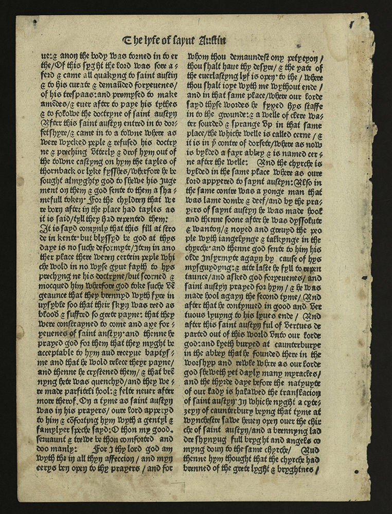
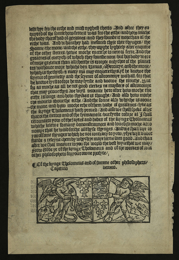
LEAF FROM THE GOLDEN LEGEND, PRINTED BY WYNKYN DE WORDE
Jacobus (ca. 1229-1298)
Westminster: Printed by Wynkyn de Worde, 1493
Z241 L4 J3 1493
Rare Books copy gift of Don Gale.
Howell J. Heaney
Newtown, PA: Bird & Bull Press, 1992
AE2 B3 H43 1992
Leaf from Wynkyn de Worde’s printing of De proprietatibus rerum, ca. 1495.
Wynkyn de Worde, born in Alsace, inherited his printing house from William Caxton, England’s first printer. Wynkyn de Worde often used a textura font. De Worde’s textura types became so popular in England that they came to be called “English.” The black letter types still appear under that name in some type specimen books of English-speaking countries.
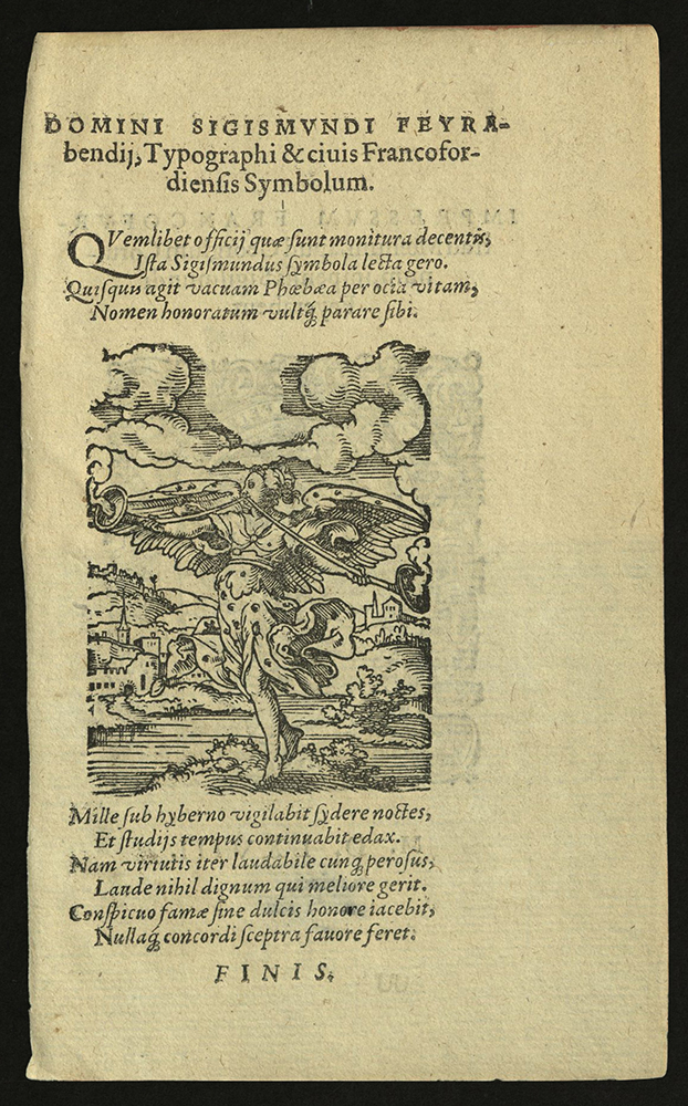
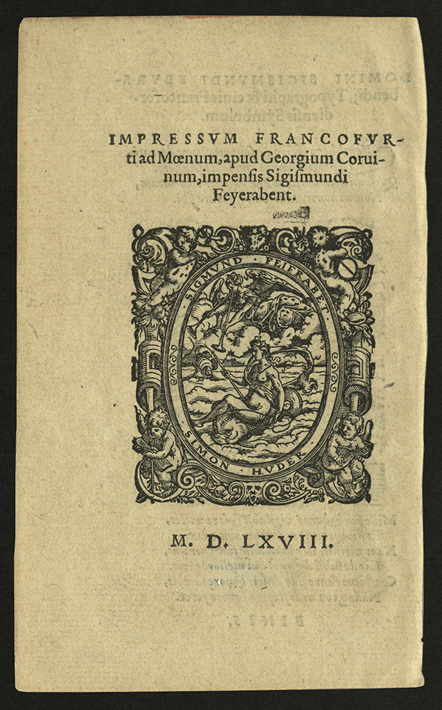
PANOPLIA OMNIUM ILLIBERALIUM MECHANICARUM AUT SEDENTARIUM ARTIUM GENERA CONTINENS...
Hartmann Schopper (b. 1542)
Francofurti ad Moenum: Impressum…apud Georgium Coruinum, impensis Sigismundi Feyerabent, 1568
GT5780 S4 1568
Designed by Jost Amman.
Rare Books copy gift of James Doolittle.
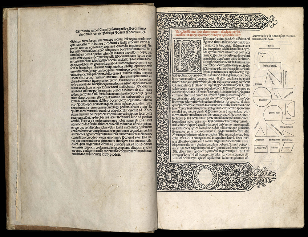
ERHARD RATDOLT
CALENDARIUM
Johannes Mueller Regiomontanus (1435-1476)
Venice: Erhard Ratdolt, 1482
CE73 M8 1482
Regiomontanus’ Calendarium was first printed at his own press in Nuremberg in 1474. In 1476, master printer Erhard Ratdolt published it in Venice, the capital of Italian printing, followed by this edition in 1482. These two Ratdolt editions easily rank among the most beautifully illustrated scientific books produced in the fifteenth century.
Regiomontanus is one of the great figures in the history of mathematics and astronomy. He was one of the first publishers of astronomical material. The Calendarium represents the first application of modern scientific methods of astronomical calculation and observation to the problems of the lunar calendar, such as the accurate prediction of eclipses. Regiomontanus’ almanacs contained planetary positions for a particular year as calculated from astronomical tables, freeing astronomers from performing the laborious task themselves.
This edition contains verses by J. Sentius in praise of the author, and by Santritter in praise of the printer. Santritter would later become a printer himself. The last two leaves are printed on four pages of thick paper pasted together to form astronomical instruments. The ingenuity of the instruments demonstrates Ratdolt’s technical skill in overcoming the challenges posed by early scientific publishing.
This edition was not only technically innovative but artistically elegant as well. Woodcut initials were placed throughout the book. The title-page initial was printed in red and black. The title-page was also bordered with intricate decoration. Other initials are printed in black and white. Breaking with printing tradition, Ratdolt included imprint details – that is, the information which tells us when and by whom the book was printed – at the end of the opening verses on the verso of the title-page, rather than at the end of the book in the colophon as was then usual practice.
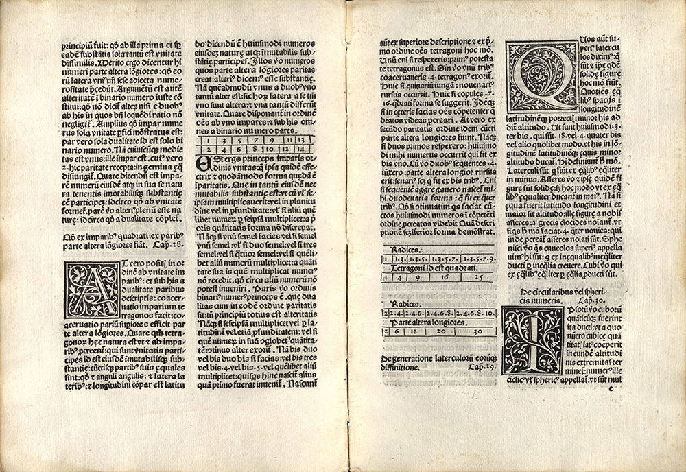
ELEMENTA GEOMETRIAE
Euclid
Venice: Erhardt Ratdolt, 1482
QA31 E86 E5 1482
This is the editio princeps, or first printed edition, of Euclid’s Elements of Geometry, the oldest mathematical textbook still in common use today. The Greek mathematician Euclid compiled the work around 300 bc. Ratdolt’s book was based on the standard Euclid of the later Middle Ages: Adelard of Bath’s twelfth-century translation from the Arabic, revised in the following century by Campanus of Novara (d. 1296).
In 1482, Erhardt Ratdolt printed eight works – Euclid’s Elements among them. Ratdolt’s fame rests upon this edition of Elements. It is the first printed book to contain geometrical figures. An elegant three-sided wooden block and a white-vine style woodcut initial, several hundred small ornamental capitals, and more than four hundred and twenty carefully designed and perfectly printed marginal diagrams, confirm its standing as a landmark publication. The page layout, particularly the first page, is an outstanding example of Ratdolt’s consideration of the overall look and readability of his work. Note the closeness of the type to the initial and the close set of the text page. For the text, Ratdolt used a type called “rotunda” or “round-text.” The Italian writing-masters called this “littera moderna” to distinguish it from textura.
In his dedication to this edition, Ratdolt suggested that the scarcity of printed mathematical works was due to the problems involved in printing geometrical diagrams. He then happily announced that he had discovered a method of printing these diagrams. He did not elaborate upon this method, but it most likely involved the use of type-metal rule arrangements that could be printed along with the text.
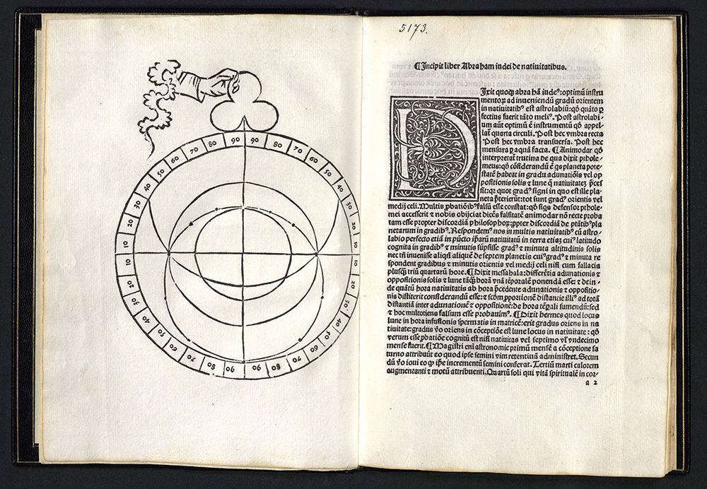
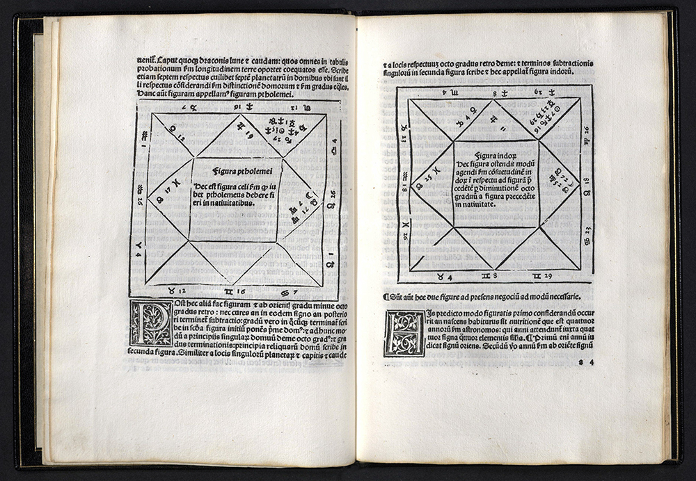
DE NATIUITATIBUS
Abraham ben Meir ibn Ezra (1092-1167)
Venice: Erhard Ratdolt, 1485
Editio princips
QB26 I32 1485
Abraham ibn Ezra was born in Toledo, Spain, where he studied astrology, math, grammar, philosophy, theology, medicine and poetry. He was fluent in Hebrew and Arabic. Ibn Ezra lived at a time when Spain, under Muslim rule, had a highly developed culture influenced equally by Christian, Islamic, and Jewish sensitivities. Ibn Ezra, a Jew, left Spain and spent the last thirty years of his life traveling throughout Europe, Africa, and Asia. His Book of the Nativities was one of eight astrological treatises written by him in 1148. The work describes the planetary influences upon man’s fate at the time of his birth.
The University of Padua, near Venice, had a well-established school of astronomy. Peter D’Abano, revered scholar at the school, translated Ibn Ezra’s astrological treatise into Latin. D’Abano died in 1316, just before he was to be tried by the Inquisition for wizardry. His body was publicly burnt. Also contained in this edition is an essay by Henry Bates written in the thirteenth century about the astrolabe. Bates was a contemporary of D’Abano’s.
Erhard Ratdolt is considered one of the best printers of the incunabula period. He used high-quality paper, printed clearly and legibly, and contracted with scholars to read and correct texts before he printed them. Ratdolt, an entrepreneur determined to make a quality product, often turned to the University of Padua for scholars cum editors.
ALDUS MANUTIUS
SAMPLE PAGE FROM LUCRETIUS' DE RERUM NATURA
Vennetiis: In aedibus Aldi et Andreae Coceri, 1515
Z232 M3 S35 1515
From the Kenneth Lieurance Ott collection.
STRABON PERI GEOGRAFIAS. STRABO DE SITV ORBIS
Strabo
Venetiis, in aedibvs Aldi, et Andreae soceri, 1516
First printed edition of the original Greek text
G87 S86 1516
Geographia is one of the most important scientific works from antiquity. It was the first attempt to collect all geographical knowledge available at the time. Strabo endeavored to give a general sketch of the character, physical peculiarities and natural productions of each country, thereby giving much valuable information regarding ethnology, trade, and metallurgy.
The impact of early printers on their world was extraordinary. Well aware of the power of the press, Aldus Manutius was particularly concerned with producing books of small format and low cost for the benefit of students. The works Aldus chose to print reflected the great diversity of the interests of his day. He printed Greek and Latin classical texts, grammars, religious writings, secular writings, political and scientific writings, histories, and geographies.
Aldus influenced his world with his craft as well as his scholarly pursuits. His work was recognized for its attractive and readable typography, clean lines and fine design. He designed and cut the first complete font of the Greek alphabet. He helped design a type after Italian cursive script said to be based upon the handwriting of Petrarch. This was the first italic font used in books. For this particular edition, Aldus set the last page of each chapter in pendentives, based on architectural designs.
ARRIGHI
SAMPLE PAGE FROM SOFONISBA BY G.G. TRISSINO
Stampata in Vecenza: Per Tolomeo Ianiculo, 1529
Z232 J26 S35 1529
Arrighi italic type.
From the Kenneth Lieurance Ott collection.
JOHANN FROBEN
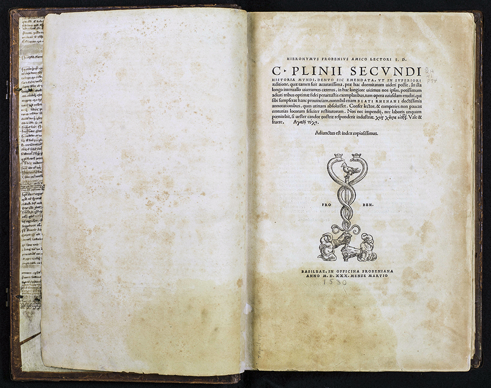
HISTORIA MVNDI
C. Plinii Secvndi
Basilae: in officina Frobeniana, 1530
QH41 P74
First printed in Venice in 1469, Historia mvndi is an account of medicine and natural history; in effect, an encyclopedia of science. This edition came from the press of Johannes Froben (1460-1527), a German printer who established himself at Basel. Froben became famous for printing scholarly texts, in part because Erasmus edited many of Froben’s publications. Froben also employed the then-unknown Hans Holbein as a designer. University of Utah binding pastedowns are manuscript leaves.
ESTIENNE
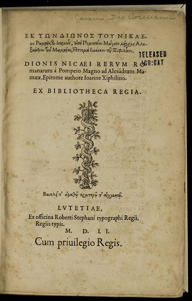
EK TON DIONOS TOU NIKAEOS ROMAIKON...
Cassius Dio Cocceianus
Lutetiae: Ex officina Robert Stephani, typgraphi regii, regiis typis, MDLI [1551]
Editio princips
PA3947 A2 1551
Influenced by the new learning encountered in Renaissance Italy, Greek presses appeared in Germany and France early in the sixteenth century. The most distinguished of these was that of the Estienne family in Paris. Founded by Henry Estienne, the press of the Stephani presented its first Greek publication in 1544. King Francis I had allocated funds in 1541 for a new font of Greek type to be cut by Claude Garamond. The font was delivered to Robert Stephanus, the King’s Printer in Greek, “typographus regius.”
After the death of his patron, Robert secretly made copies of the royal type and smuggled them to Geneva, where he set up shop in 1550. Accused in Paris of heresy, Robert fully embraced Protestantism in Geneva and devoted his time to publishing religious works, many for his friend John Calvin.
Dionis nicaei rerum… was printed in Garamond’s type. It is one of the last books issued by Robert Estienne from his Paris press.
PLANTIN
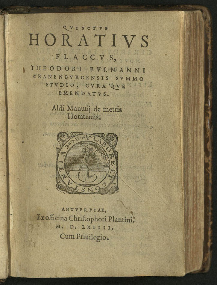
QVINCTVS HORATIVS FLACCVS…
Horace
Antverpiae: Ex officina Chrisophori Plantini, MDLXIII [1564]
PA6393 A2 1564
Christopher Plantin was one of the great sixteenth-century humanist printers.
Printer’s device on title-page and last page. University of Utah copy from the Kenneth Lieurance Ott Collection donated to the Okanagan County Museum.
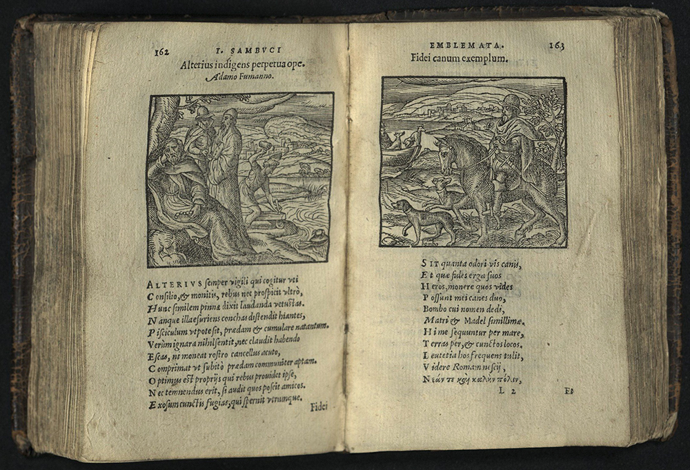
EMBLEMATA ET ALIQVOT NVMMI ANTIQVI OPERIS…
Janos Zsamboki (1531-1584)
Antverpiae: Ex officina Chrisophori Plantini, MDLXIX [1569]
PN 6349 Z63 1569
The emblem book addressed a wide range of interests within Renaissance culture, among them the relative power of the visual and the verbal. The first edition of physician Janos Zsamboki’s Emblemata was printed by the Plantin press in 1564. It was the first new emblem book to appear outside of Italy or France.
Janos Zsamboki was a Hungarian humanist who spent much of his life in Vienna as court-historiographer to the Habsburg emperors Ferdinand I, Maximilian II, and Rudolf II. He was renowned for his impressive collection of books and old manuscripts. Zsamboki prepared his emblem book at the end of two decades of traveling throughout Germany, France, Italy, and the Low Countries.
Emblemata consists of single pages containing a motto, a woodcut illustration and an epigram. Nearly a third of the emblems are also accompanied by dedications to well-known humanists, powerful courtiers, clergymen and friends and relatives. Zsamboki commissioned Lucas d’Heere to draw the illustrations.
Printer Christopher Plantin had half of d’Heere’s designs redrawn by Geoffory Ballain and Pieter Huys. The woodcuts were produced by Gerard Janssen van Kampen, Cornelis Muller and Arnold Nicolai. The Plantin printer’s device appears on the title-page. A full-page engraving of Zsamboki faces the preface. Various decorative vignettes throughout. Several leaves with wood engravings of Roman coins at the end of the book. University of Utah copy from the Kenneth Lieurance Ott Collection donated to the Okanagan County Museum, Washington.
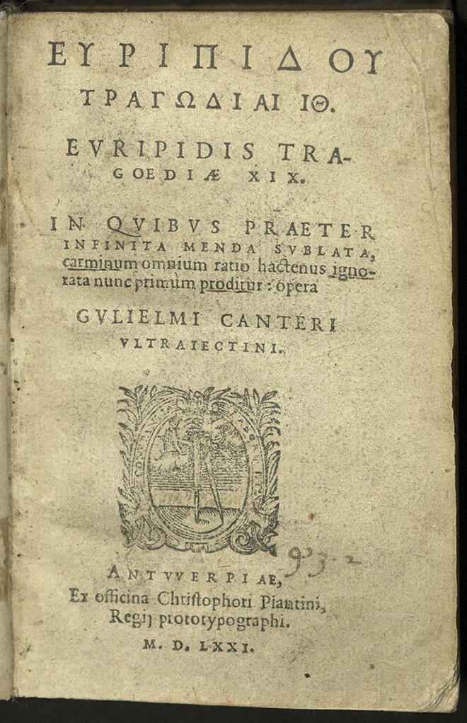
EURIPIDOU TRAGODIAI [IOTA][THETA]
Euripides
Antuuerpiae: Ex officina Chrisophori Plantini…; MDLXXI (1571)
PA3973 A2 1571
This important and oft-praised edition of Euripides was edited by the short-lived but industrious Dutch scholar Gulielmi Canteri Vltraiectini (Willem Canter (1542-1575). It is the first edition in which the metrical responses between strophe and antistrophe are clearly marked by means of Arabic numerals in the margin and the text repeatedly corrected under the guidance of these responsions.
Printer’s compass device on title-page. Text and first title-page printed in Greek. Introductory matter in Latin. From the Kenneth Lieurance Ott Collection donated to the Okanangan County Museum, Washington.
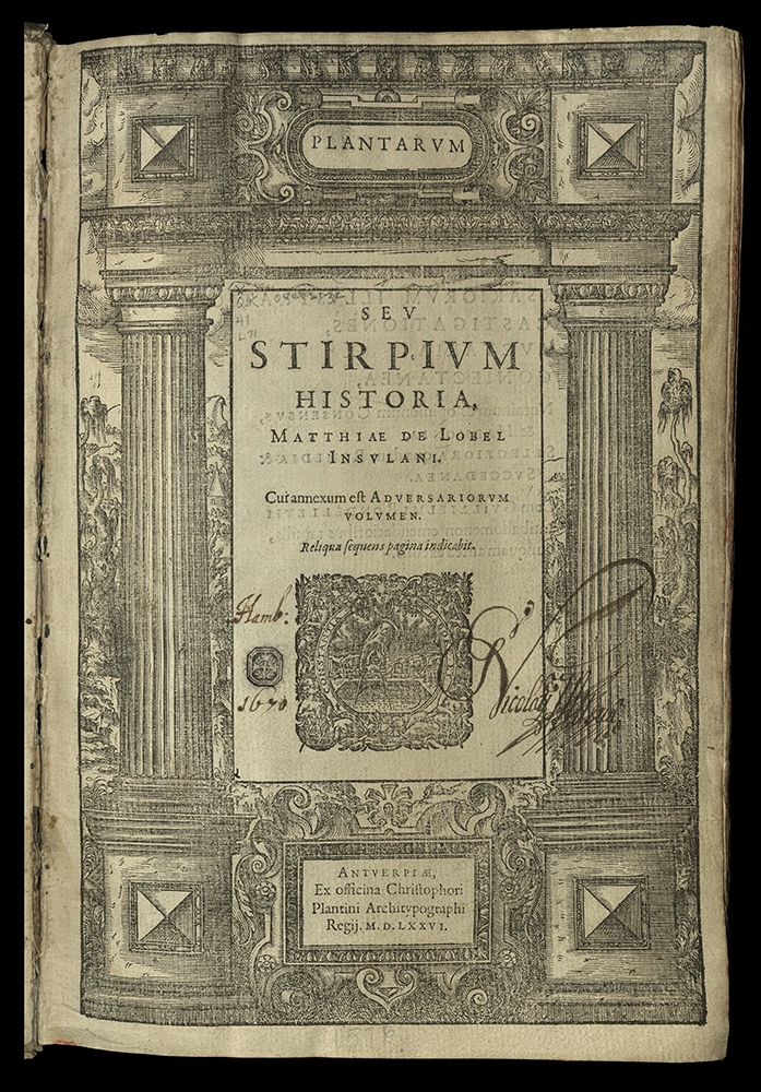


NOVA STIRPIVM ADVERSARIA…
Matthias de L’Obel (1538-1616)
Antwerp: apud C. Plantinum, 1576
QK41 L71
Originally printed and published by Thomas Purfoot in London in 1571. Eight hundred copies were purchased from Purfoot by Christopher Plantin, who provided new title pages and bound them with the author’s Plantarum sev Stirpivm Historia.
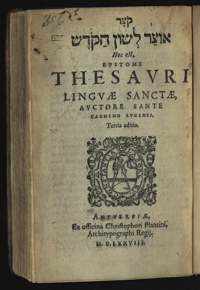
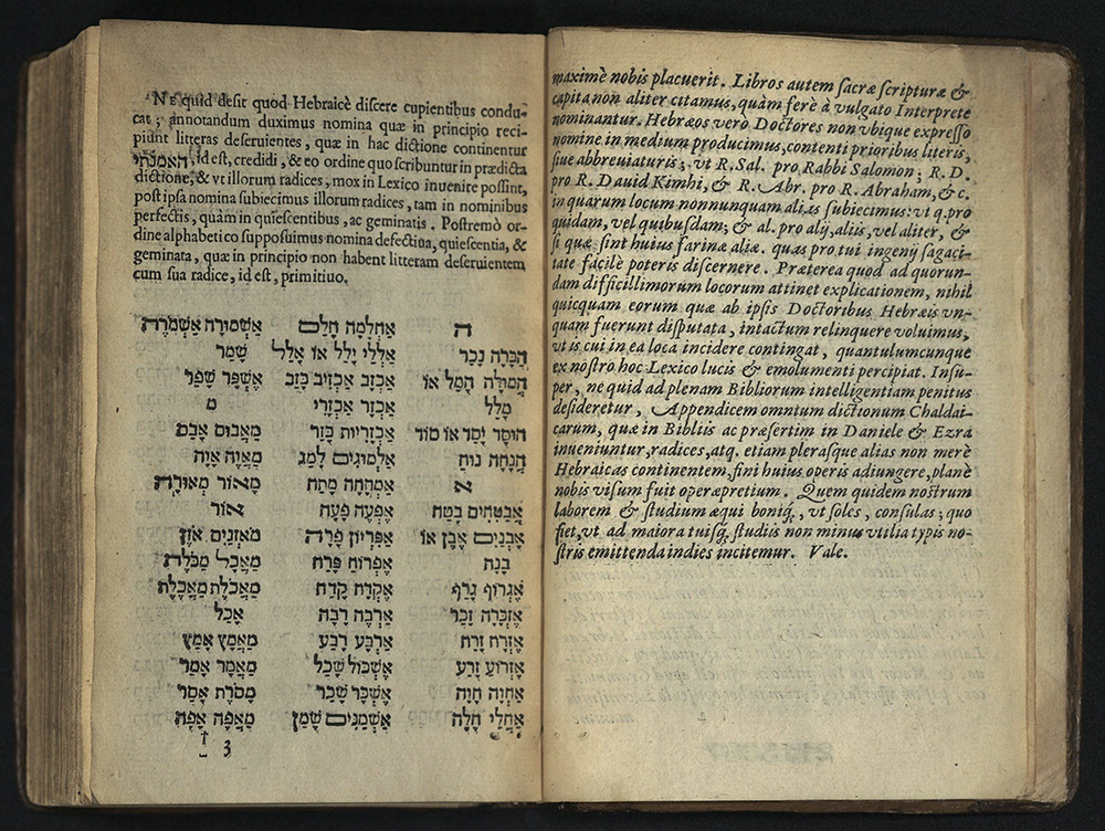
KETSER ‘OTSAR LESHON HA-KODESH…
Santi Pagnino (1470-1541)
Antverpaie: C. Plantini, 1578
PJ4835 L3 P3 1578
Third edition
JOHN DAYE


THE ELEMENTS OF GEOMETRIE…
Euclid
London: Imprinted by I. Daye, 1570
First edition of the first English translation
QA31 E87
The preface to this first English edition of Euclid’s Elements of Geometrie, was written by John Dee (1527-1608), physician and court astrologer to Elizabeth I. This translation, by Sir Henry Billingsley, was based on the Latin edition printed at Basle in 1558 and the editio princeps of the Greek text, printed in 1533.
Euclid of Alexandria is best known for his treatise on mathematics, Elements, a compilation of knowledge that became the basis of mathematical teaching for two thousand years. It is a work remarkable in the clarity with which the theorems are stated and proved. More than one thousand editions of Elements have been published since the Latin translation by Campanus was first printed in 1482 at Venice by Erhard Ratdolt.
This English edition contains hundreds of mathematical and geometrical diagrams, thirty-six of which have moving parts or one or more overslips, making the figures three-dimensional.
ELZEVIR
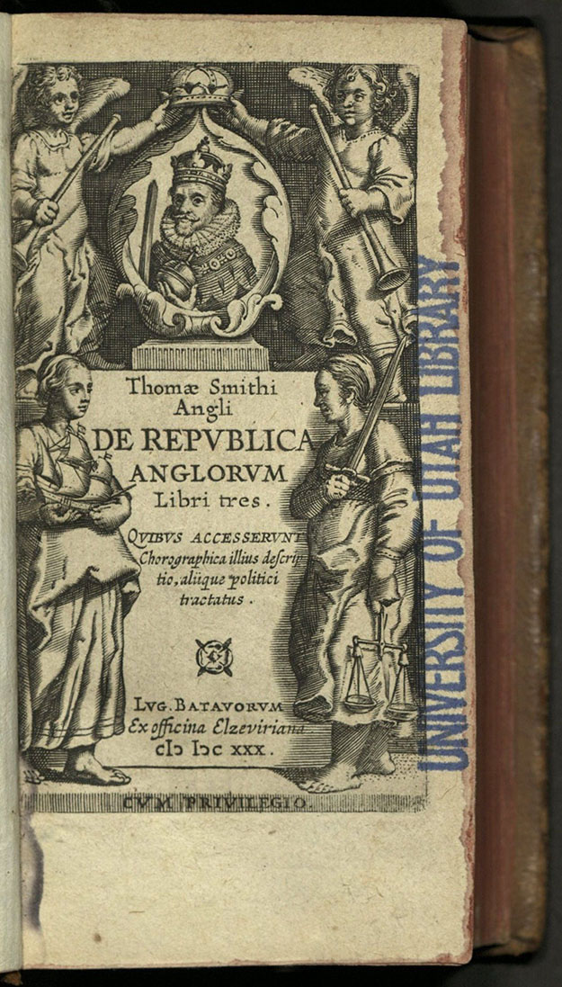
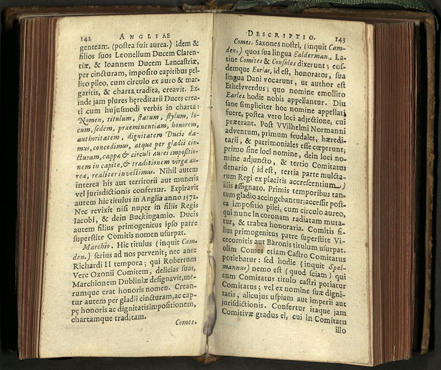
THOM SMITHI ANGLI DE REPVBLICA ANGLORVM LIBRI TRES…
Thomas Smith (1513-1577)
Lvg. Batavorvm: ex officina Elzeviriana, CIC ICC XXX [1630]
JN185 S6 1630
Following the earlier example of Aldus in the sixteenth century, the Elzevirs issued inexpensive books in conveniently small formats throughout the seventeenth century. These included the classics as well as a series of travel books called the “Republics.” Written by various authors, these travel books contain historical and geographical descriptions of several different countries, including Switzerland, Scotland and Ireland, France, Spain, Persia, and England. Joannes de Laet (1593-1649) wrote many of these books. In the present piece, de Laet translated a work by Thomas Smith.
Small, but not necessarily plain, this edition has an engraved title within ornamental borders. Printed by Bonaventure and Abraham Elzevir. A foundry in Frankfurt furnished most of the Elzevir types.


HISTOIRE DU ROY HENRY LE GRAND…
Hardouin de Péréfixe de Beaumont (b. 1605)
Amsterdam: Chez Daniel Elzevier, 1664
DC122 P4 1664
Paul Philippe Hardouin de Beaumont de Péréfixe was a French historian and clergyman. Two editions of this work were published by Louys and Daniel Elziver in 1661.
This third edition was revised and expanded by the author with the addition of a poem by Jacque de Cassagnes (1635-1679). It is illustrated with an engraved title-page with a portrait of the king on horseback and initials throughout. These engravings were taken from the first Elzevir edition.
University of Utah copy bound in olive morocco with double gold lines on sides and fully gilt tooled back.
OXFORD

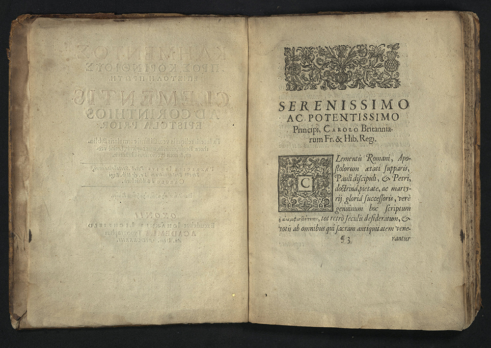
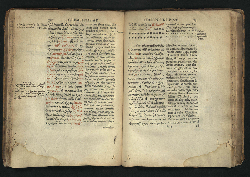

KLEMENTOS PROS KORINTHIOUS EPISTLE PROTE…
Clement I
Oxonii: Excudebat Iohannes Lichfield Academiae typographus, an. Dom. MDCXXXIII [1633]
Editio princips
BR65 C54 Y68 1633
The editor of this edition was Patrick Young (1584-1652), librarian to James I and Charles I and one of the most learned scholars of his time. Young discovered this letter bound in Codex Alexandrinus, a fifth-century manuscript. The Patriarch of Constantinople had presented the book to Charles I. Young wanted to publish the entire tome, but that plan was waylaid by the Great Rebellion. He did, however, publish this letter, one of the earliest extant Christian documents, which contains a wealth of information on the life of the early Christian church under Domitian. This letter is the only work ascribed to Clement I, the first Apostolic Father of the Church and probably the third successor to Peter.
The printing is a masterpiece of innovative typographical design. Young’s use of red ink for the filling of lacunae must have presented the Oxford printers considerable technical grief. Still, they produced a work of elegance and beauty.
Greek and roman letters in parallel columns. Title page in red and black. Printed shoulder notes. Engraved historiated initials and head- and tail-pieces. University of Utah copy bound in contemporary English calf; rebacked, covers ruled in blind.


OF THE ADVANCEMENT AND PROVICIENCE OF…
Francis Bacon (1561-1626)
Oxford: Printed by Leon Lichfield, printer to the University, for Rob. Young & Ed. Forrest, 1640
First complete English edition
B1173 E5 W3 1640
Francis Bacon’s belief in man’s sovereignty over nature was sorely tried by his conviction that the knowledge possessed by man was practically useless. It was this frustration that motivated him to found a new scientific methodology.
This edition of Advancement is an expanded version of his massive survey of knowledge, first published in 1605. Illustrated with an engraved portrait of Bacon.
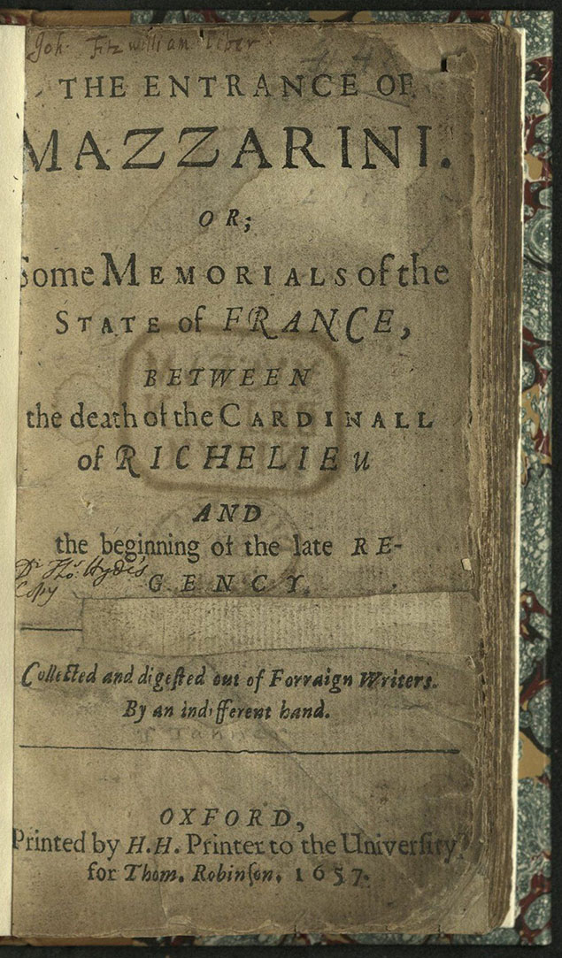
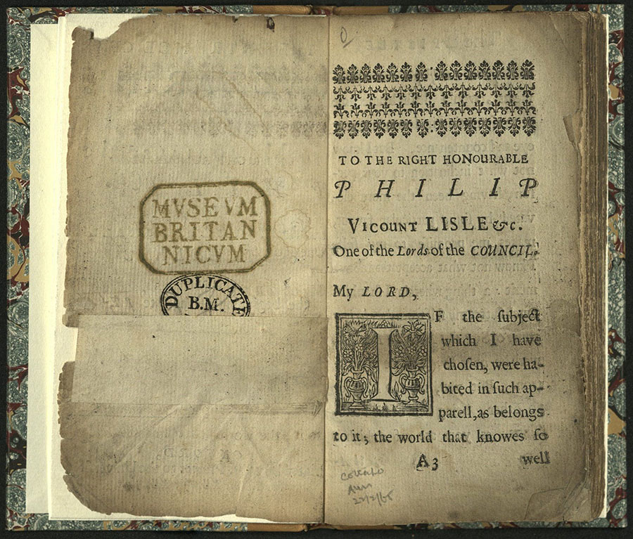
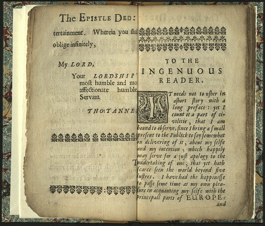
THE ENTRANCE OF MAZZARINI…
Thomas Tanner (1630-1682)
Oxford: Printed by H. H., Printer to the University, for Thom. Robinson, 1657
First edition
DC130 M4 T36
TYPE SPECIMENS
SAMPLE PAGE FROM THE CATALOGUE OF THE ROYAL AND NOBLE AUTHORS OF ENGLAND...
Twickenham: Strawberry Hill Press, 1758
Z232 S9 S35 1758
Printed in Caslon, roman, and italic type faces.
From the Kenneth Lieurance Ott Collection.


POETRY OF NATURE… THE TYPOGRAPHICAL EXECUTION IN A STYLE ENTIRELY NEW...
James Macpherson (1736-1796)
Londini: typis J. P. Cooke, 179-
PR3544 A1 1790c
First printed in 1789, this is a collection of prose re-workings written anonymously by Mary Potter. The original poems were attributed to Scottish Highland storyteller Ossian, who was, in fact, a fictional character. James Macpherson was the actual poet.
Printer J. P. Cooke used copperplate script and added titles in blackletter capitals. Of the eccentric typography Alistair Johnston writes, “The decorative qualities of the blackletter caps work well individually with the plainer lowercase letters, but when grouped together, all-cap titles in blackletter become a tangle of confusion.” Copperplate script was manufactured well into the mid-19th century, in spite of its tendency to break due to heavy kerning.
THE AMERICAN PRINTER: A MANUAL OF TYPOGRAPHY…
Thomas Mackellar (1812-1899)
Philadelphia: Mackellar, Smiths & Jordan, 1873
Eighth edition
Z244 A2 M2 1873
University of Utah copy from the library of Richard-Gabriel Rummonds.
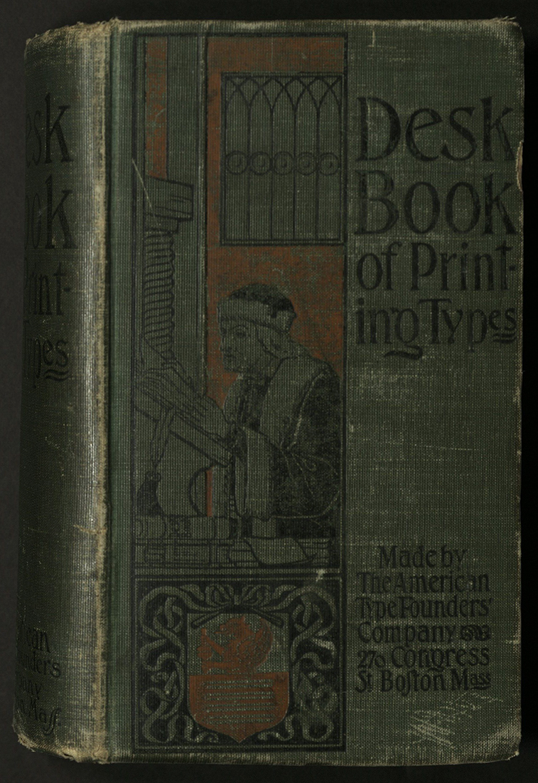
A DESK BOOK OF PRINTING TYPES…
American Type Founders Company
Boston: American Type Founders, Co., 1898
Z250 A53 1898
American Type Founders was formed in 1892, consolidating twenty-three prominent type foundries in the United States. Individually, these foundries had dominated American typesetting. However, newly invented automated mechanical typesetting machines – the Linotype and the Monotype – threatened the foundries. ATF was a unified response to that threat.
ATF marketed itself as the keeper of traditional quality in the face of mass production, but also as the cutting edge of the new technologies. In 1903, a headquarters for the foundries was built in Jersey City. An effort to consolidate each foundry’s variant fonts into families of type was begun by Morris Fuller Benton, who also designed his own typefaces. By the 1920s ATF was the dominant force in the typesetting industry, with everything from fonts to printing plants.
ATF declared bankruptcy in 1933 – a result of changes in the industry and, especially, the Great Depression. Re-formed, the company continued a rocky existence. In the early 1990s, ATF closed. Its collective matrices and equipment were auctioned off in 1993. Much of this can now be found at the Smithsonian Institution and at Columbia University.
University of Utah copy gift of Eleanor Nicholes.
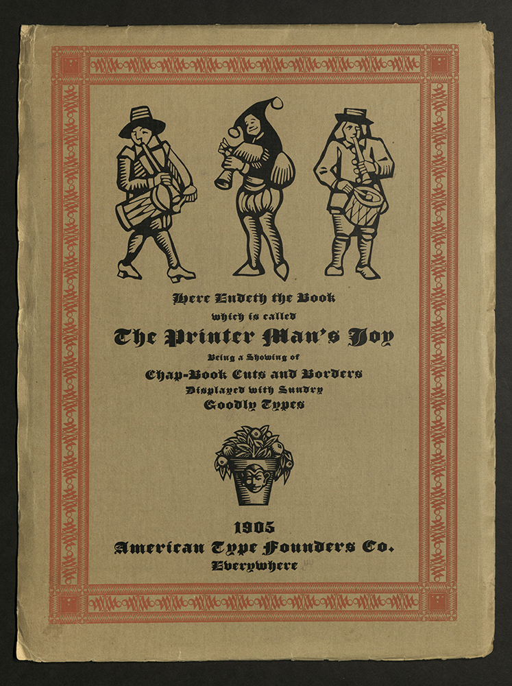
THE DELECTABLE ART OF PRINTING…
[S.l.]: American Type Founders, 1905
Z250 D45 1950
Designed and printed by Will Bradley. Bound at top in paper wrappers.
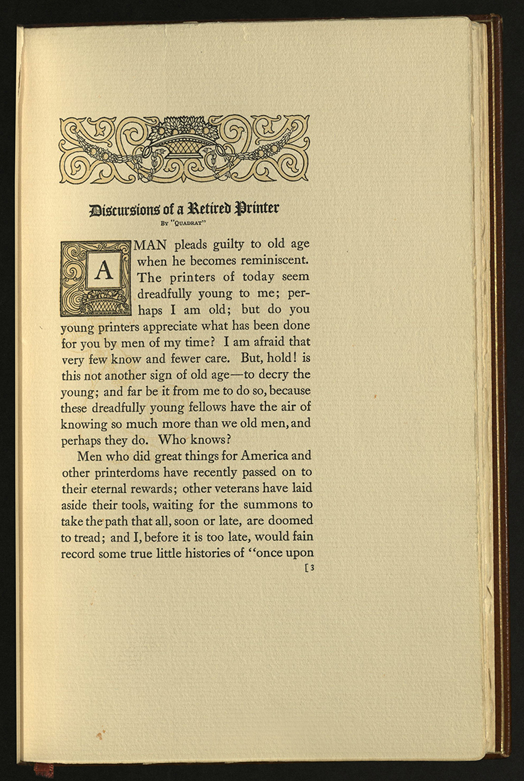
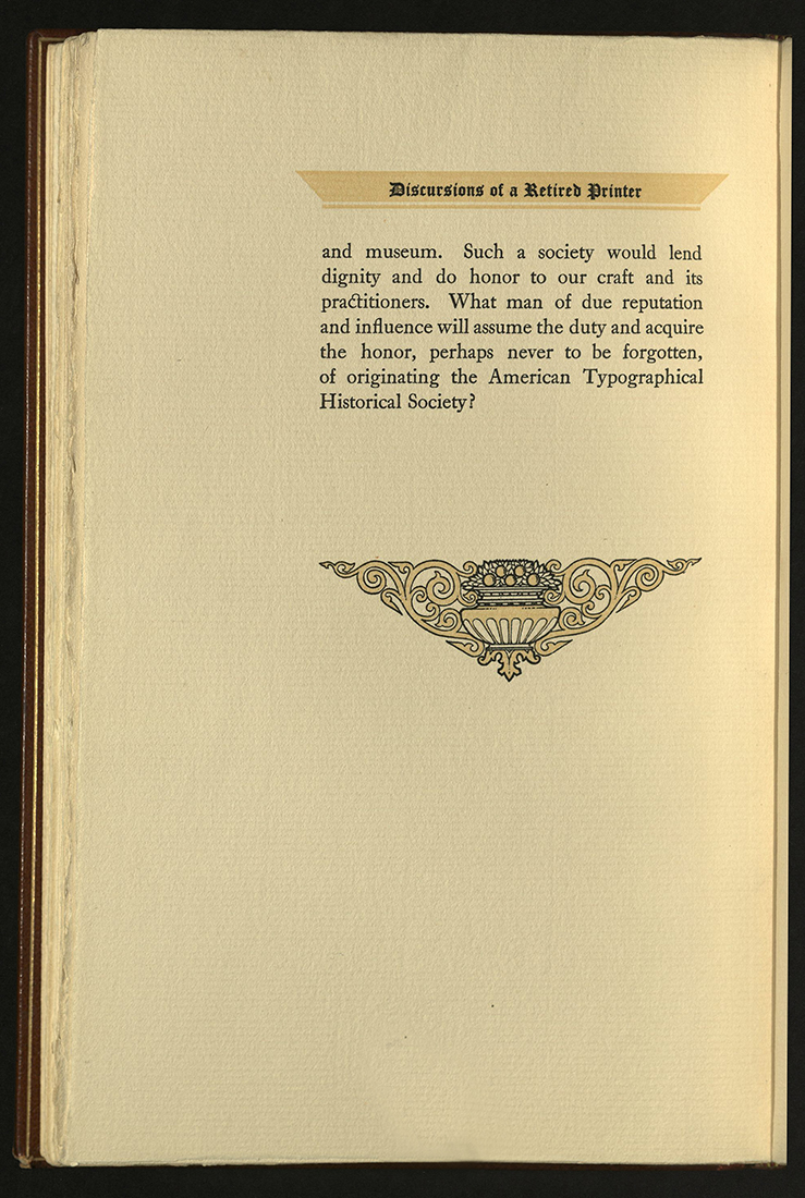
DISCURSIONS OF A RETIRED PRINTER…
Henry Lewis Bullen (1857-1938)
Jersey City, NJ: Specimen Printing Dept., American Type Founders Co., 1906
Z250 B93 1906
Printed on one side only of folded leaves. University of Utah copy from the library of Richard-Gabriel Rummonds.
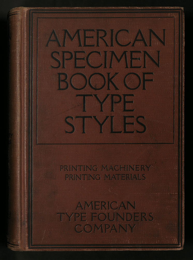
AMERICAN SPECIMEN BOOK OF TYPE STYLES…
American Type Founders, Inc.
[Jersey City]: American Type Founders Company, [c1912]
Z250 A517 1912
University of Utah copy from the library of Sidney E. Berger.

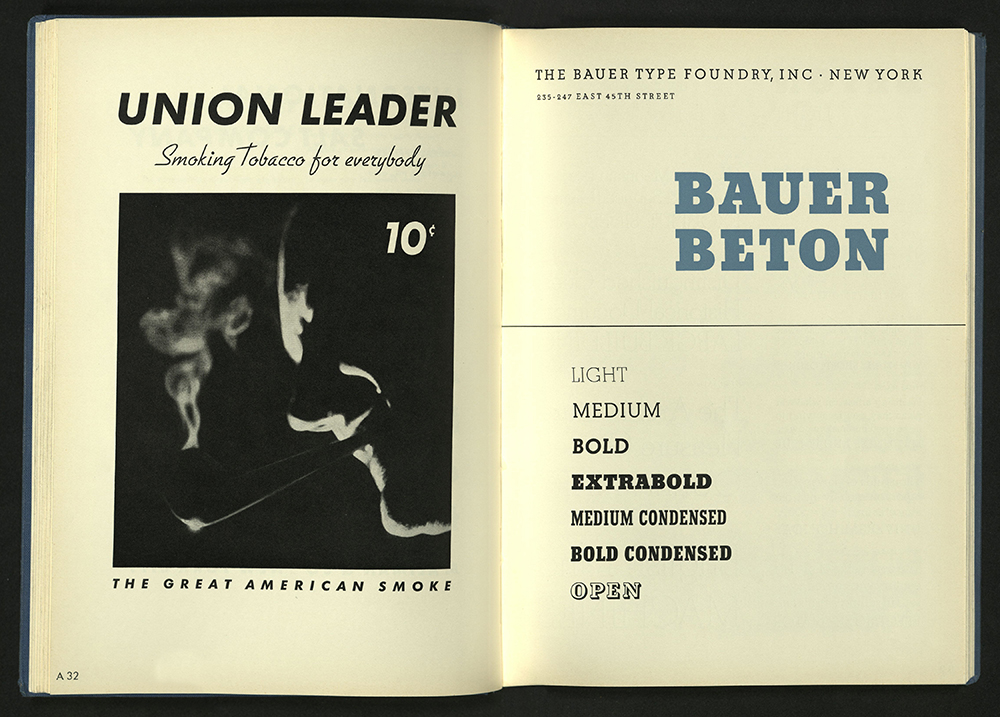
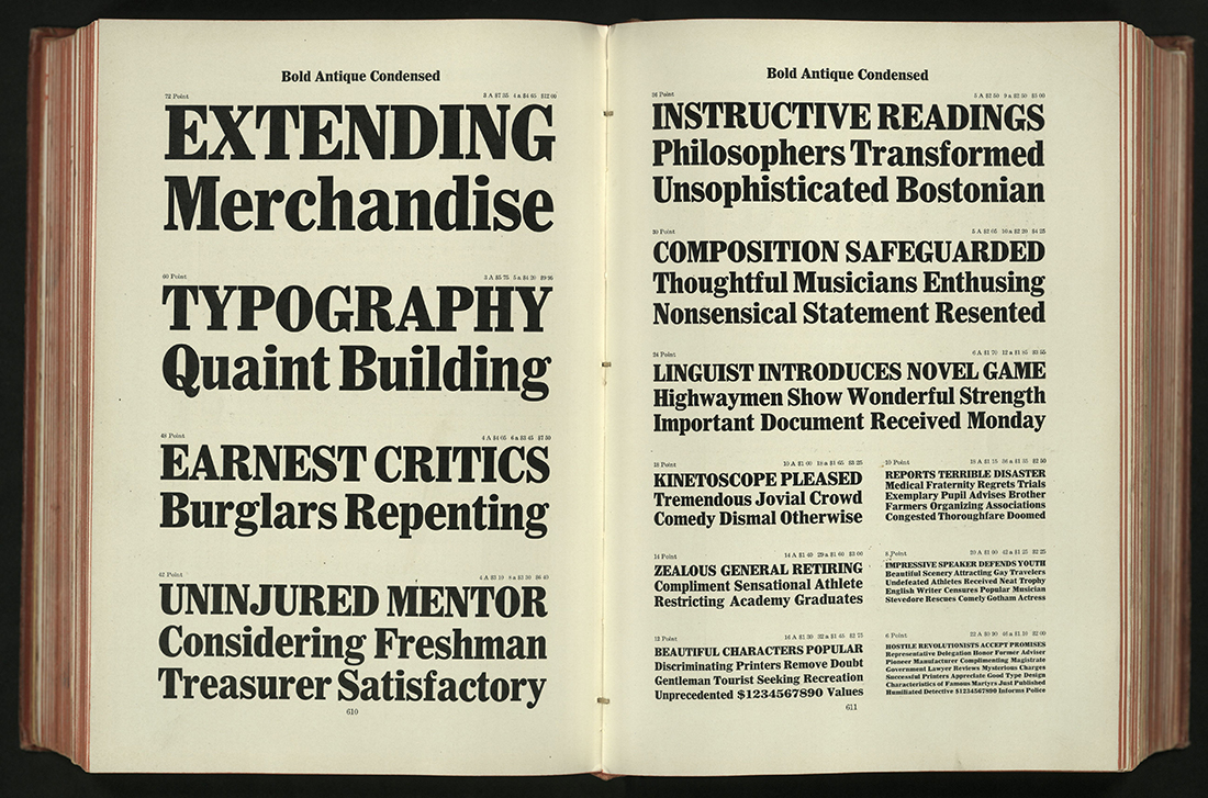
SPECIMEN BOOK OF BAUER TYPES
Bauer Type Foundry
New York: The Foundry, [1935?]
Second edition
Z250 B35 1937
University of Utah copy gift of Eleanor Nicholes.
SELECTED SPECIMEN BOOK PAGES SET IN MONOTYPE FACES
Philadelphia: Lanston Monotype Co., 1938
Z250 S415 1938
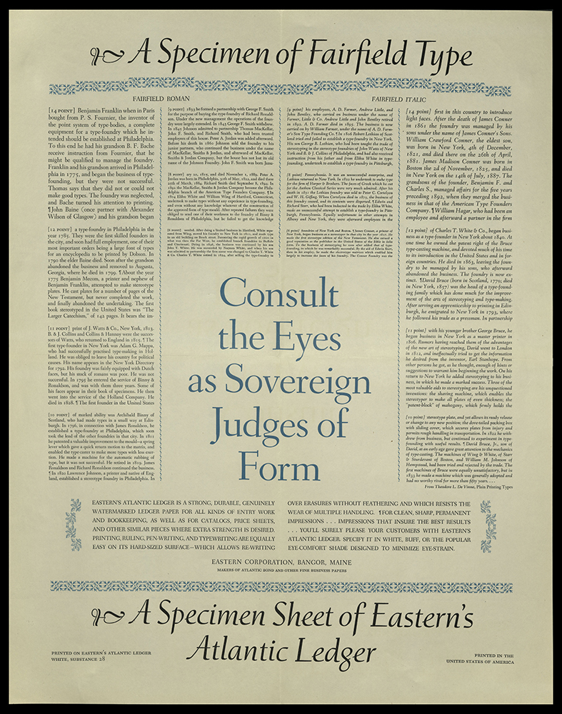
A SPECIMEN OF FAIRFIELD TYPE
Bangor, ME: Eastern Corporation, 1940
Z250 S6353 1940z
University of Utah copy gift of James Doolittle.
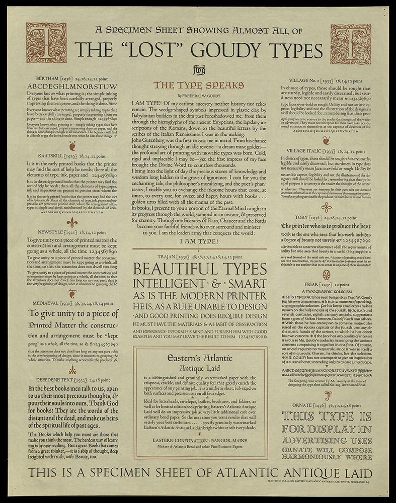
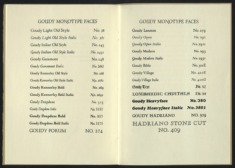
A SPECIMEN SHEET SHOWING ALMOST ALL OF THE “LOST” GOUDY TYPE
Bangor, ME: Eastern Corporation, 1940
Z250 S63563 1940z
University of Utah copy gift of James Doolittle.
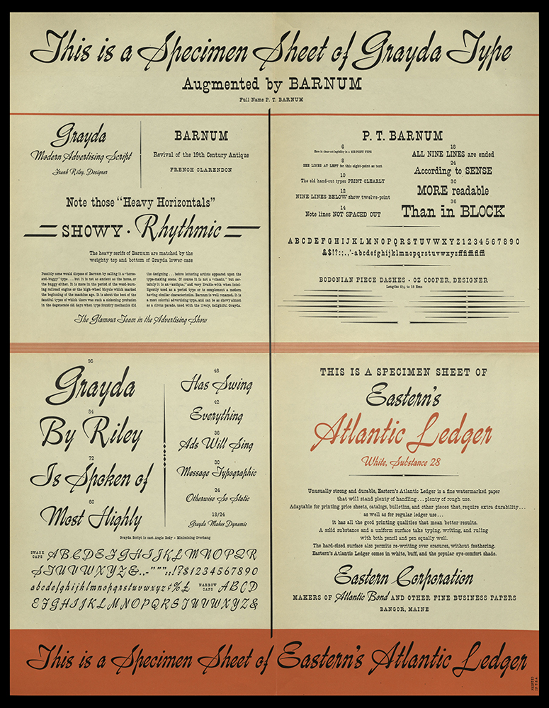
THIS IS A SPECIMEN SHEET OF GRAYDA TYPE…
Bangor, ME: Eastern Corporation, 1940
Z250 T434 1940z
University of Utah copy gift of James Doolittle.
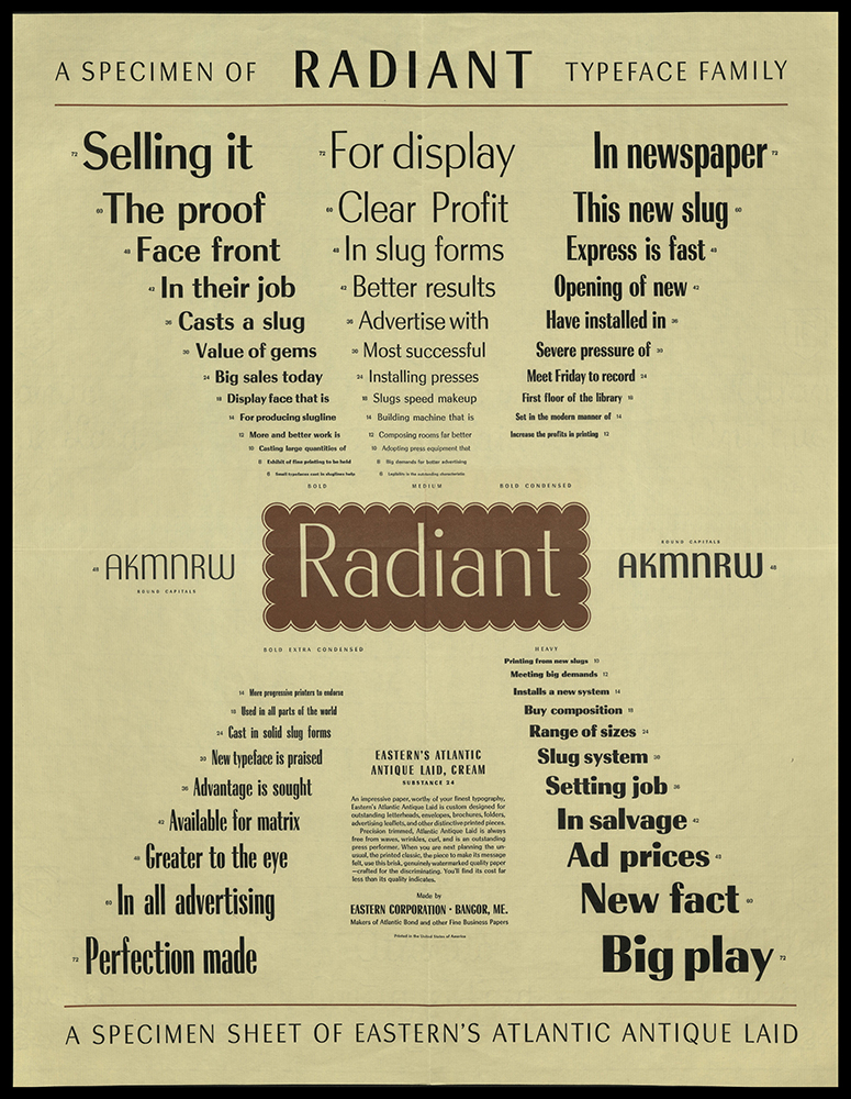
A SPECIMEN SHEET OF RADIANT TYPEFACE FAMILY
Bangor, ME: Eastern Corporation, 1940
Z250 S6374 1940z
University of Utah copy gift of James Doolittle.
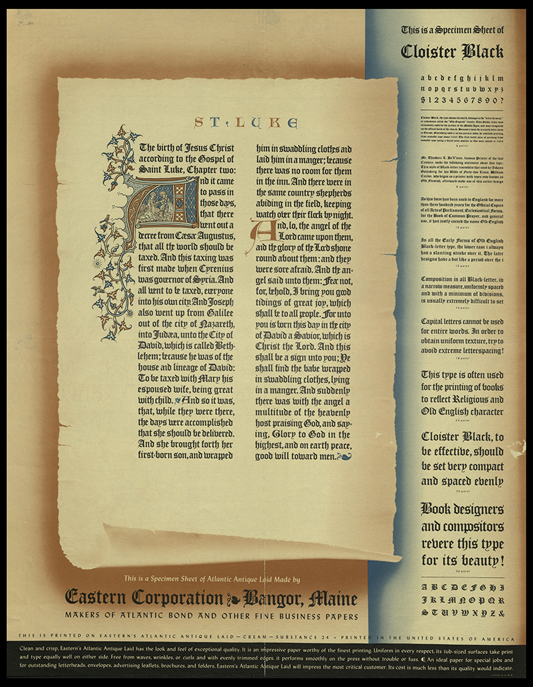
THIS IS A SPECIMEN SHEET OF CLOISTER BLACK
Bangor, ME: Eastern Corporation, 1940
Z250 T4325 1940z
University of Utah copy gift of James Doolittle.
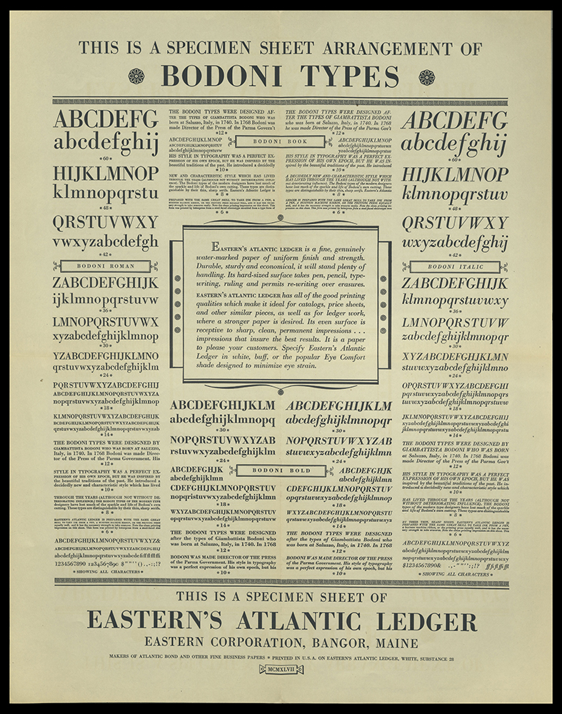
THIS IS A SPECIMEN SHEET OF ARRANGEMENT OF BODONI TYPES
Bangor, ME: Eastern Corporation, 1947
Z250 T4316 1947
University of Utah copy gift of James Doolittle.
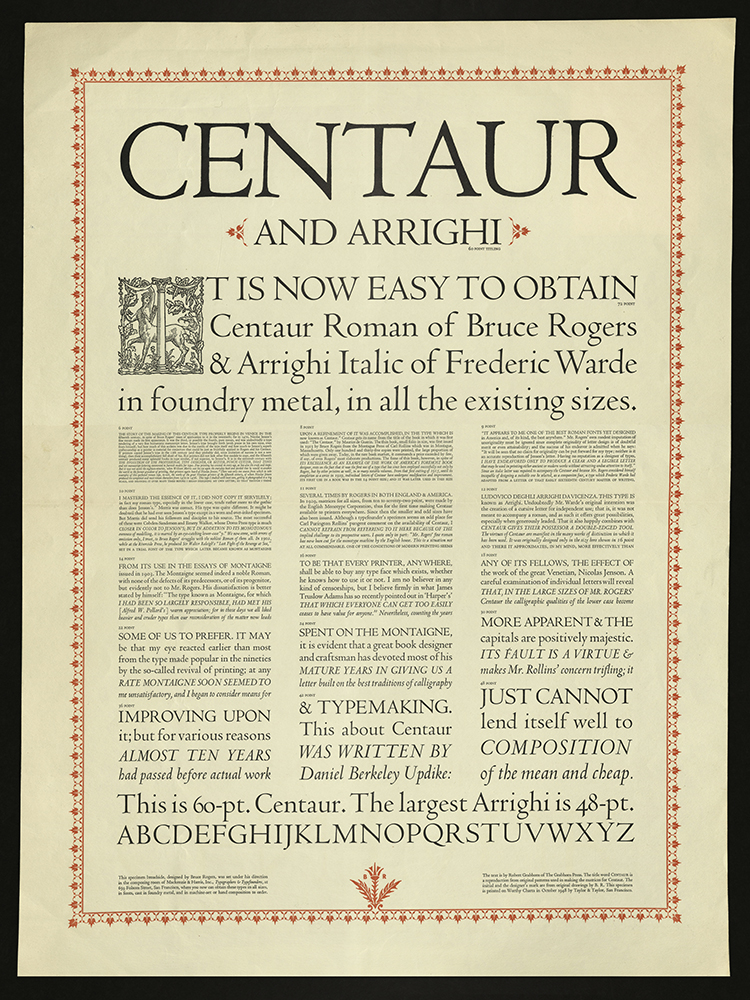
CENTAUR AND ARRIGHI
Robert Grabhorn
San Francisco, CA: Mackenzie & Harris, Inc., 1948
Z250.5 C44 G73 1948
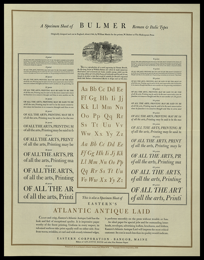
A SPECIMEN SHEET OF BULMER ROMAN & ITALIC TYPES...
Bangor, ME: Eastern Corporation, 1948
Z250 S63557 1948
University of Utah copy gift of James Doolittle.
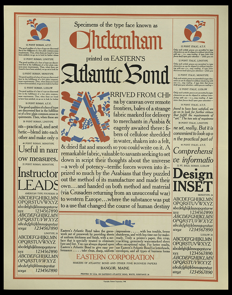
SPECIMENS OF THE TYPE FACE KNOWN AS CHELTENHAM…
Bangor, ME: Eastern Corporation, 1948
Z250 S645 1948
University of Utah copy gift of James Doolittle.
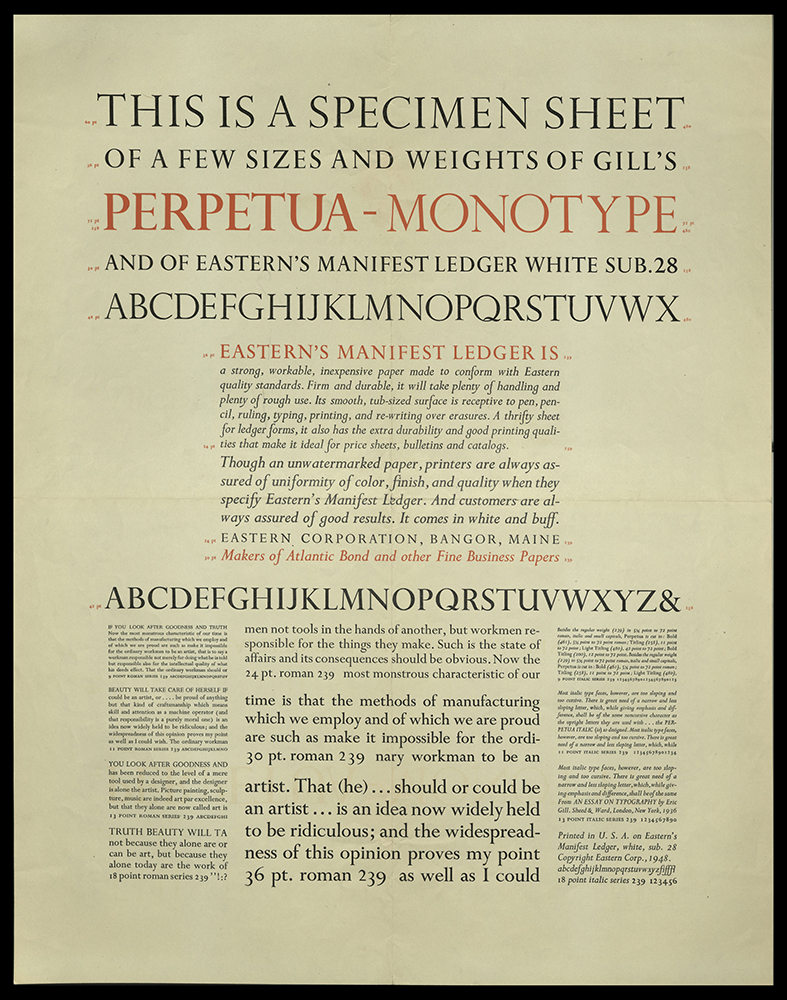
THIS IS A SPECIMEN SHEET OF A FEW SIZES AND WEIGHTS OF GILL’S PERPETUA-MONOTYPE...
Bangor, ME: Eastern Corporation, 1948
Z250 T432 1948
University of Utah copy gift of James Doolittle.
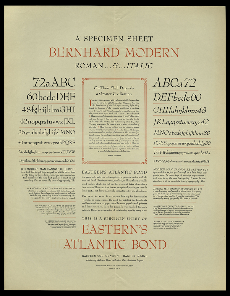
A SPECIMEN SHEET: BERNHARD MODERN ROMAN & ITALIC
Bangor, ME: Eastern Corporation, 1949
Z250 S63555 1949
University of Utah copy gift of James Doolittle.
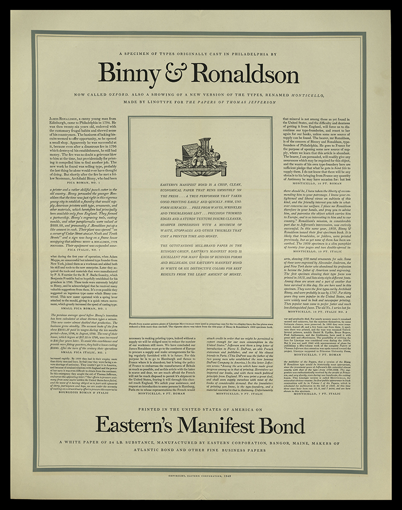
A SPECIMEN OF TYPES ORIGINALLY CAST IN PHILADELPHIA BY BINNY & RONALDSON…
Bangor, ME: Eastern Corporation, 1949
Z250 S63536 1949
University of Utah copy gift of James Doolittle.
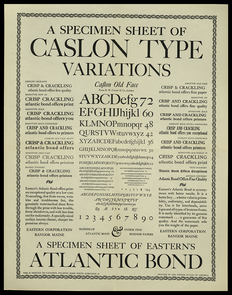
A SPECIMEN SHEET OF CASLON TYPE, VARIATIONS
Bangor, ME: Eastern Corporation, 1949
Z250 S63556 1949
University of Utah copy gift of James Doolittle.
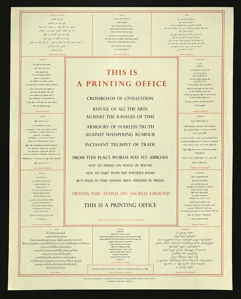
THIS IS A PRINTING OFFICE
Salfords, Redhill, Surrey, England: Monotype Corporation Limited, 1950
Z250 T43 1950z

AN ALPHABET FOR PRINTERS
Philadelphia: Lanston Monotype Co., [between 1950 and 1959?]
Z250 A52 1950z
University of Utah copy gift of James Doolittle.
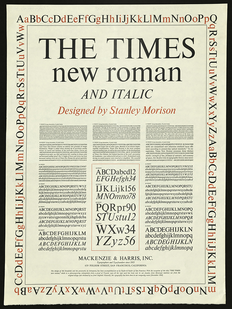
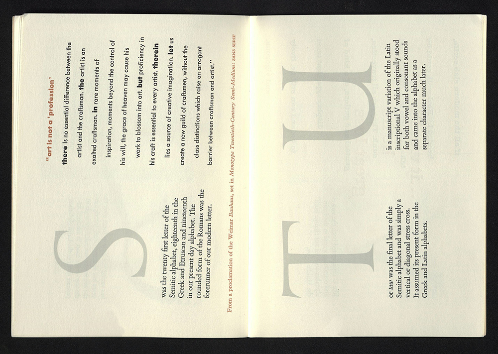
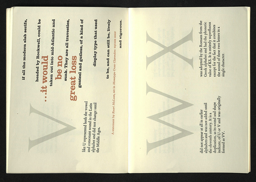
THE TIMES NEW ROMAN AND ITALIC
San Francisco, CA: Mackenzie & Harris, Inc., 1960
Z250 M67 1960
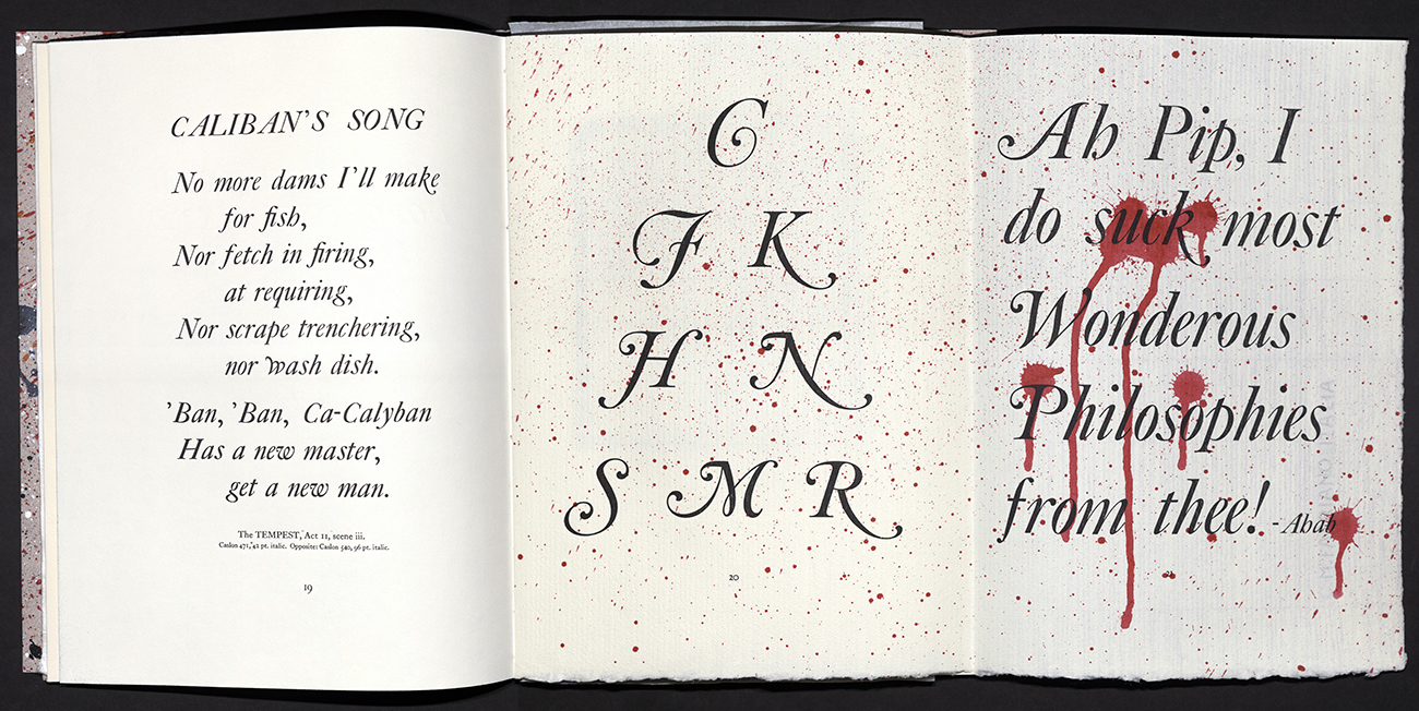
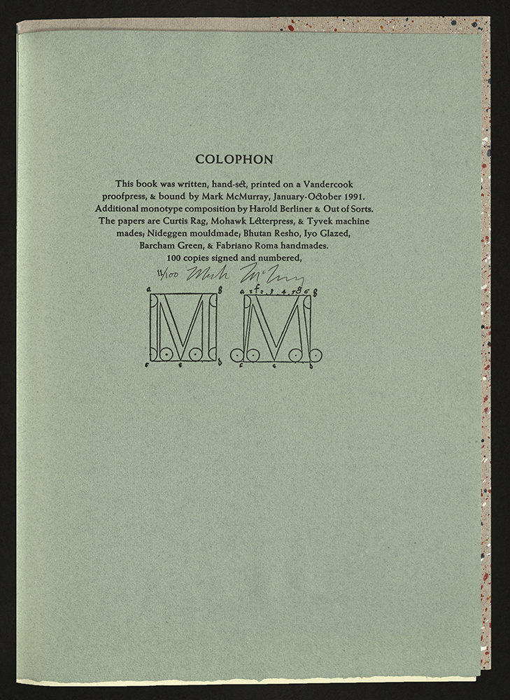
TYPE SPECIMENS OF CALIBAN PRESS…
Mark McMurray (b. 1954)
Montclair: NJ: Caliban Press, 1991
Z232 C15 M3 1991
Issued in grayish pink paper covers over still cream paper; non-adhesive binding structure, attached to the signatures with exposed spines. Paper is hand-splattered on outside surfaces.

40 MILLS PLACE: A COLLECTION OF TYPE SPECIMENS
Pasadena, CA: Archetype Press, Art Center College of Design, 2003
Z250 F685 2003
Printed as a tribute to 40 Mills Place, the address at which the Archetype Press printed forty different projects. The press then moved.
40 Mills Place is one of Archetype’s most ambitious projects. It includes samples of the different kinds of type owned by the press, from classic fonts like Bembo, Palatino, Garamond, Baskerville and Bodoni to those by the great designers of the twentieth-century such as Eric Gill, Jan Van Krimpen, Frederic Goudy, and Rudolf Koch to contemporary faces.
Photographer Steven Heller’s illustration is a color rendition of the historic Old Pasadena building. Introduction by Donald Young. Fifty-three loose leaves illustrate forty-eight metal and wood type specimens featuring color and illustrations printed on rectos only by students at Art Center College of Design using metal and wood types. The instructors for the project were Cody Clark, Heidrun Mumper-Drumm, and Gloria Kondrup, Director of the Press, assisted by Christina Aumann. Each copy contains an image transfer print by photographer Steven A. Heller who was assisted by Vahe Alaverdian. Issued in red clamshell case handmade by Alice Vaughan. Edition of one hundred and twenty copies.
BASKERVILLE
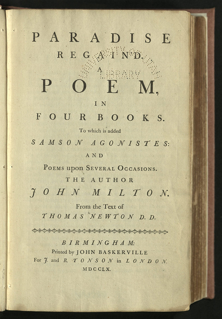
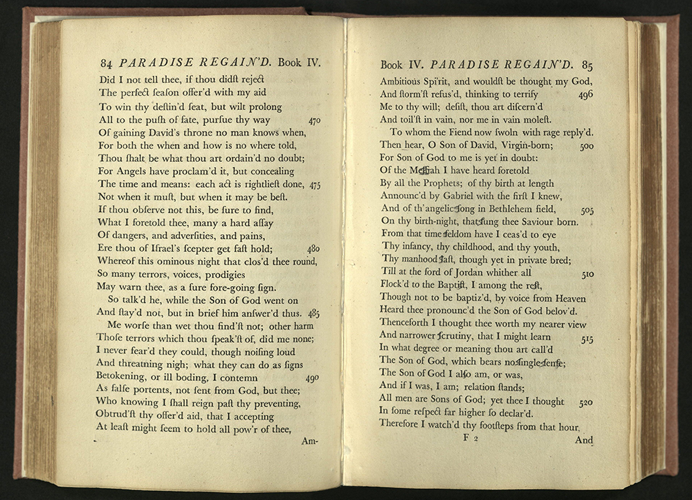
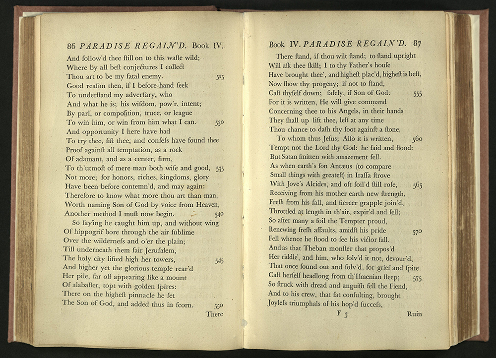
PARADISE REGAIN’D. A POEM, IN FOUR BOOKS…
John Milton (1608-1674)
Birmingham: Printed by J. Baskerville, for J. and R. Tonson, in London, 1760
PR3560 1760
Papermaker, printer, and typographer John Baskerville (1707?-1775) is known for his typeface of the same name, a font that remains in general use today. The typeface is clean, spare, understated, readable, and well-proportioned.
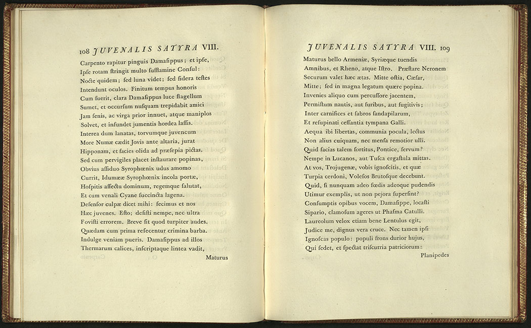
JUNII JUVENALIS ET AULI PERSII FLACCI SATYRAE
D. Juvenal
Birminghamiae: typis Johannis Baskerville, 1761
PA6446 A2 1761
John Baskerville established a paper mill, printing press, and type foundry at Birmingham in 1750. He spent years experimenting with designs for types and various processes for improving the surface of paper. One method he developed was to press the sheets between hot plates after printing. Baskerville was a perfectionist. He used his type only once before recasting it.
Baskerville presented his first printed works to the public in 1757 and 1758. These works established him as a printer of excellent workmanship and quality. Both his printing and the types he designed greatly influenced typography. Baskerville said that his greatest influence was William Caslon (d. 1766), but it was Baskerville who introduced lightness and refinement into English typography. Baskerville’s insistence on high printing standards, smooth wove paper, unworn type, and excellent ink combined to create a new style that relied on superior typography and materials to produce a fine book.
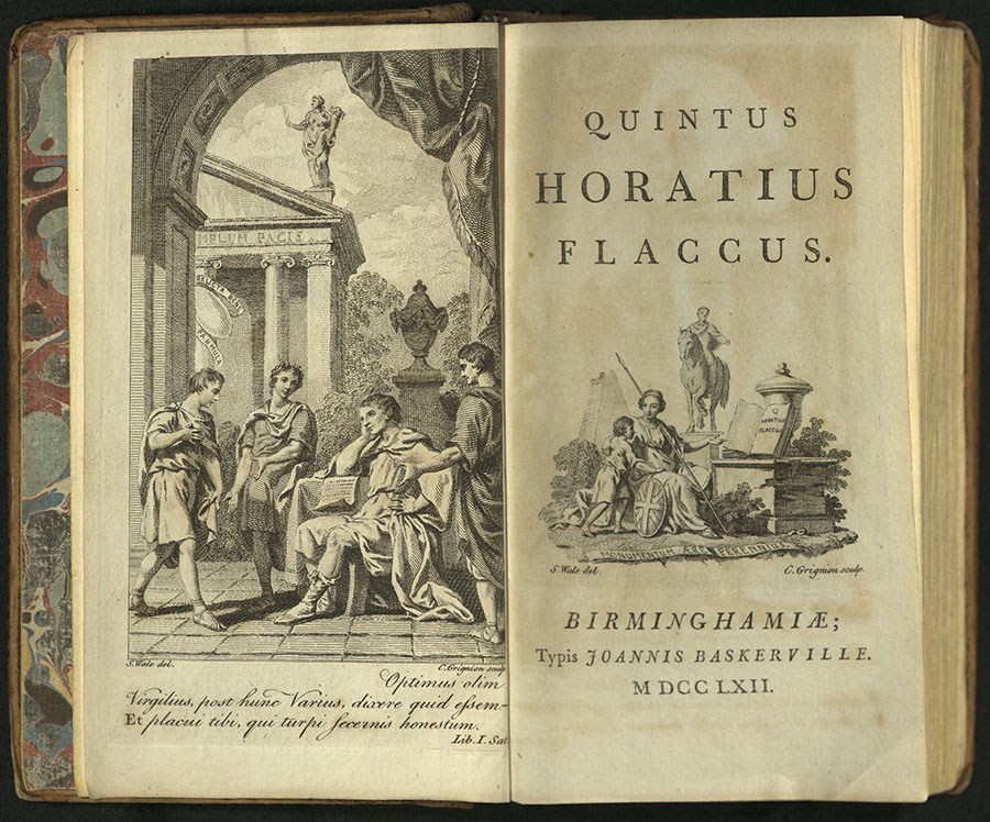
QUINTUS HORATIUS FLACCUS
Homer
Birminghamaiae: Typis Joannis Baskerville, MDCCLXII [1762]
Edited by John Livie.
PA6393 A2 1762
This was the earliest of Baskerville’s series of the works of classical authors in small pocket edition in imitation of the publications of the sixteenth-century Elzevir family. This edition is distinguished even among Baskerville’s other exquisite publications for the quality of its paper and type.
Title-page vignette designed by S. Wade and engraved by C. Grignion. Engraved frontispiece by Grignion opposite title-page. Engraved coat of arms on dedication leaf to Joanni Comiti de Bute.
University of Utah copy from the Kenneth Lieurance Ott Collection donated to the Okanogan County Museum, Washington.
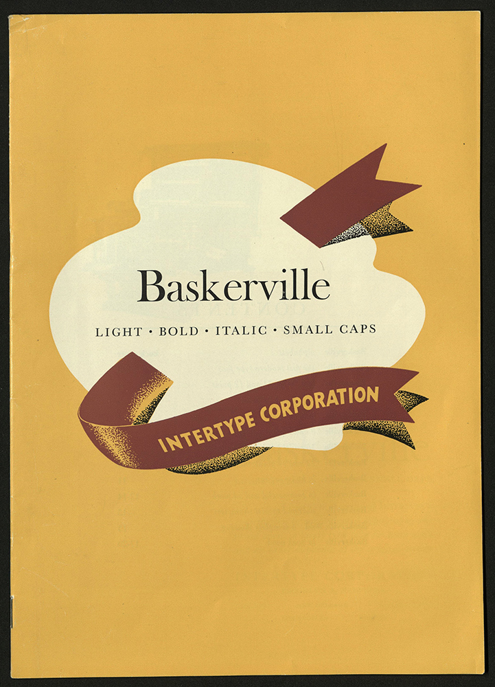
BASKERVILLE: LIGHT, ITALIC, BOLD, SMALL CAPS…
Intertype Corporation
Brooklyn, NY: Intertype Corp., [1947?]
Z 250 I622 1947
University of Utah copy gift of Don Gale.
IMPRIMERIE
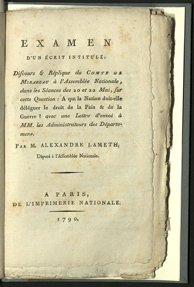
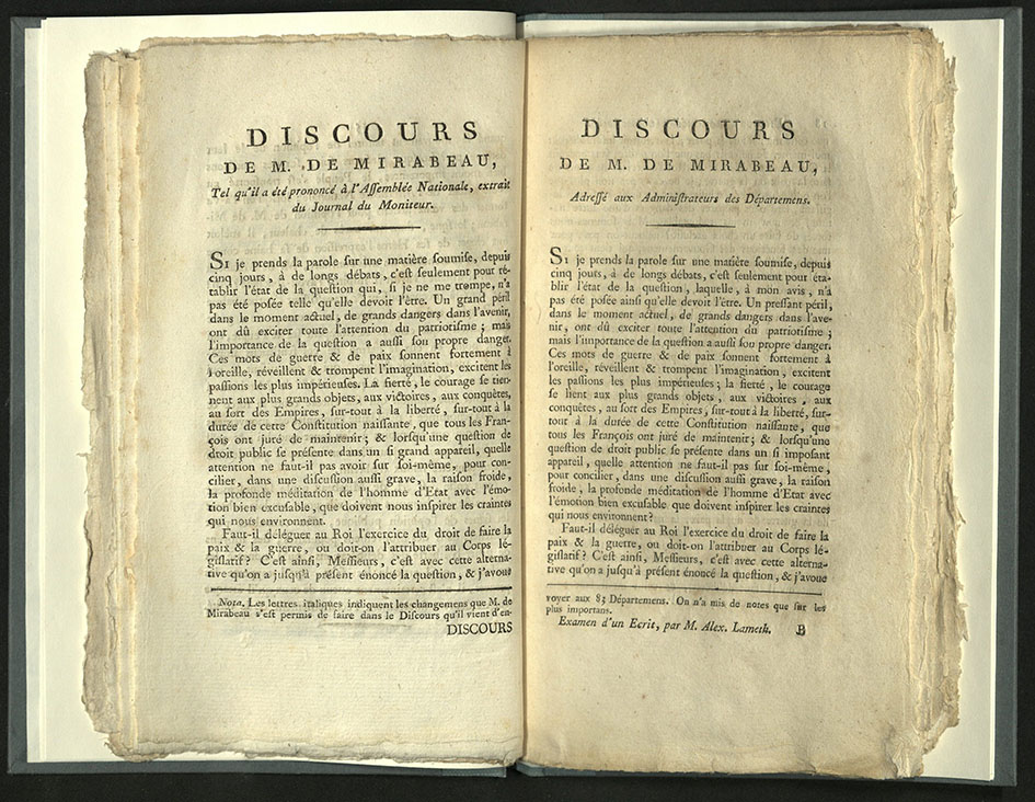
EXAMEN D’UN ECRIT INTITULE: DISCOURS & REPLIQUE DU…
Alexandre Lameth [Theodore Victor], (1760-1829)
Paris: Imprimerie nationale, 1790
DC146 M7 A35
The official printing house of France was begun in 1640 by Cardinal Richelieu on behalf of Louis XIII. Workmen were brought in from Holland to set up shop. The first book produced with the imprint “Imprimerie Royale du Louvre” was De imitation Christi.
In 1692, Louis XIV commissioned a new type for exclusive use by the crown, the roman du roi. Deluxe French book production became a feature of the press, along with more perfunctory official printing. With the many changes in French governments during the following centuries, the name of the press changed: from Imprimerie de la République to Imprimerie impériale to Imprimerie royale to Imprimerie nationale. Regardless of government or name, the press was the exclusive printer for the French state until 1994.
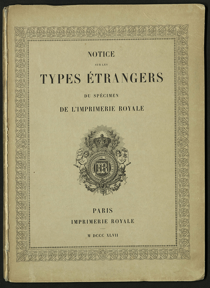
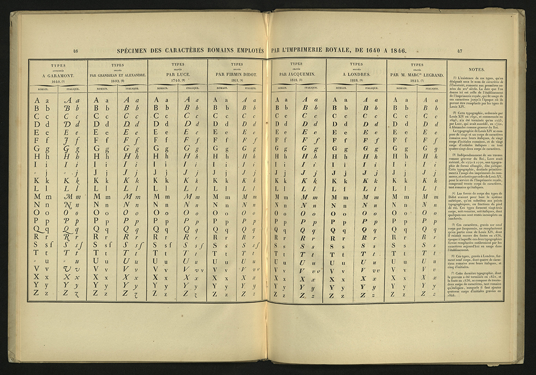
NOTICE SUR LES TYPES ESTRANGES DU SPECIMEN DE L’IMPRIMERIE ROYALE...
Paris: Imprimerie royale, 1847
Z 250 P25 1847
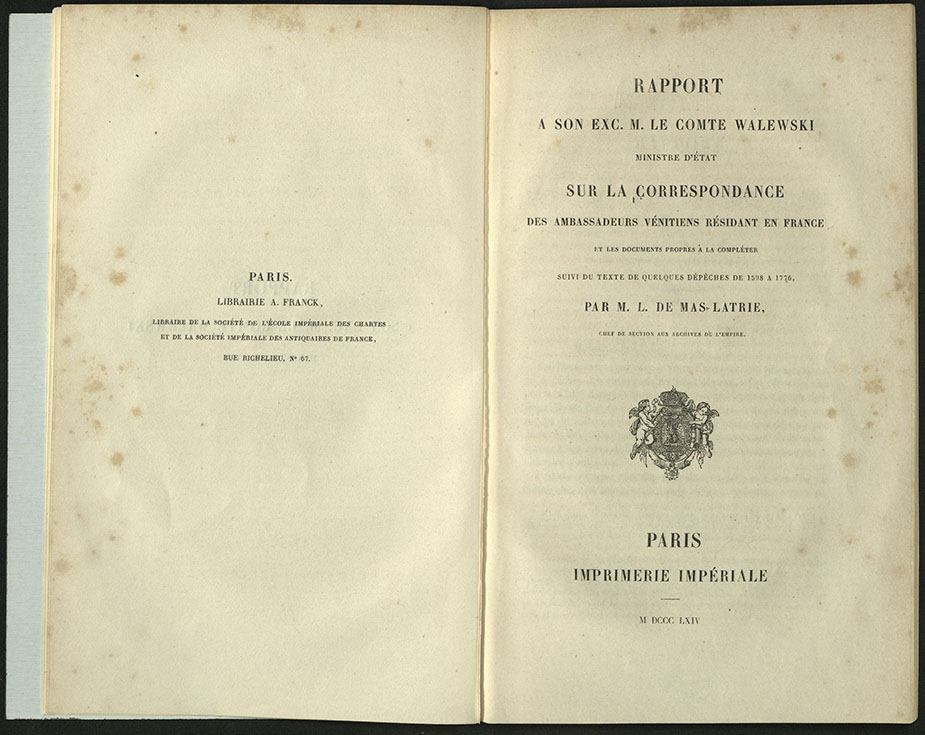
RAPPORT A SON EXC. M. LE COMTE WALEWSKI…
Paris: Imprimerie Imperiale, 1864
DC57 A5
ISAIAH THOMAS
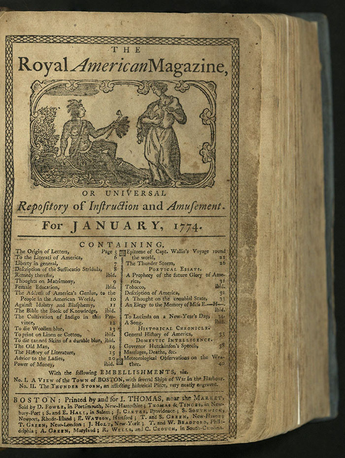
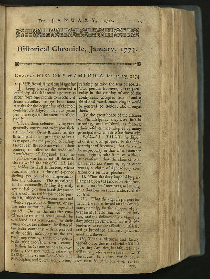
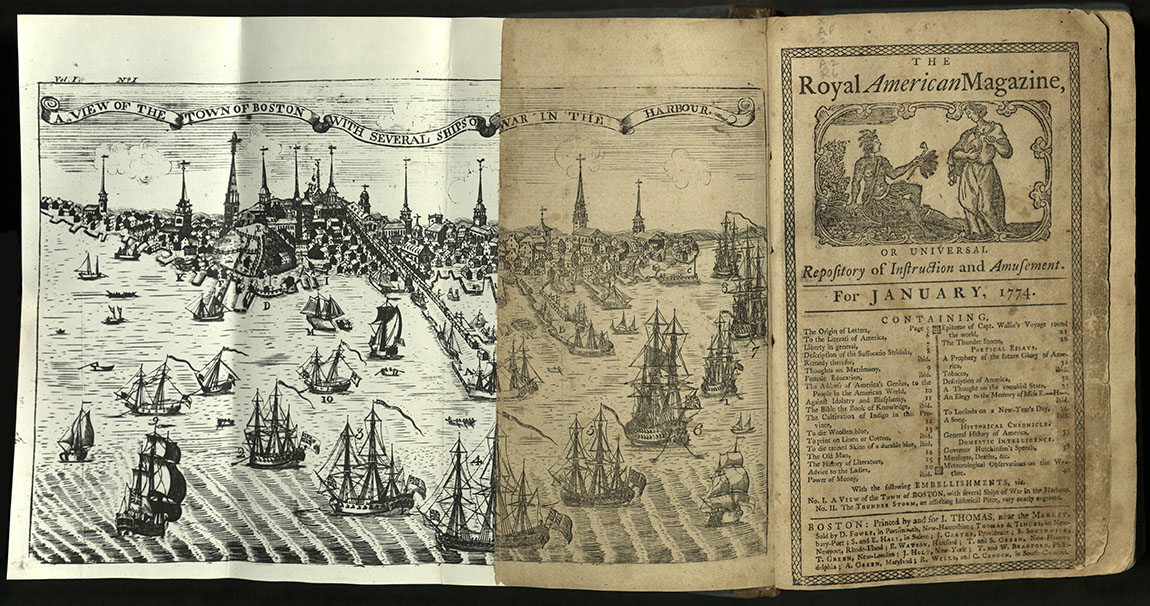
ROYAL AMERICAN MAGAZINE…
Boston: Printed by and for I. Thomas, [etc., 1774-75]
AP2 A2 R6
Under the editorship of Isaiah Thomas until 1774, the Royal American Magazine was almost violently patriotic. This fervor abated somewhat under the editorship of Joseph Greenleaf, who, nevertheless, published political burlesques and Paul Revere’s political cartoons.
American papermaker, publisher and printer, Isaiah Thomas preferred Caslon typefaces. Caslon became the look of revolution in the eighteenth century. A Caslon font was used to print the Declaration of Independence.
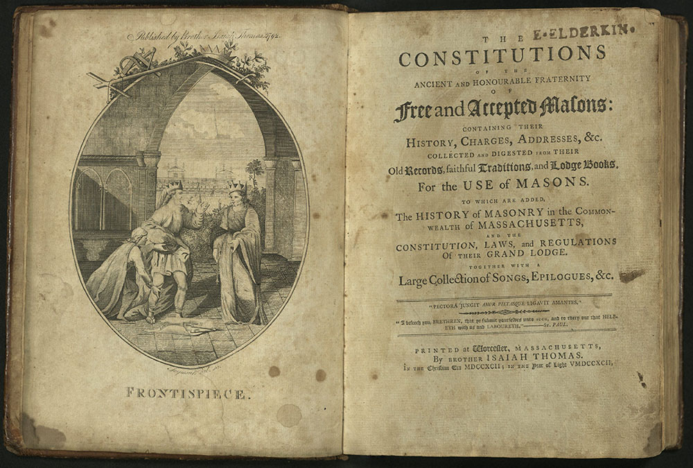
THE CONSTITUTIONS OF THE ANCIENT AND HONOURABLE….
Printed at Worcester, Massachusetts: by Brother Isaiah Thomas, in the Christian era MDCCXCII [1792];
in the year of light VMDCCXCII
HS445 M4 A2 1792
Dedicated to George Washington. Frontispiece engraved by Joseph Seymour.
University of Utah copy from the Kent Walgren Masonic Collection.
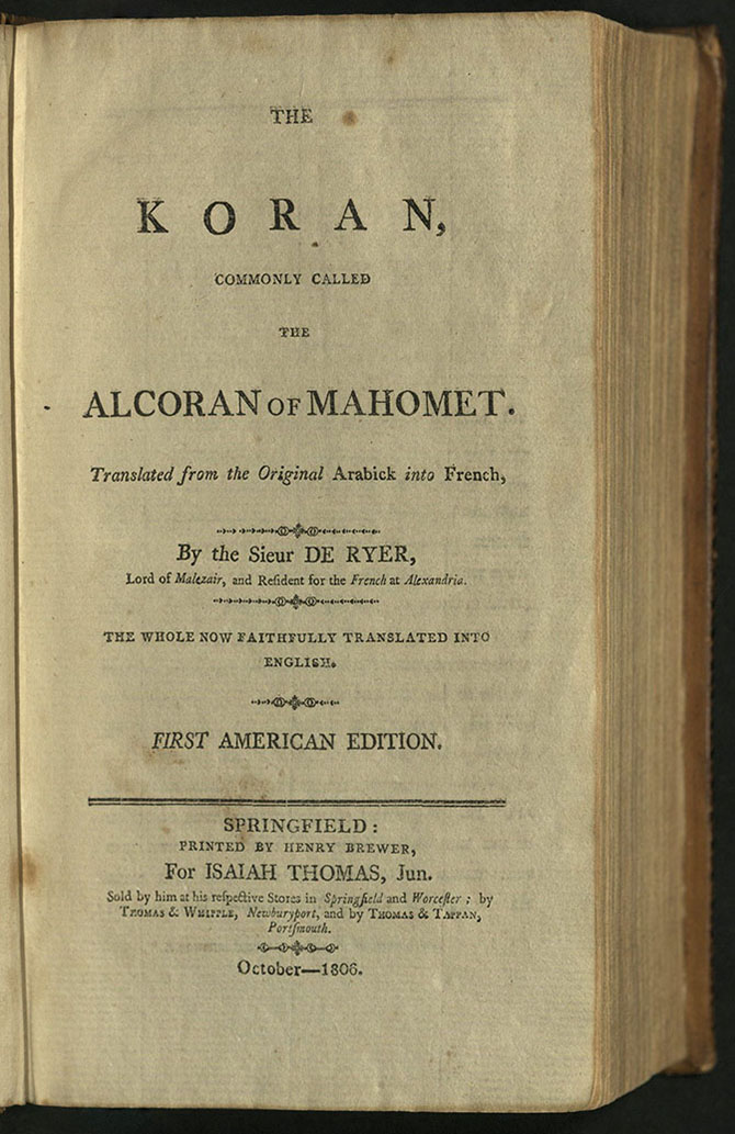
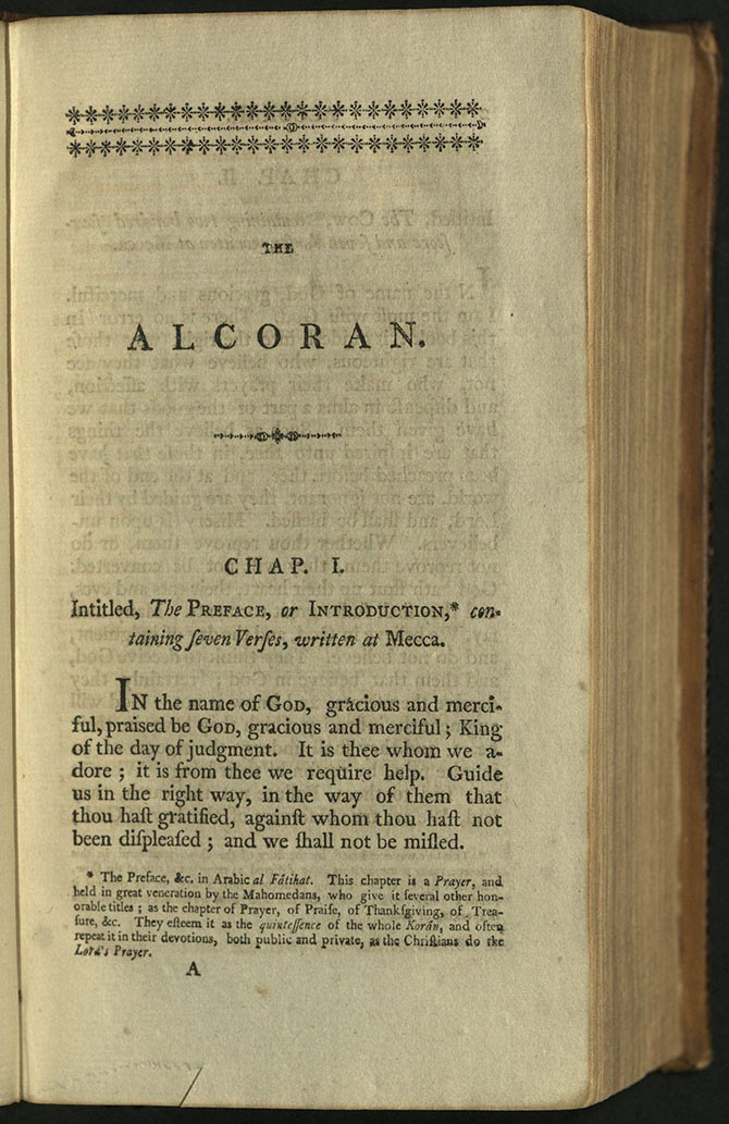
THE KORAN, COMMONLY CALLED THE ALCORAN OF…
Springfield, MA: Printed by Henry Brewer, for Isaiah Thomas, jun. Sold by him at his respective stores in Springfield and Worcester; by Thomas & Whipple, Newburyport, and by Thomas & Tappan, Portsmouth, October – 1806
First American edition
BP109 D8 1806
The printing house of Isaiah Thomas was the largest and most important American publisher in the late eighteenth and early nineteenth centuries. For the first American edition of the Qu’ran, Thomas adapted a translation by French orientalist Du Ryer. Du Ryer was the envoy of the French king at Alexandria and Constantinople in the seventeenth century. His French translation of the Qu’ran was frequently reprinted and translated into other Western European languages during the eighteenth century. The first edition in English was translated by George Sale and published in 1734.
For the first American edition, Thomas added notes, including discussions of Turkish traditions. The United States’ involvement in the Barbary Wars (“the shores of Tripoli”), provoked anti-Muslim sentiment but interest in the “infidels,” nonetheless. This edition of the Qu’ran was intended not for Muslim readership but for the curious American. The introduction to this edition refers to the verses as “fables” and faults the entire text for incongruity and repetition.
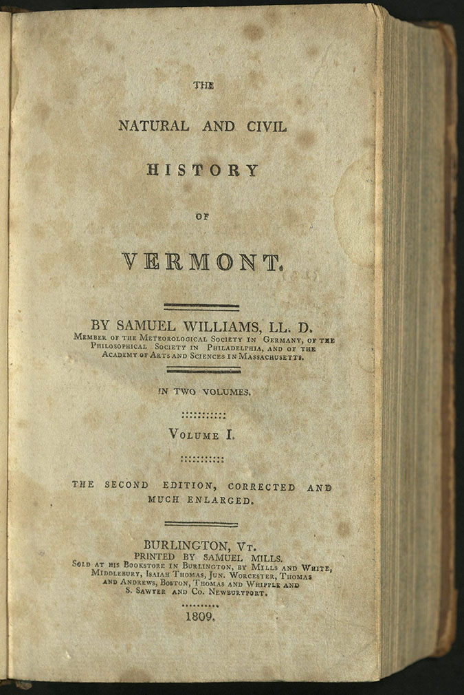
THE NATURAL AND CIVIL HISTORY OF VERMONT…
Samuel Williams (1743-1817)
Burlington, VT: Printed by Samuel Mills.
F49 W72 1809
Sold at his Bookstore in Burlington, by Mills and White, Middlebury, Isaiah Thomas, Jun. Worcester, Thomas and Andrews, Boston, Thomas and Whipple and S. Sawyer and Co. Newburyport., 1809 The 2d ed. Cor. and much enl.
University of Utah copy lacking frontispiece.
DIDOT
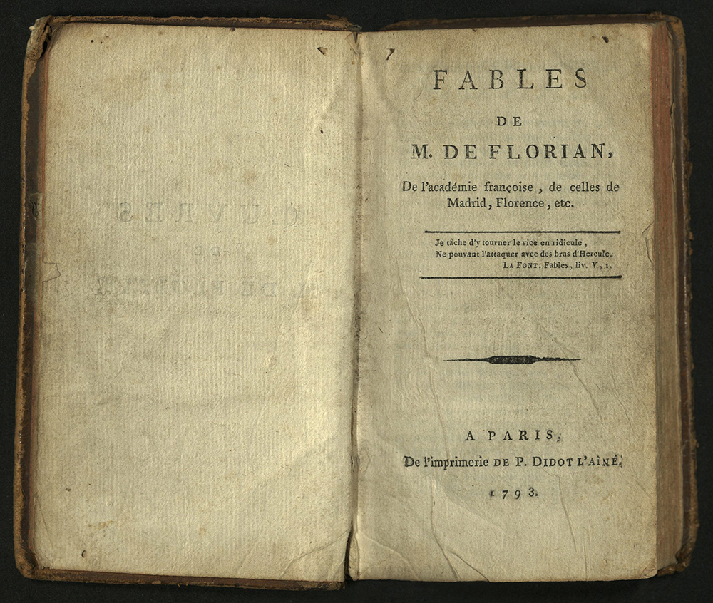
FABLES DE M. DE FLORIAN
Florian (1755-1794)
Paris: P. Didot l'aîné, 1793
PQ1983 F6 F3 1793
Florian, whose mother was Castilian, was raised by his grandfather. His uncle and guardian, the Marquis of Florian, who had married a niece of Voltaire, introduced him into French society. He became a page in the household of Duc de Penthievre. The two remained lifelong friends. He joined the army, but soon left it to write. In 1788 he was elected to the Académie française. He hid after the outbreak of the French Revolution but was discovered and imprisoned, where he died a few months later. Known today for his fables, he was recognized in his own time for his poetic, pastoral novels. He showed an affinity for Spanish literature and imitated the writing of Cervantes.
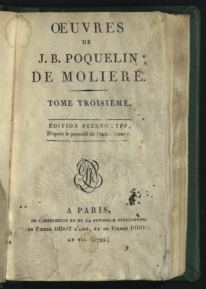
OEUVRES DE J. B. POQUELIN DE MOLIÈRE…
Molière (1622-1673)
Paris: Pierre Didot l'aîné, et de Firmin Didot, 1799
Edition stereotype, d’apres le procede de Firmin Didot
PQ1821 1799
Firmin Didot was born into a family of Parisian printers. His grandfather, François Didot, founded the print shop and also a family paper mill in Corbeil, an area known for its paper factories. Firmin Didot invented the word “stereotype” to describe his process of printing from a metal plate created to print an entire page. Didot printed his first book using this method in 1795. The process helped revolutionize the print industry, allowing for much cheaper editions. The Didot firm used this process extensively, and attracted printers from all over the world to view the new process.
A contemporary of Giambattista Bodoni, Firmin Didot helped establish a serif typeface now referred to as “Modern” or “Didone” style. These typefaces are characterized by a notable contrast between thin and thick strokes, using hairline serifs and a vertical stress on the lettering.
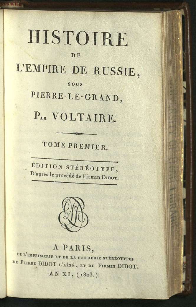
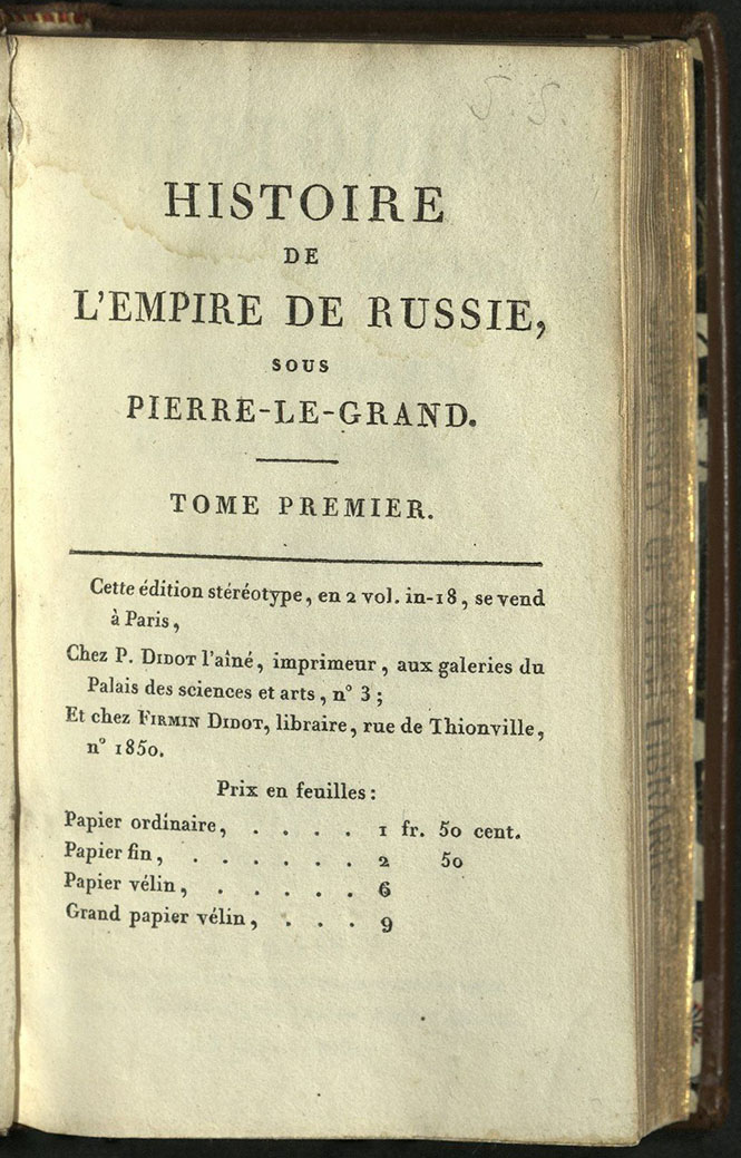
HISTOIRE DE L’EMPIRE DE RUSSIE…
Voltaire (1694-1778)
Paris: Impr. De P. Didot l’aîné de F. Didot, 1803
Ed. Stereotype
DK131 V6 1803
Pierre Didot (1761-1853) was one of the preeminent printers of his day. Pierre commissioned his father’s former apprentice to cut or improve the types used by Françoise-Ambroise Didot. In 1818, Pierre bought nearly three thousand steel punches and almost as many matrices of Baskerville types, but never used them.
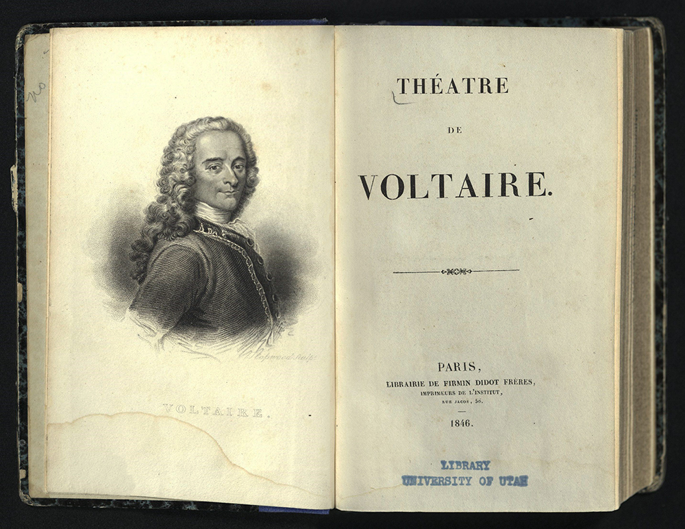
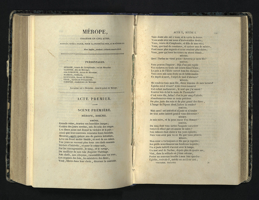
THEATRE DE VOLTAIRE
Voltaire (1694-1778)
Paris: Librairie de Firmin Didot Frères, 1846
PQ2076 A2 1846
Firmin Didot, the second son of Françoise-Ambroise Didot, cut his first modern face roman in 1784. In 1812, Firmin was invited to improve the typeface used by the Imprimerie Impériale. His modern faces were the standard types used by French printers for the rest of the nineteenth century.
BODONI
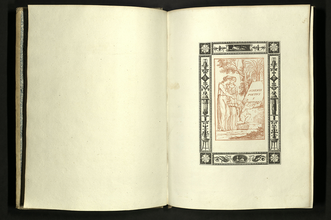
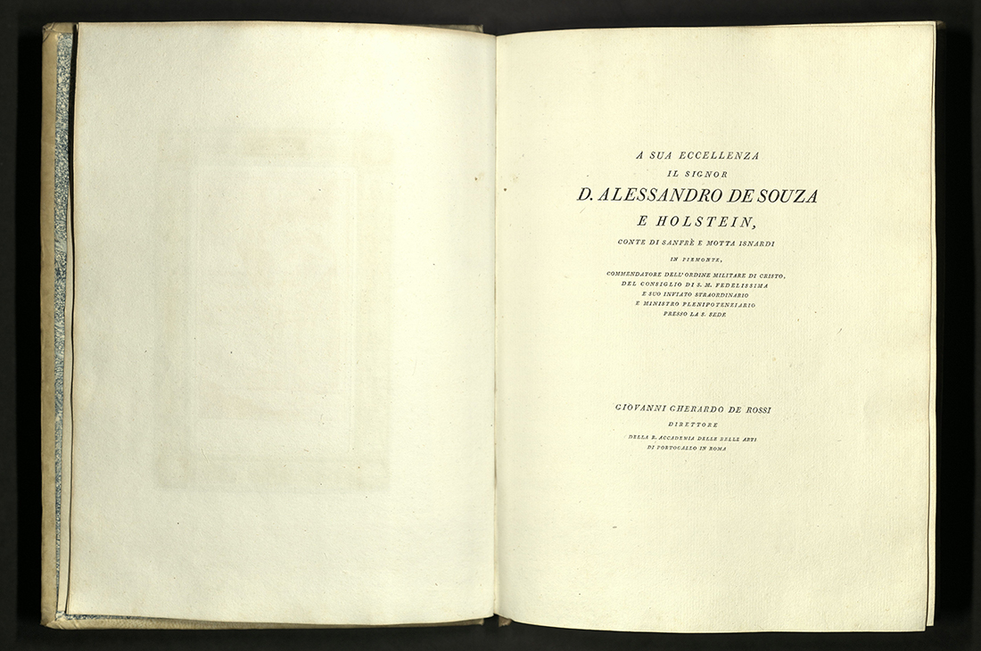

SCHERZI POETICI E PITTORICI
Giovanni Gherardo de Rossi (1754-1827)
Parma: Co’ tipi Bodoniani, MDCCXCV [1795]
First edition
PQ4731 R63 S4 1795
Giovanni de Rossi was a poet and playwright born in Rome. He served as president of the Academy of Fine Arts of Portugal and Director of the Royal Academy of Naples. The son of a banker, he also served as Minister of Finance of the Roman Republic from 1798-1800.
This is the smallest of the four formats printed by Giambattista Bodoni. Forty brief but elegant love epigrams, sonnets, and other poems are illustrated with delicate line drawings, all within frames, featuring shafts of wheat, griffins and other motifs inspired by the art of Pompeii in fine Neoclassical style. Little-known Portuguese artist Jose Teixeira (1762-1810) designed the illustrations. Forty engravings by Francesco Rosapina are set within a colored background. The clean typeface set on a spare, uncluttered page sings Bodoni’s name.
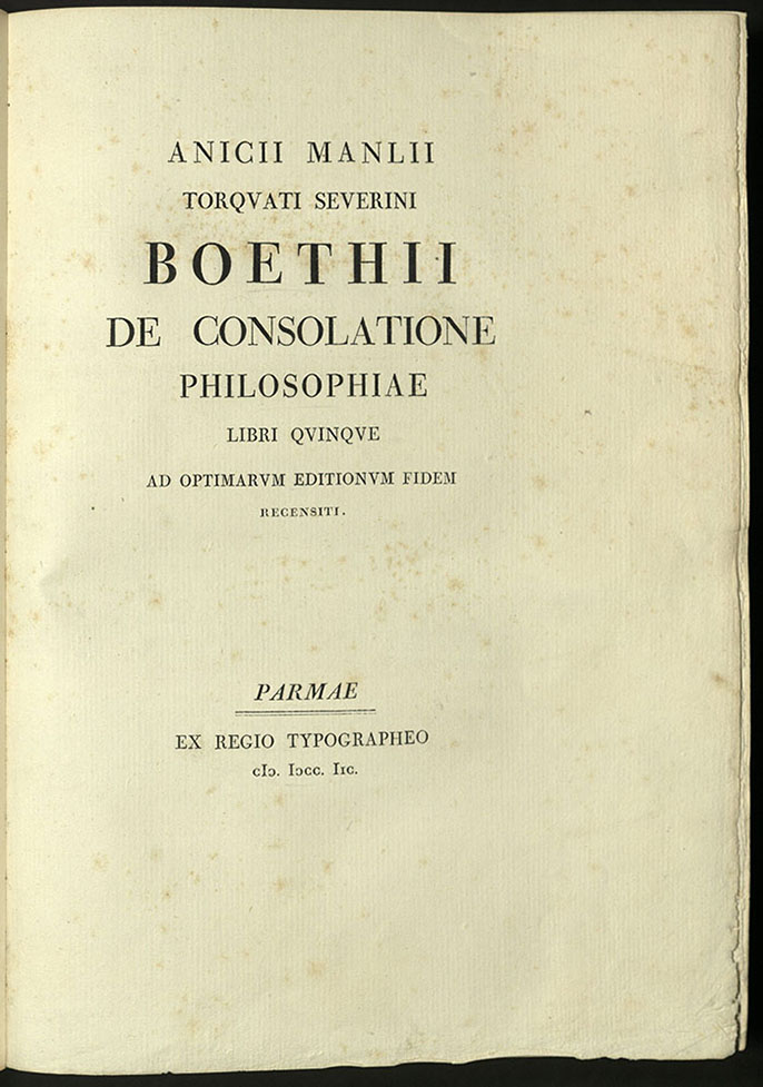
ANICII MANLII TORQUATI SEVERINI BOETHII…
Boetheus (d. 524)
Parmae: Ex Regio Typgrapheo, 1798
B659 C2 1798
LE PIU INSIGNI PITTURE PARMENSI…
Giambattista Bodoni (1740-1813)
Parma: Dalla Tipografia Bodoniana, 1809
ND621 P3 B63 1809
Giambattista Bodoni is considered one of the great typographers and printers of the eighteenth century. Bodoni was raised in a family of printers. He worked as an apprentice for the Vatican’s printing house in Rome, where he printed a Coptic missal and a Tibetan alphabet. His skill was so great that he was allowed to place his name on the imprint for these publications.
In 1766, the Duke of Parma hired Bodoni to organize a print shop there. Bodoni began by publishing type specimen books. European nobility recognized the quality of the printing and soon commissioned Bodoni to print editions of classical works. His editions were bought for the beauty of their production as much as for their content. In 1770, Bodoni opened his own type foundry. He designed more than two hundred typefaces. He became successful enough to open his own print shop under his name, Officina Bodoni, in 1790. So lauded was he that the cathedral bells of Parma were rung at his death.
Le più insigni pitture Parmensi was printed in 1809, but not published until 1816, three years after Bodoni’s death, by his widow, the Duchess Maria Luigia. Engravings by Francesco Rosaspina after Francisco Vieira.
Printed in Italian and French. University of Utah copy in original binding with gold crest stamp on front and back. University of Utah copy from the Kenneth Lieurance Ott Collection donated to the Okanagan County Museum, Washington.
WILLIAM PICKERING
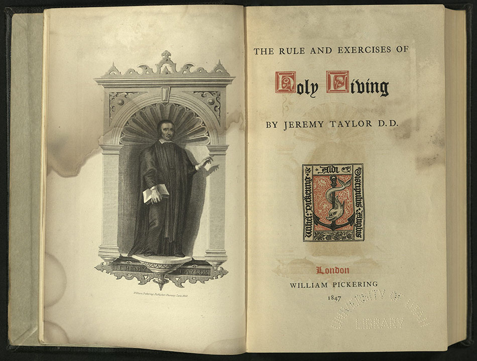
THE RULE AND EXERCISES OF HOLY LIVING…
Jeremy Taylor (1613-1667)
London: William Pickering, 1847
BV4500 T34 1847
Jeremy Taylor was a clergyman in the Church of England. He worked under the protectorate of Oliver Cromwell. Called the “Shakespeare of Divines,” Taylor wrote prose in an expressive, poetic style. His work was admired by John Wesley, Samuel Taylor Coleridge, William Hazlett and other later English writers. He is best known for The Rules and Exercises of Holy Living (1650) and The Rules and Exercises of Holy Dying (1651). Both books of Rules were guides to Christian practice – how to attain virtuous behavior and remedies against vice.
William Pickering (1796-1854) first published a series of small books printed in tiny type and sold them at an affordable price. The books in this series were bound in dyed cotton cloth and are probably the first publisher’s bindings in cloth. The move away from flimsy paper wrappers covering the boards quickly became the industry standard. Pickering published the first edition in type of William Blake’s Songs of Innocence and of Experience.
Pickering is now best known for his typography and book design. In 1830, he began working with Charles Whittingham, a talented printer and designer. The close working relationship between publisher and printer helped set a high standard of book production for commercially produced books. Whittington often looked to the past for inspiration. He re-introduced use of a Caslon type, re-using actual matrices from 1740. The current living Caslon, Henry Caslon II, was skeptical about this project. The Caslon family had introduced new types in 1805 and stopped displaying their old types after this.
CHARLES WHITTINGHAM AND THE CHISWICK PRESS
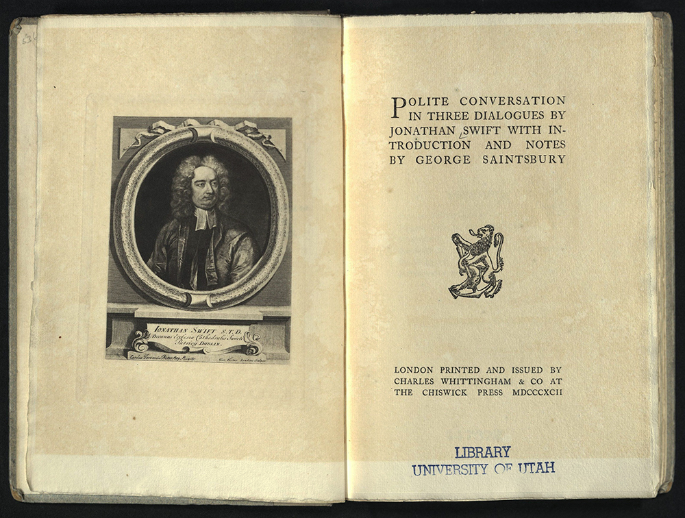
POLITE CONVERSATION: IN THREE DIALOGUES…
Jonathan Swift (1667-1745)
London: Printed and issued by Charles Whittingham & Co. at the Chiswick Press, 1892
PR3724 P6 1892
The Chiswick Press was founded by Charles Whittingham the Elder (1767-1840) in 1811. Management of the press was taken over by the founder’s nephew Charles Whittingham II (1795-1876). In 1854 William Howard cut the typeface Basle Roman for the Chiswick Press, based on a type used by Johannes Froben of Basel in the early sixteenth century. Basle Roman was used for William Morris’s The Roots of the Mountains in 1890.
The Chiswick Press produced affordably priced but quality classics under Whittington I, but became very influential in typography when under the direction of Whittington II, who published some of the first designs of William Morris. The press continued to operate until 1962.
EPISTLE OF PETRUS PEREGRINUS OF MARICOURT…
Pierre (13th c.)
Chiswick (London): Chiswick Press, 1902
QC751 P48 1902
Printed with a Caxton typeface with ornamental initials by Charles Whittington. Edition of two hundred and fifty copies.
THE DANIEL PRESS
CHRISTMAS…
Robert Herrick (1591-1674)
Oxford, H. Daniel, 1891
Z232 D18 H47 1891
The Daniel Press is one of a handful of nineteenth century English presses considered precursors to the fine book production of William Morris and his Kelmscott Press and T.J. Cobden-Sanderson and The Doves Press. The Daniel Press was owned and operated by the Reverend C.H.O. Daniel (1836-1919), who, with help from family members, set his texts in Fell type obtained from the Oxford University Press. While at Worcester College in Oxford, Daniel began work in 1874 on a miniature press and, in 1882, continued his work on a full-size Albion. Daniel was particularly interested in the Elizabethan era and the seventeenth century. Many of the Daniel Press publications are texts from these periods. The press did, however, publish a number of works by contemporary authors. The Daniel Press is recognized for tastefully produced editions of quiet, harmonious design sympathetic to subject and author.
Edition of sixty copies. University of Utah copy is no. 40.
ODE ON THE MORNING OF CHRISTS NATIVITY
John Milton (1608-1674)
Oxford: printed by H. Daniel, 1894
Z232 D18 M55 1894
Edition of two hundred copies. Rare Books copy is no. 180.
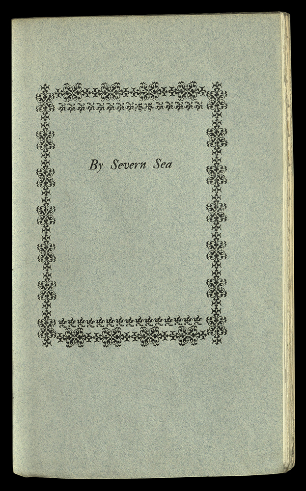
BY SEVERN SEA, AND OTHER POEMS
Thomas Herbert Warren (1853-1930)
Oxford: printed by H. Daniel, 1897
PR6045 A814 B9 1897
Edition of one hundred and thirty copies. University of Utah copy is no. 127.
AILES D’ALOUETTE, SECOND SERIES
F. W. Bourdillon
Oxford: H. Daniel, 1902
Z232 D18 B68 1902
Edition of one hundred and thirty copies. University of Utah copy is no. 50.
KELMSCOTT PRESS
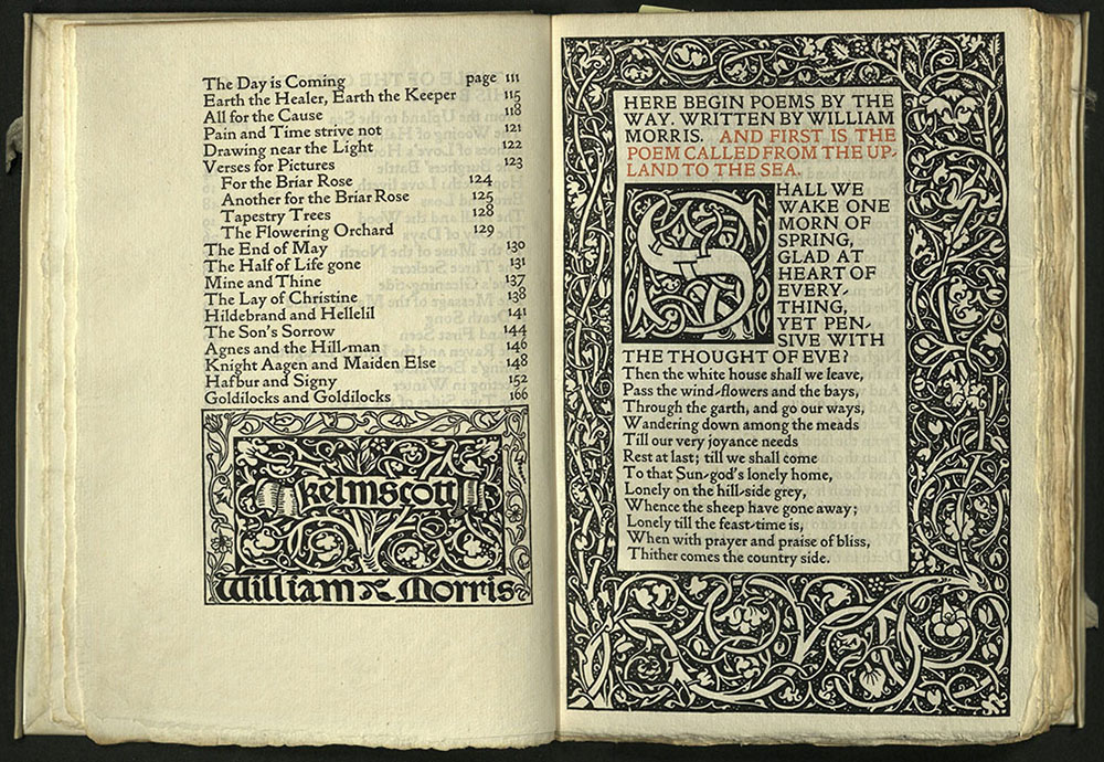
POEMS BY THE WAY…
William Morris (1834-1896)
Kelmscott Press; [London]: Sold by Reeves and Turner 1891
PR5078 P4 1891
Printed in black and red in Golden type on watermarked Batchelor handmade paper. Bound in full vellum with title in gilt on spine, blue silk ties. Edition of three hundred copies printed on paper, thirteen on vellum.
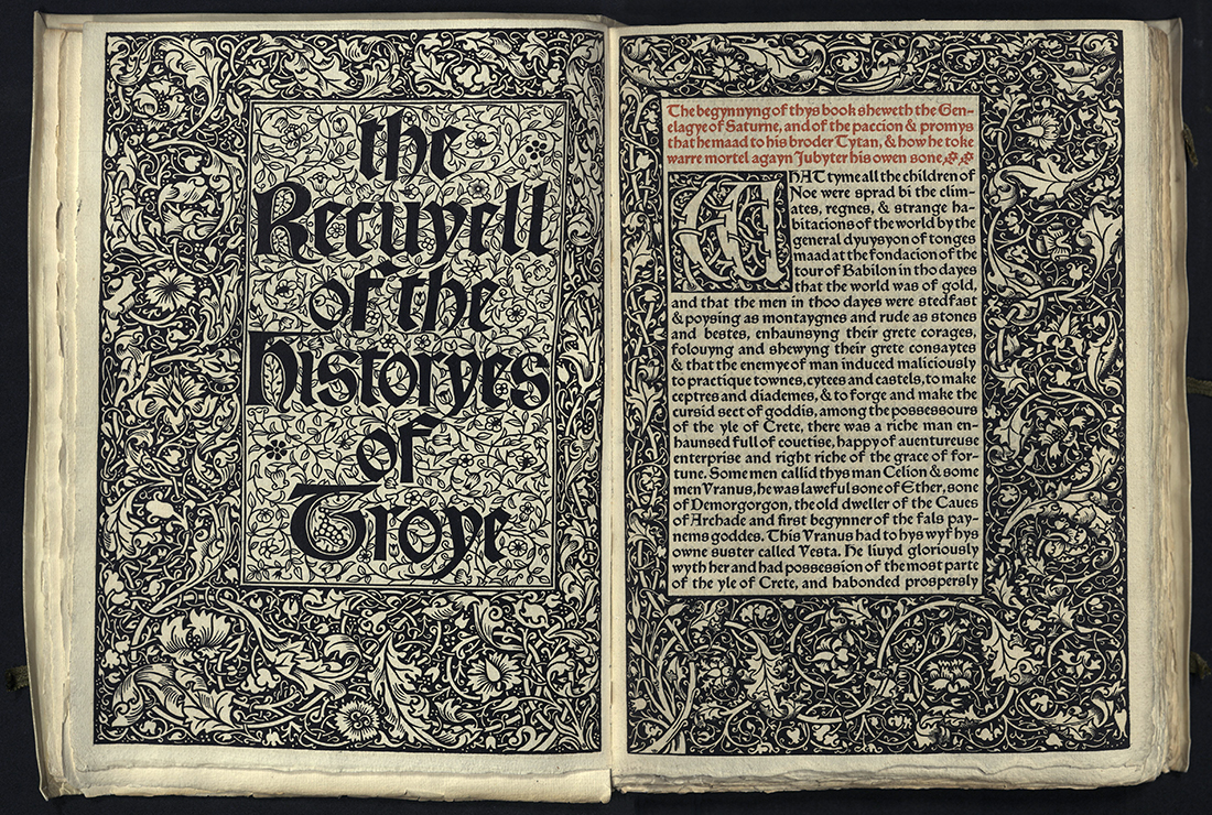
THE RECUYELL OF THE HISTORYES OF TROYE
Raoul Lefevre (fl. 1460)
Hammersmith: Kelmscott Press, 1892
PQ1570 A7 1892
A reprint of the first book printed in the English language by William Caxton in 1474. The Kelmscott edition was designed by the English artist William Morris. It is printed on paper in black and red inks, with wood-engraved title, borders, half-borders, ornaments, and initial letters.
The Recuyell of the Historyes of Troye is the first Kelmscott Press book printed in “Troy” type and also the first book in which “Chaucer” type appears. Both typefaces were designed by William Morris. The body of the book is set in “Troy” type, designed in 1891. The table of chapters and the glossary is set in the smaller “Chaucer” type, cut in 1892.
Bound in full limp vellum with brown silk ties, spine lettered in gilt, yap edges. Edition of three hundred copies.
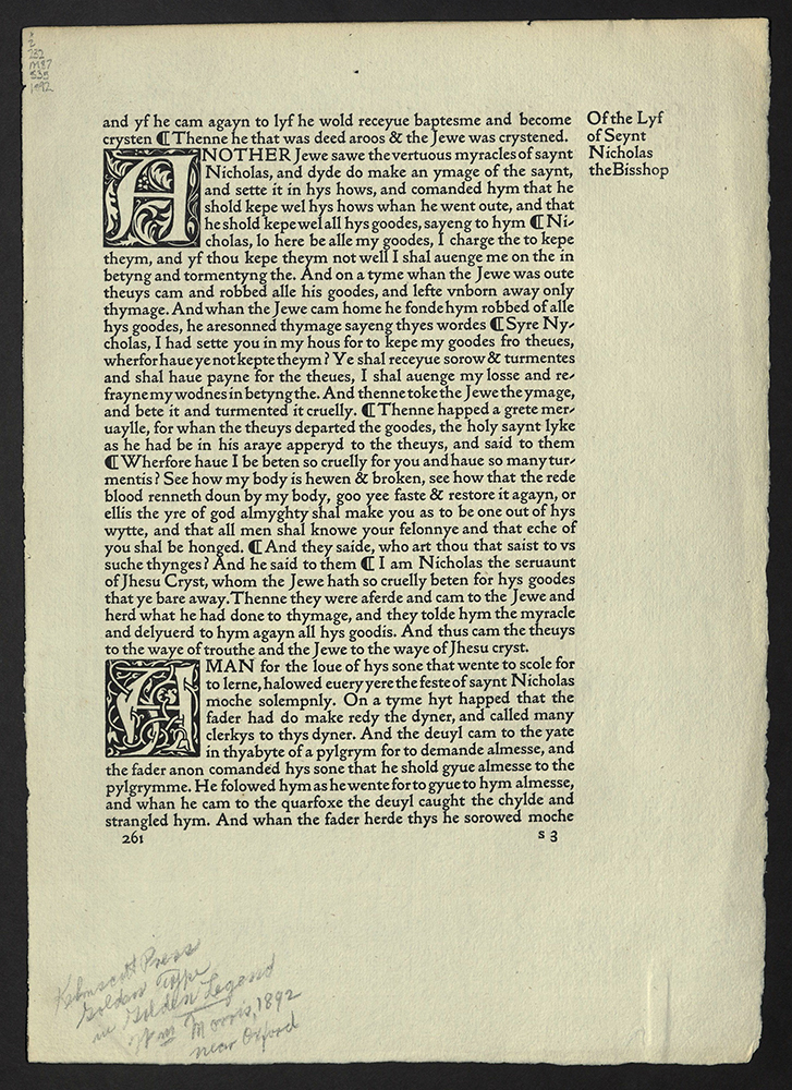
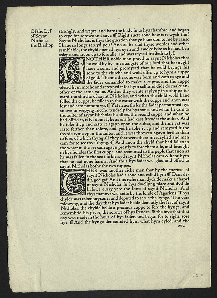
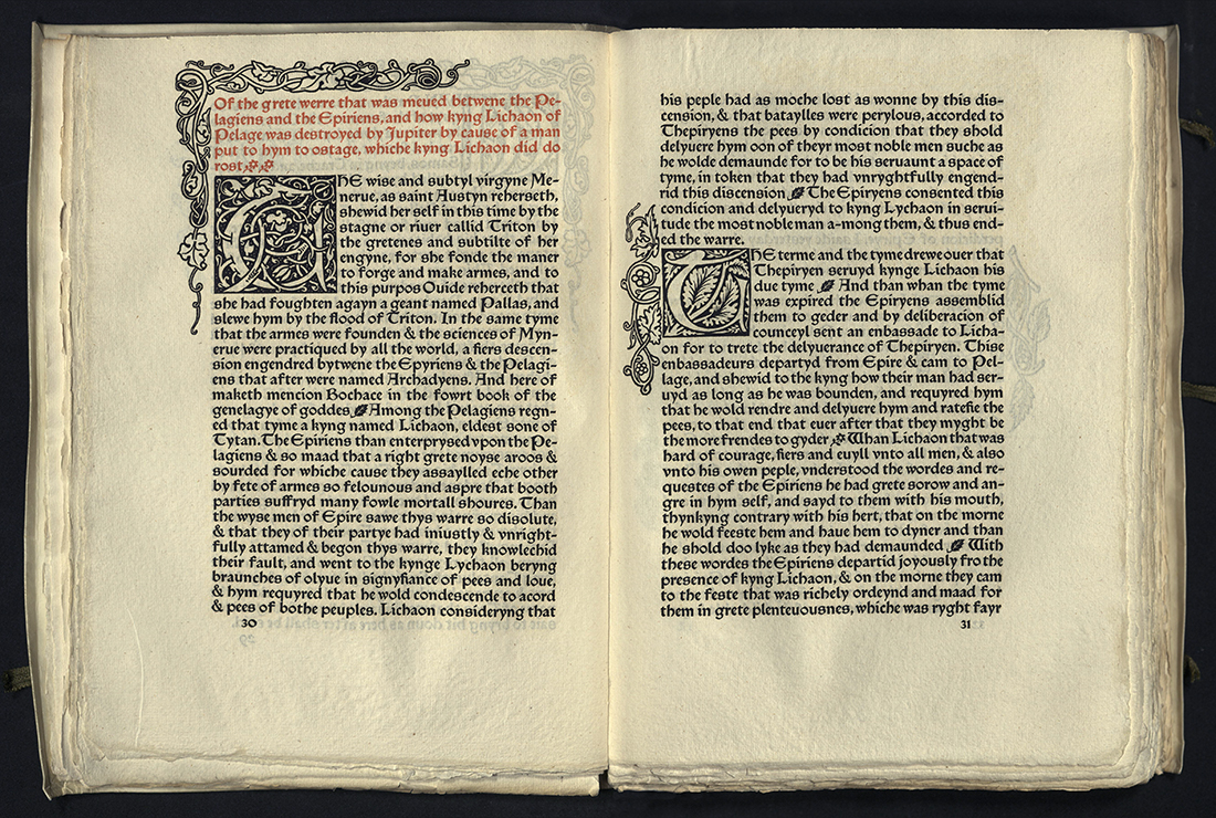
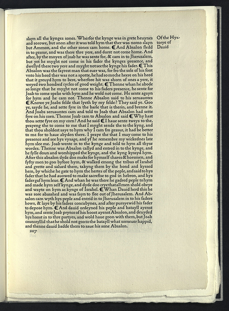
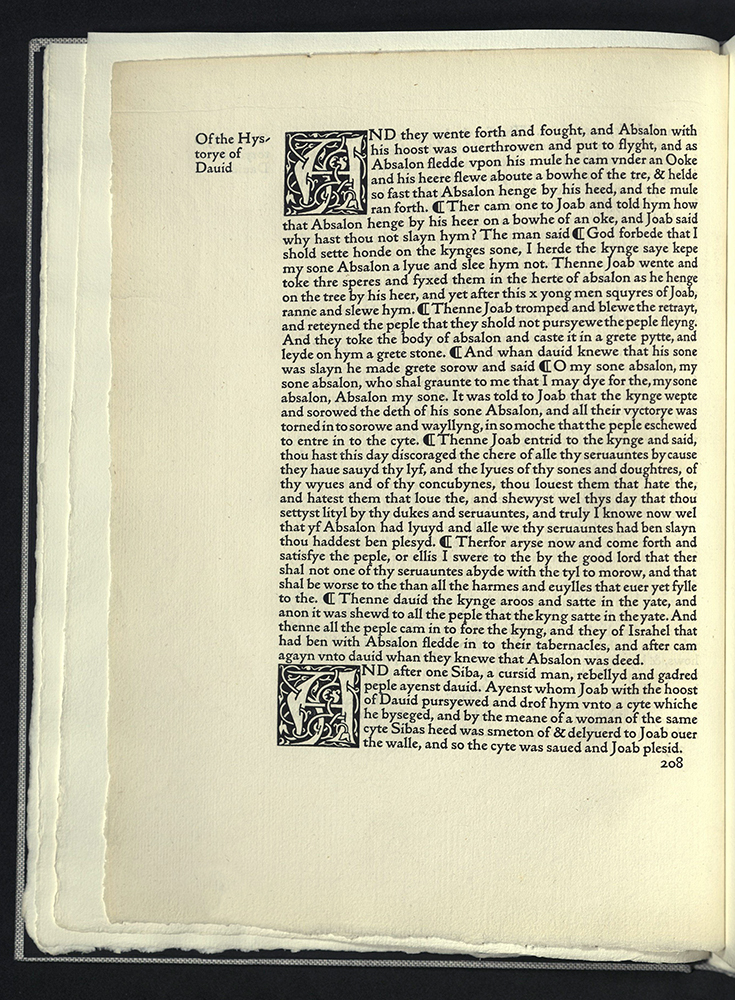
SAMPLE PAGE FROM THE GOLDEN LEGEND
Hammersmith: Kelmscott Press, 1892
Z 232 M87 S35 1892
From the Kenneth Lieurance Ott Collection.
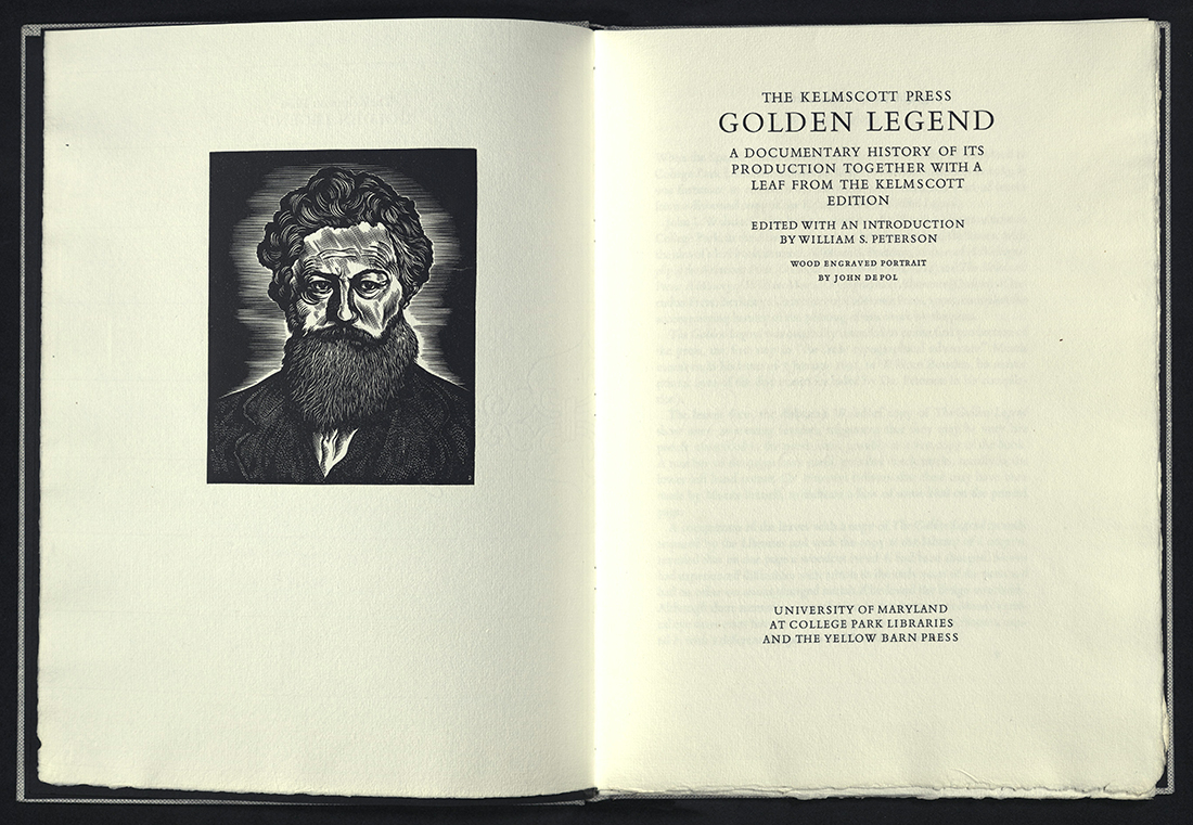
THE KELMSCOTT PRESS GOLDEN LEGEND
William S. Peterson
College Park, MD: University of Maryland at College Park Libraries, c1990
Z232 M87 P452 1990
Leaf from the Kelmscott Press edition of The Golden Legend.
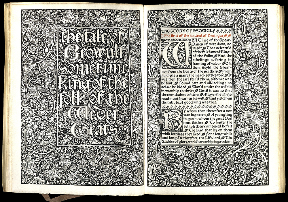
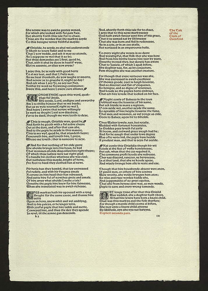
THE TALE OF BEOWULF...
Hammersmith: Kelmscott Press, 1895
PR1583 M6 1895
The epic of Beowulf, a Norse legend, is one of the earliest examples of Old English in particular and Germanic literature in general. It is a unique source for information on the early history of the peoples of northern Germany and Scandinavia. This translation is by William Morris, founder of the Kelmscott Press, and A.J. Wyatt.
The Kelmscott edition is one of the most typographically beautiful editions ever published. It was printed in Troy and Chaucer types in red and black. Morris designed the woodcut title page and facing page with full woodcut page-border, as well as the numerous three-quarter and smaller woodcut page borders, and six-line and smaller initials.
Vellum binding with yapp edges, silk ties and a gilt spine. Printer’s device with note to reader tipped in. Edition of three hundred copies on paper.
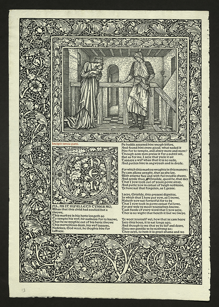
A LEAF FROM THE KELMSCOTT CHAUCER…
John Windle
San Francisco: Arion Press, 1994
Z232.5 A7 W56 1994
Leaf from “The Clerk of Oxenford’s Tale, Kelmscott Chaucer.
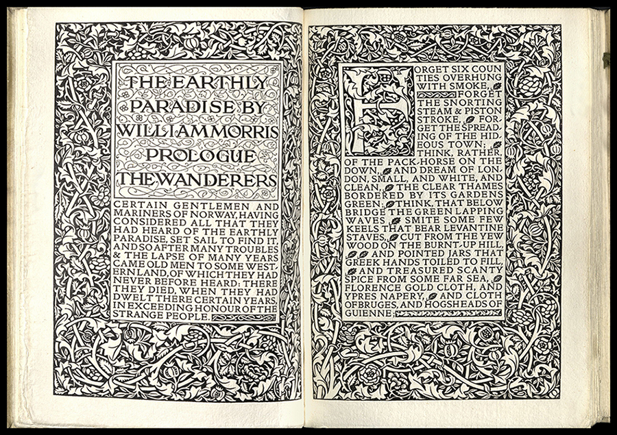
THE EARTHLY PARADISE
William Morris (1834-1896)
Hammersmith: Kelmscott Press, 1896-97
PR5075 A1 1896
Earthly Paradise, a collection of twenty-four tales, two for each month, contains twelve tales from classical sources and twelve from Medieval Latin, French, and Icelandic origins. The set of eight volumes became one of the most popular works of the Victorian era. For this work Morris was offered the poet laureateship upon the death of Tennyson. Morris refused the honor.
Morris oversaw completion of the first two volumes, while the remaining six were printed by the trustees of the estate after his death.
Printed in Golden type in red and black. Illustrated with full-page woodcut borders and initials. The ten borders and four half-borders used in The Earthly Paradise do not appear in any other Kelmscott book. Bound in vellum with ties. Edition of two hundred and thirty-one copies.
BRUCE ROGERS


A REPORT OF THE TRUTH CONCERNING THE LAST…
Walter Raleigh (1552?-1618)
Boston, MA: Houghton Mifflin, 1902
DA86.8 1591 R298 1967
Originally published in 1591. Designed by Bruce Rogers. Illustration by Howard Pyle. Edition of three hundred numbered copies. University of Utah copy is unnumbered and signed in ink as “Designer’s copy” and signed by Bruce Rogers.
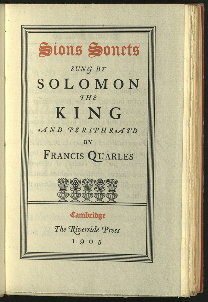
SIONS SONETS…
Francis Quarles (1592-1644)
Cambridge, MA: Riverside Press, 1905
BS1487 Q3 1905
Designed by Bruce Rogers. Edition of four hundred and thirty numbered copies. University of Utah copy is no. 164.
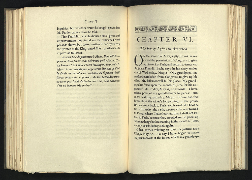
FRANKLIN AND HIS PRESS AT PASSY…
Luther Samuel Livingston (1864-1914)
New York: Grolier Club, 1914
Z232 F8 L6 1914
Designed by Bruce Rogers. Edition of three hundred copies printed on Van Gelder paper and three copies on Alton Mill paper.
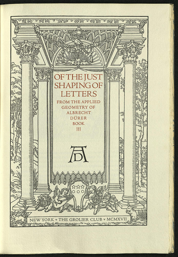
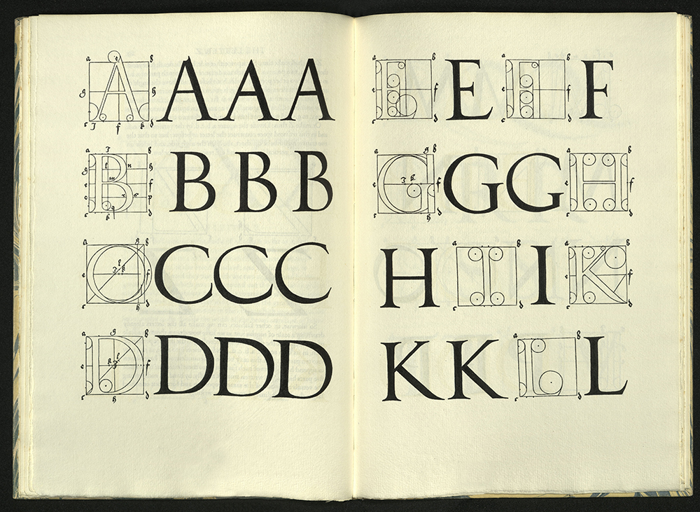
OF THE JUST SHAPING OF LETTERS
Albrecht Durer (1471-1528)
New York: Grolier Club, 1917
NK3615 S7313 1917
Designed by Bruce Rogers. Printed by Emery Walker and Wilfred Merton. Edition of two hundred and fifteen copies on paper and three on vellum.
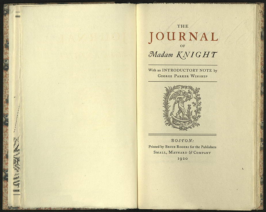
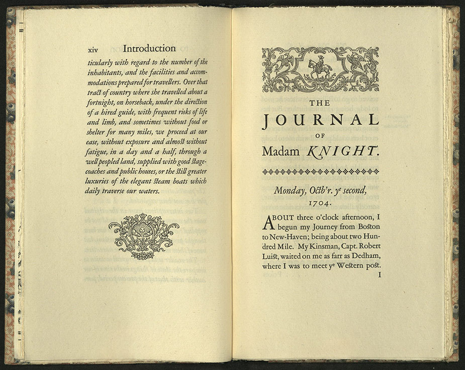
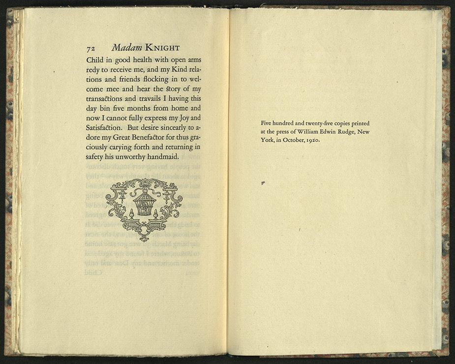
THE JOURNAL OF MADAM KNIGHT
Sarah Kemble Knight (1666-1727)
Boston: Printed by Bruce Rogers for the Publishers, Small, Maynard, 1920
F7 K723 1920
Edition of five hundred and twenty-five copies printed at the press of William Edwin Rudge, New York.
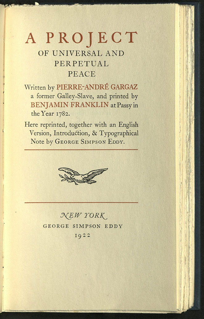
A PROJECT OF UNIVERSAL AND PERPETUAL PEACE…
Pierre-Andre Gargaz
New York: G.S. Eddy, 1922
JX1946 G3 1922
Designed by Bruce Rogers and printed from monotype Caslon type at the printing house of William Edwin Rudge, Mount Vernon, New York.
DREAM-CHILDREN: A REVERIE…
Charles Lamb (1775-1834)
New York: F. Altschul, 1923
PR4862 D7 1923
Printed by Bruce Rogers for Frank Altschul, American Institute of Graphic Arts. Edition of five hundred copies.
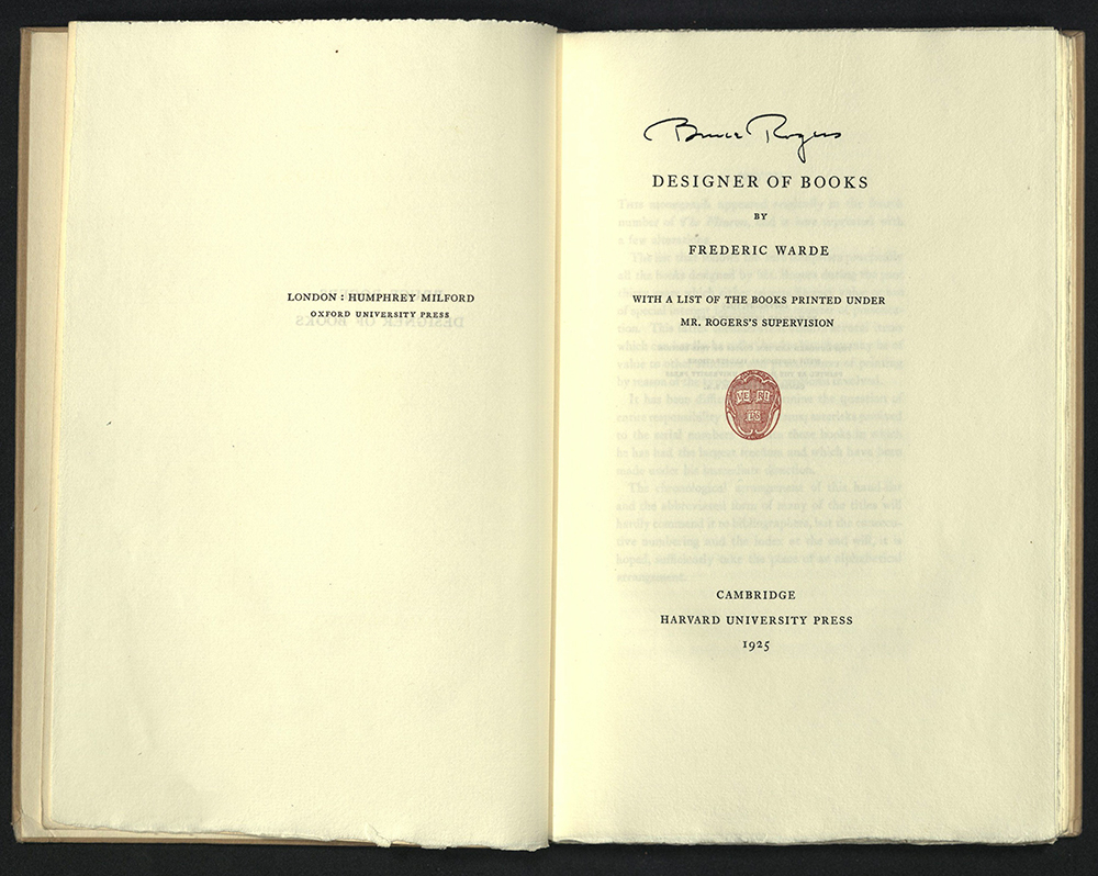
BRUCE ROGERS, DESIGNER OF BOOKS…
Frederic Warde (1894-1939)
Cambridge, MA: Harvard University Press, 1925
Z232 R67 W2 1925
Designed by Bruce Rogers. Edition of two hundred and ten copies. University of Utah copy signed by Bruce Rogers.
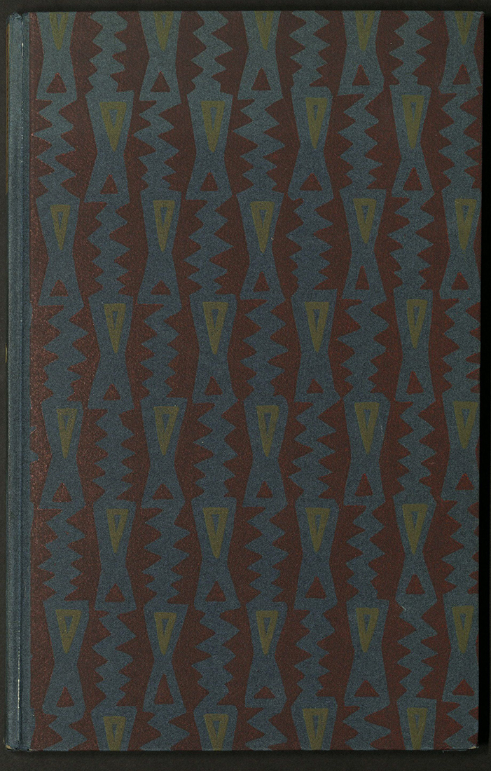
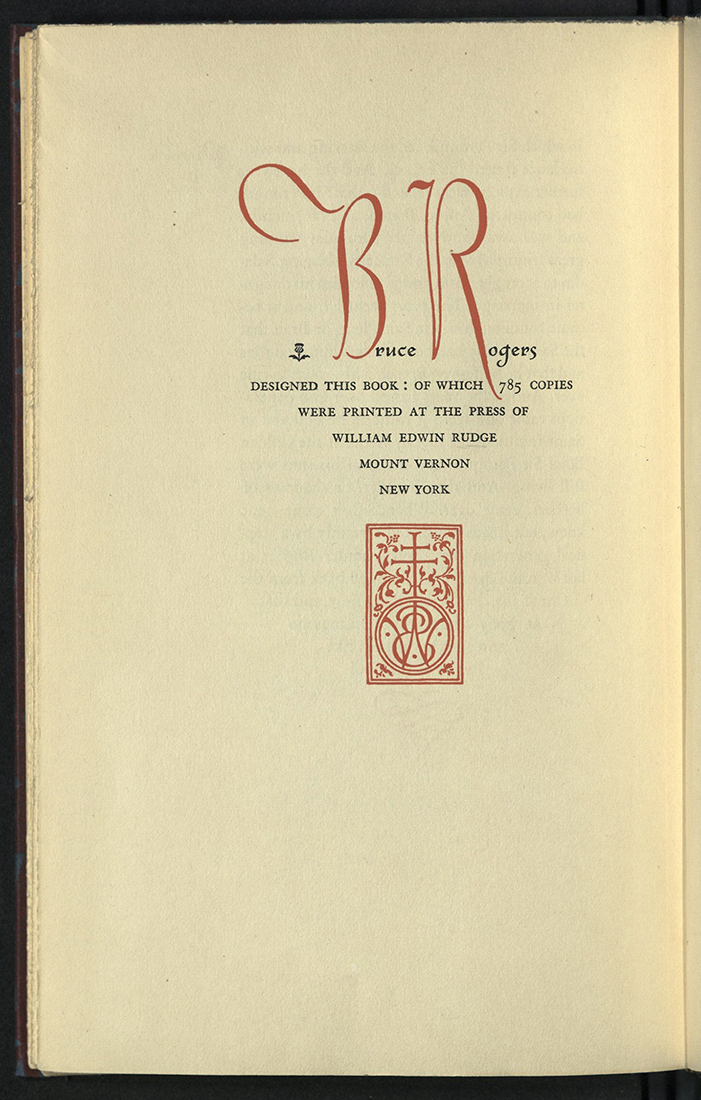
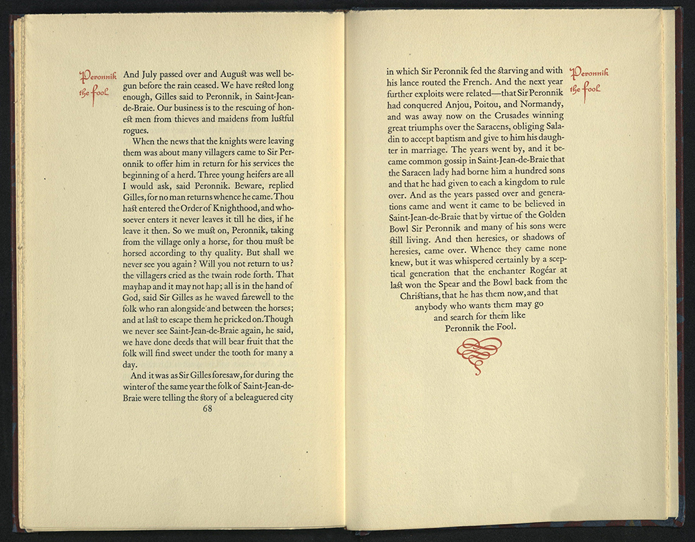
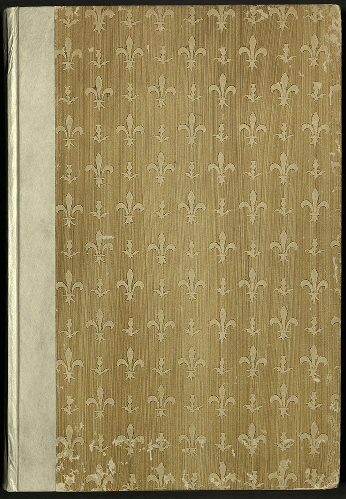
PERONNIK THE FOOL
George Moore (1852-1933)
Mount Vernon, NY: Press of W. E. Rudge, 1926
PR5042 P47 1926
Designed by Bruce Rogers. Edition of seven hundred and eighty-five copies.
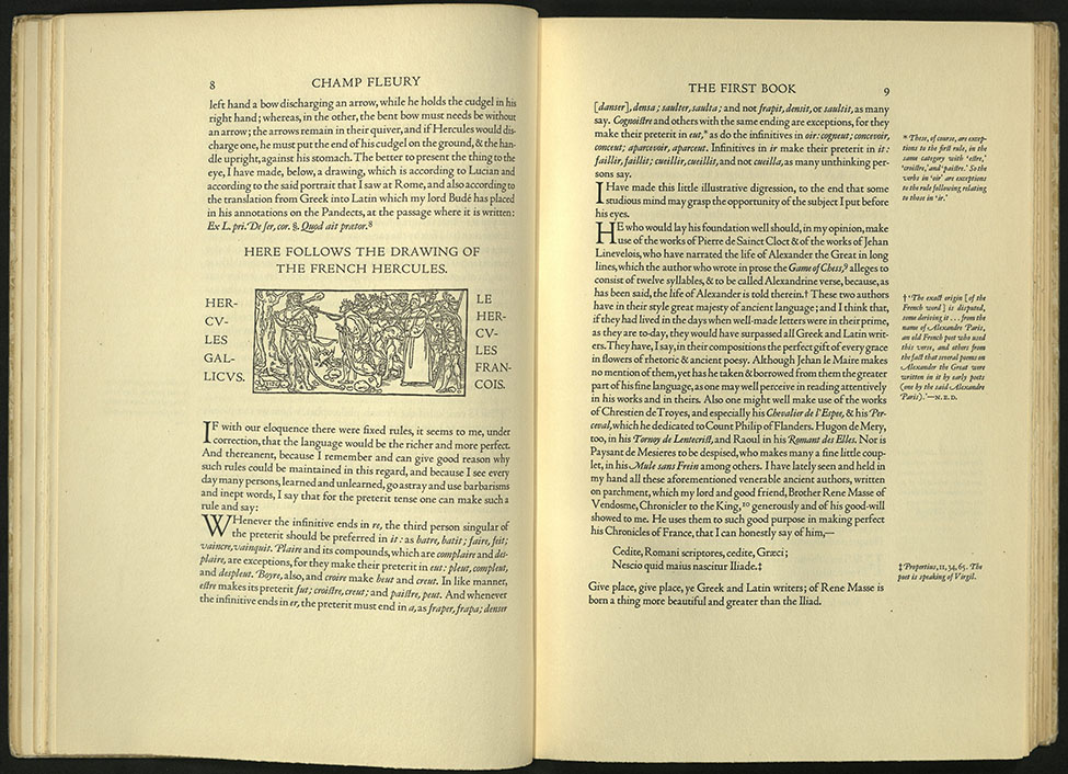
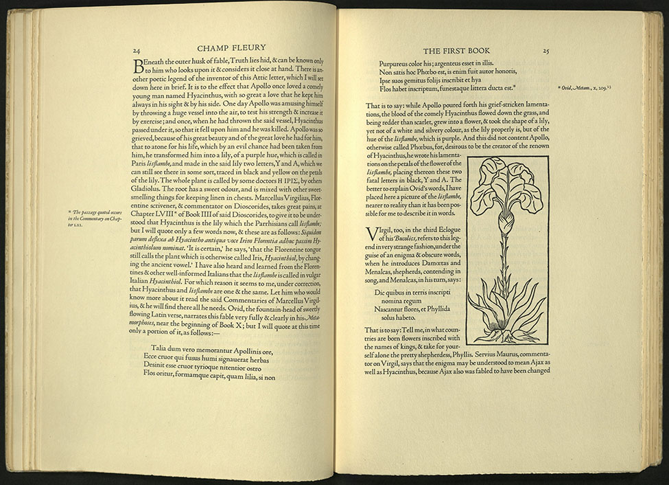

CHAMP FLEURY…
Geoffroy Tory (ca. 1480 – ca. 1533)
New York: Grolier Club, 1927
First English edition
NK3615 T62 1927
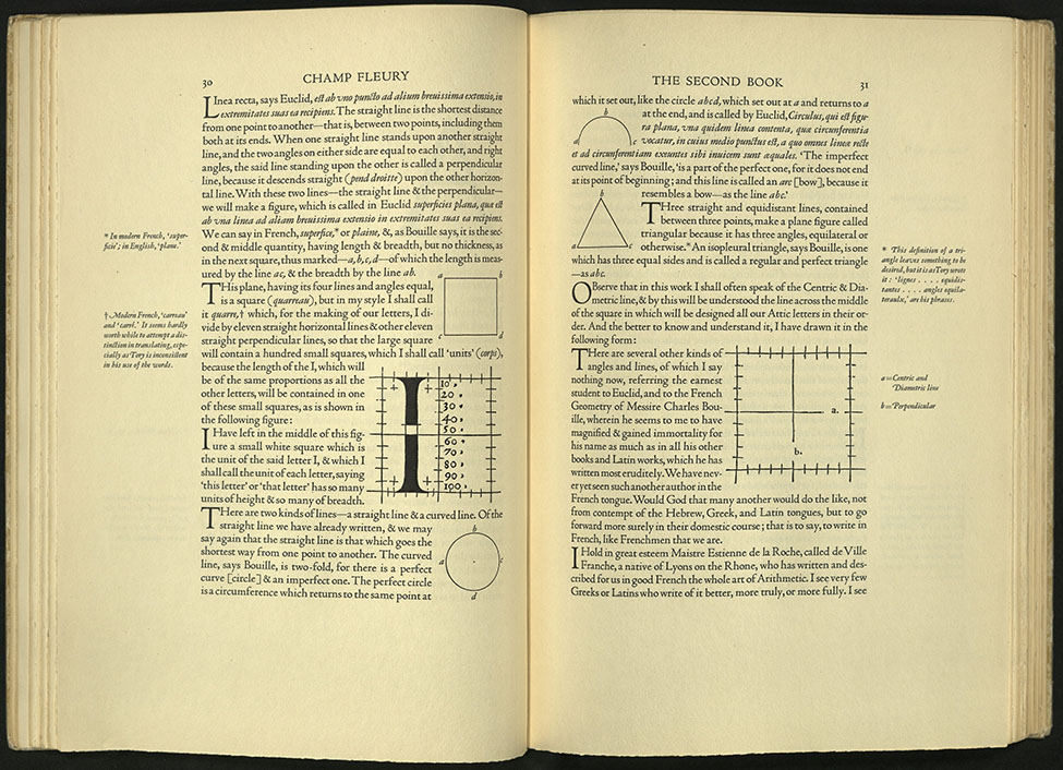
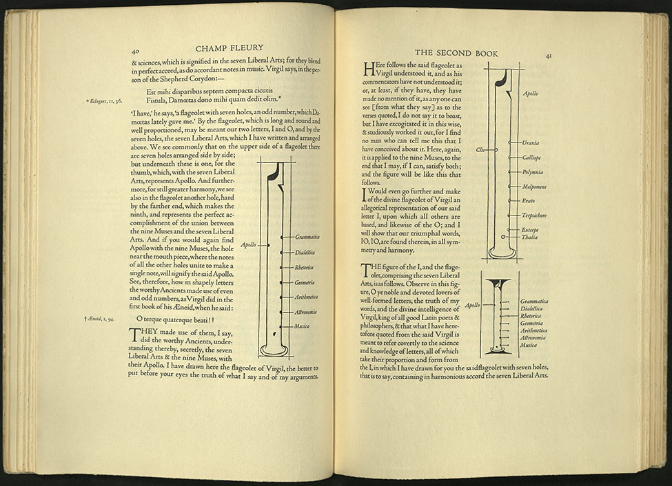
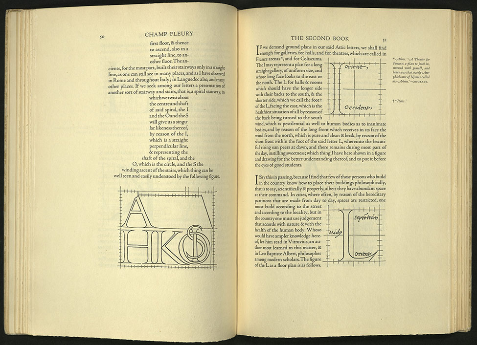
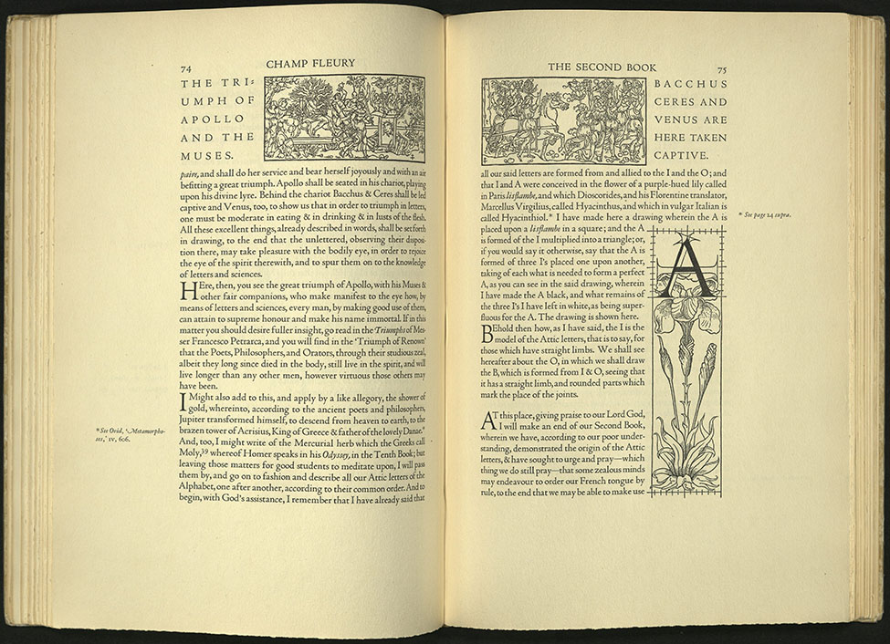
This is the first edition in English of Geoffroy Tory’s famous work on Roman letterforms, first published in Paris in 1529. Tory, one of the major printers in Paris during the first third of the sixteenth century, wrote and printed this theoretical treatise on the design of Roman capital letters in 1529. In 1531 he was named Imprimeur du roi. Tory developed a method of drawing letters with geometrical aids and then related their proportions to the human body.
The English edition was printed for the Grolier Club at The Printing House of William Edwin Rudge and designed by Bruce Rogers, one of the premier American typographers of the twentieth century. The typeface is Centaur, designed by Rogers and based on traditional Venetian typefaces first developed around 1465 by master printer Nicholas Jensen.
For this book, Rogers redrew all of Tory’s original specimens and illustrations, thereby omitting the imperfections resulting from the over-inking and poor printing of the Paris original. This book was one of Rogers’ own favorites.
Printed on American woven rag paper, bound in half vellum, lettered in gold, and covered with a paper in a pattern of alternating fleurs-de-lys and thistles, also designed by Rogers. University of Utah copy is signed by Bruce Rogers.
PRIVATE PAPERS OF JAMES BOSWELL FROM MALAHIDE CASTLE
James Boswell (1740-1795)
Mount Vernon, NY: W. E. Rudge, priv. print, (1928-34)
PR3325 A16
Designed by Bruce Rogers. Printed by William Edwin Rudge. Edition of five hundred and seventy copies. University of Utah copy is no. 335.
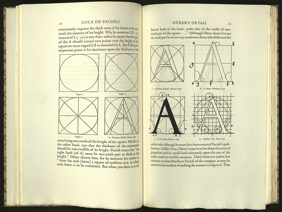
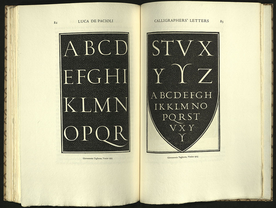
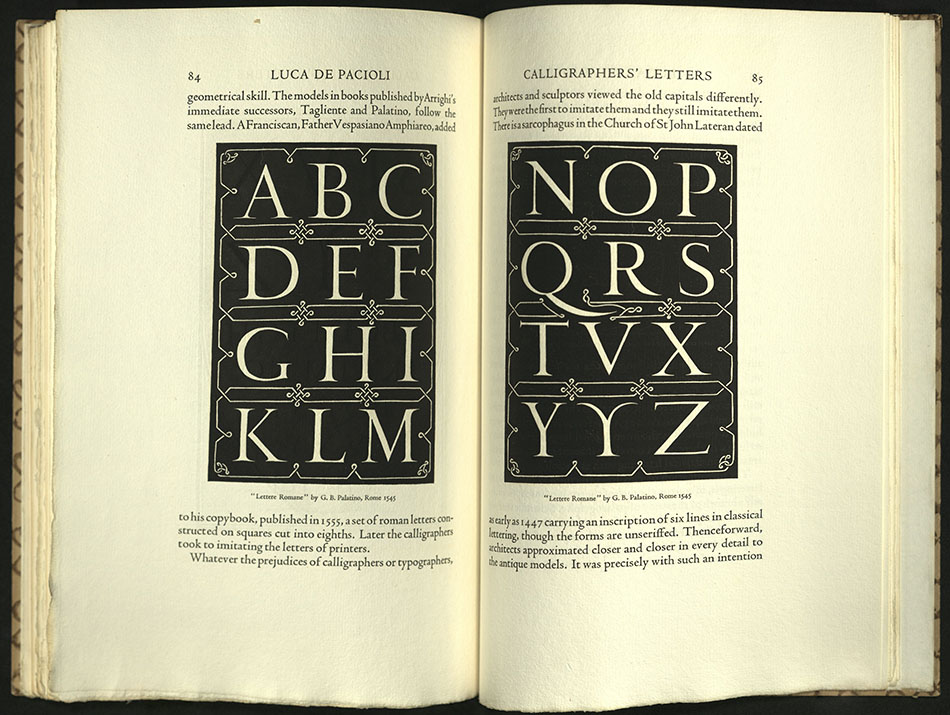
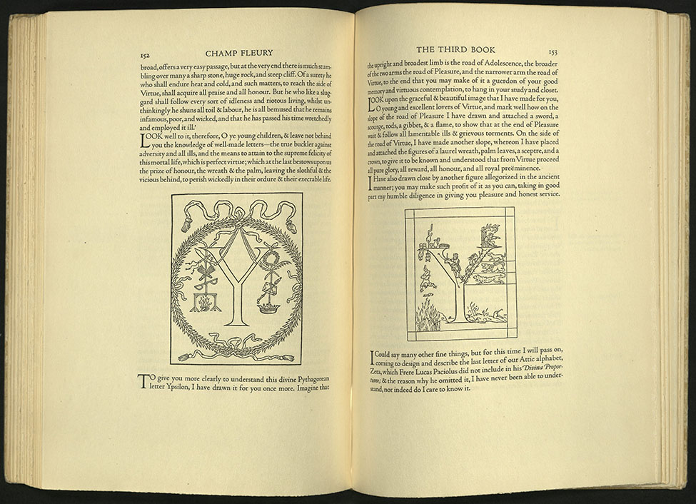
FRA LUCA DE PACIOLI OF BORGO S. SEPOLENO…
Stanley Morison (1889-1967)
New York: Grolier Club, MCMXXXIII [1933]
NK3615 P34 1933
From the preface: “The following pages describe a section of De divina proportione which comprises diagrams of the true shapes and proportions of classical Roman letters…Pacioli’s alphabet is herewith produced in the size of the original.”
Typography by Bruce Rogers. Printed on Batchelor’s handmade paper, seven copies on large paper. Edition of three hundred and ninety copies.

PETER PIPER’S PRACTICAL PRINCIPLES OF PLAIN & PERFECT…
Brooklyn, NY: Mergenthaler Linotype Co., c1936
PE1137 F36 1936
Designed by Bruce Rogers.
University of Utah copy from the library of James Doolittle.
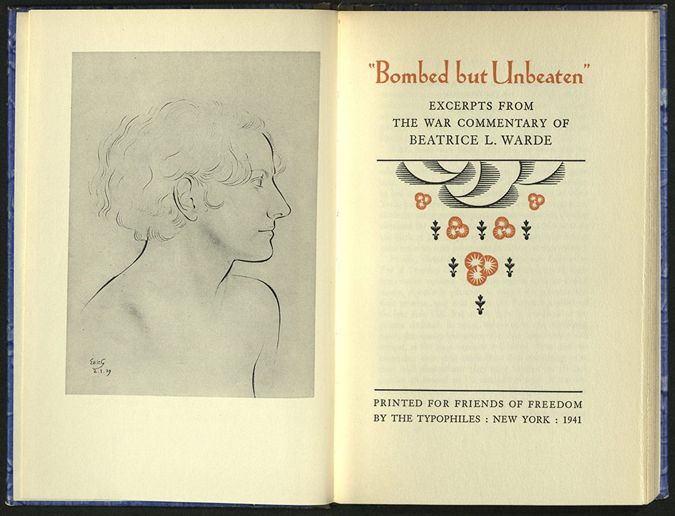
BOMBED BUT UNBEATEN: EXCERPTS FROM THE WAR…
Beatrice Warde (1900-1969)
New York: Typophiles, 1941
D811.5 W343 1941
Designed by Bruce Rogers. Edition of eight hundred and fifty copies. University of Utah copy is no. 265.
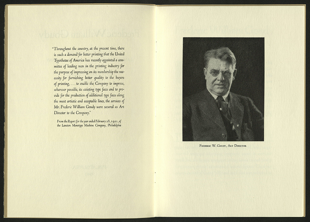
FREDERIC WILLIAM GOUDY: ART DIRECTOR…
Philadelphia: The Company, 1947
Z232 G68 F74 1947
Designed by Bruce Rogers. University of Utah copy gift of James Doolittle.
A CHILDREN’S SAMPLER
New York: Distaff Side, 1950
PN1009 A1 D565 1950
Title-page designed by Bruce Rogers. Edition of three hundred and seventy-five copies.
DOVES PRESS
THE ENGLISH BIBLE…
Hammersmith: The Doves Press, 1903-1905
BS189 1903 H3
In contrast to William Morris’s extravagant design sensibilities, bookbinder T. J. Cobden-Sanderson demonstrated that well-set type; wide, unadorned margins; proportion and symmetry could produce a powerful page. The English Bible is the magnum opus of the Doves Press. It is stark and pure in design and presswork. The English Bible was printed with Doves type, a crisp and faithful version of a roman type designed in the fifteenth century by French printer Nicholas Jenson. Ornament and color were used sparingly in Doves Press books. The only hint of embellishment in the design of The English Bible is in bold but elegant red calligraphic initials by Edward Johnston, an example of the forceful combination of calligraphy and typography.
This is the only folio T. J. Cobden-Sanderson printed. He wrote in his journal that he wished the book serve “plainly, monumentally, for a nation’s masterpiece, for a nation’s guidance, consolation and hope.”
When Doves Press closed in 1916, Cobden-Sanderson destroyed its type and matrices, throwing it all into the Thames to spite his former friend and business partner, printer Emery Walker. Some of the type was retrieved in 2014.
The English Bible was bound by the Doves Bindery in vellum and stamped in gold. Edition of five hundred copies on paper, two on vellum.
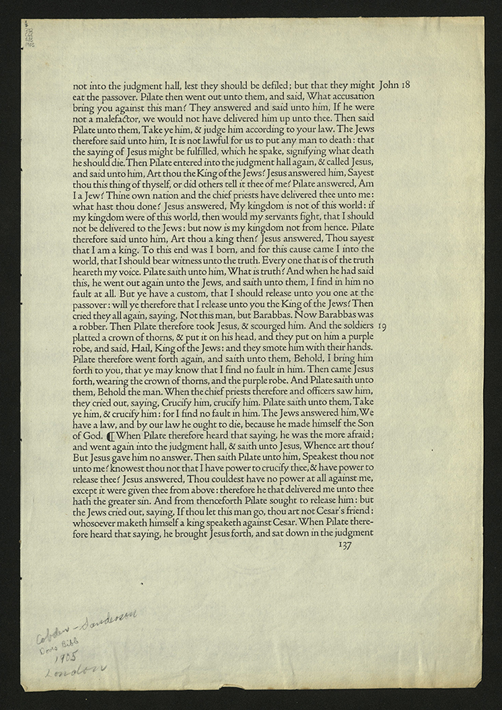
SAMPLE PAGE FROM THE DOVES BIBLE
London: Doves Press, printed by Cobden-Sanderson Press, 1905
Z232 C65 S35 1905
From the Kenneth Lieurance Ott Collection.
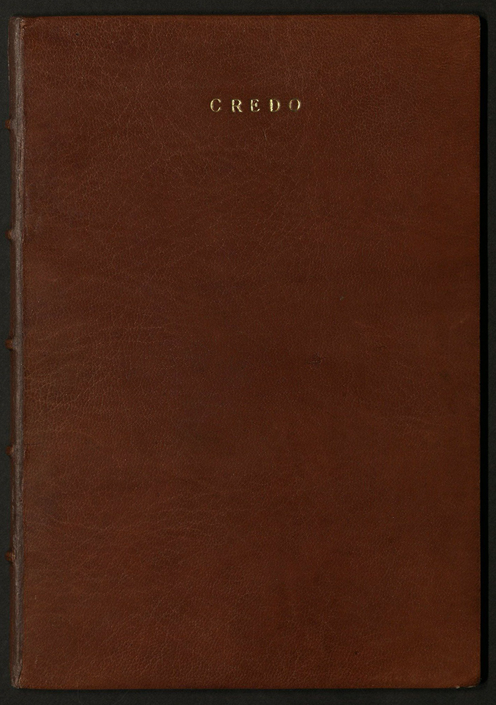
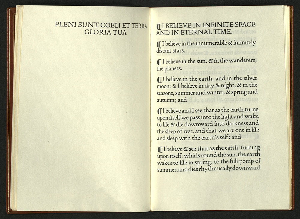
CREDO
Hammersmith: Doves Press, 1908
Z232 D69 C7 1908
This is one of three diminutive books published by Doves Press (the other two being the first chapter of Genesis and the Lord’s Prayer). The Doves Press was founded by T. J. Cobden-Sanderson and Emery Walker in 1900. The Doves Bindery, established by Cobden-Sanderson in 1893, shared premises with William Morris’s Kelmscott Press in its early years. Edition of two hundred and sixty-two copies.
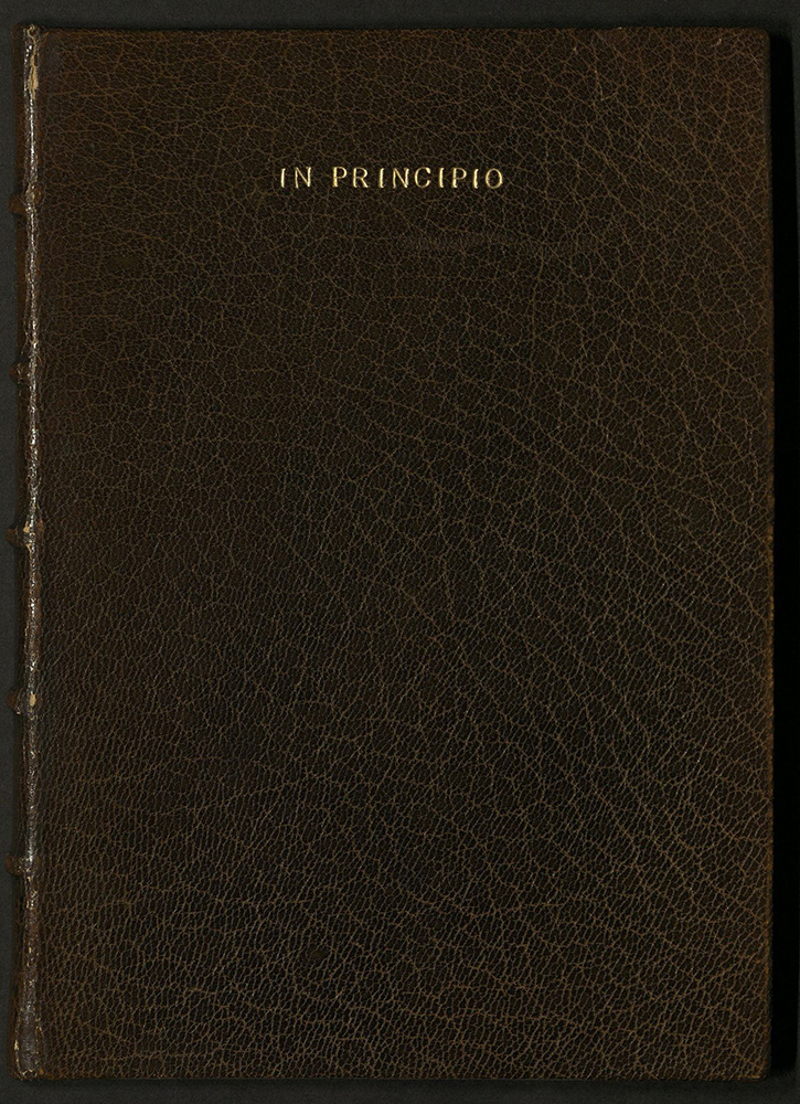
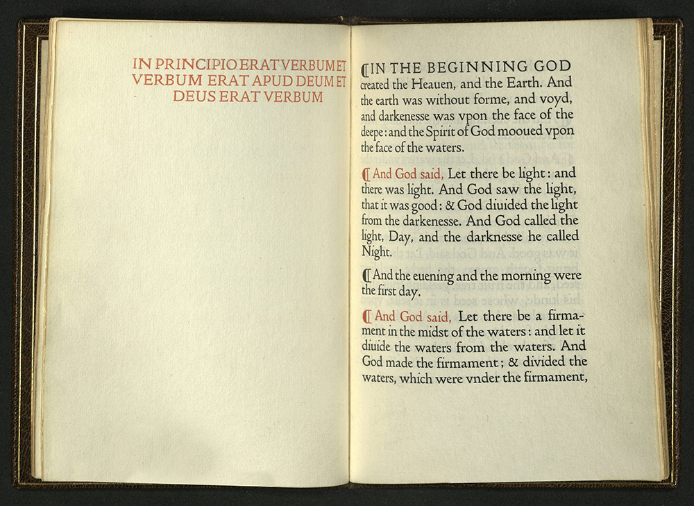
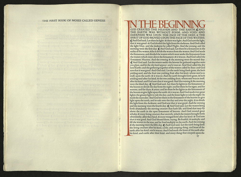
IN PRINCIPIO
Hammersmith: Doves Press, 1911
Z232 D69 I6 1911
The first chapter of Genesis from the Old Testament, published on the tercentenary of the publication of the King James Bible (1611). Bound in leather at the Doves Bindery.
TWENTIETH CENTURY ARTISTS BOOKS
VANITY
Rebecca Chamlee Keeley
Los Angeles, CA: R.C. Keeley, 1988
N7433.4 K434 V35 1988
Text composed in Spartan, Futura and Baskerville types by Bell type and Rule Co. Printed on Roma paper. Illustrated with zinc cuts colored by a letterpress method invented by Dikko Faust of Purgatory Pie Press. Trapezoidal pages in which the top edge has been trimmed on an angle. Accordion structure. Bound in cloth covered boards. Designed and bound by the author. Edition of twenty-five copies. University of Utah copy is no. 22, signed by the bookmaker.
THE ALPHABET OF CREATION…
Seattle: Tabula Rasa Press, 1993
N7433.4 A46 1993
The Alphabet of Creation is printed in an edition of 125 copies. The Divine Alphabet is printed in an edition of 200 copies. Direction for the construction of text or quadrate letters is printed in an edition of 150 copies. University of Utah copies of each work are nos. 64.
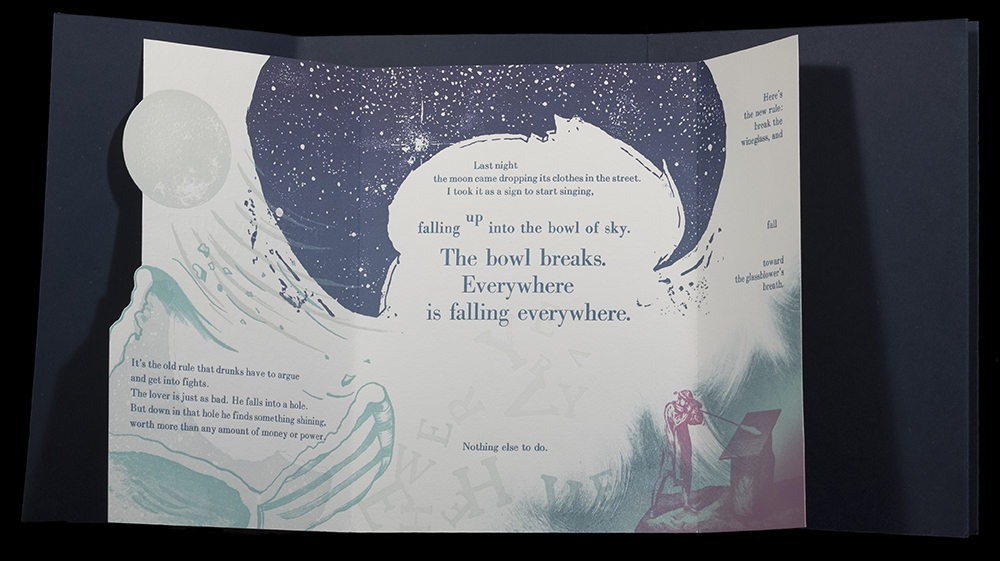
THE NEW RULE: A POEM BY RUMI
Sibyl Rubottom
San Diego, CA: Bay Park Press, 2000
N7433.4 R73 N49 2000
A flecked, navy wrapper is folded in three, housing the primary sheet which is, in turn, folded into three, unequal sections. Letterpress from Bodoni and Times Roman on Fabriano Rosaspina Bianco and Fox River Confetti wrapper. Images created using polymer plates, monotypes, linocut, and screen printing. Edition of forty-five copies. University of Utah copy is no. 19.
THE ALPHABET OF TIME
Jim Machacek
San Diego, CA: Bay Park Press, 2002
N7433.4 M2595 A6 2002
Multi-media including photopolymer plates, wood type, hand painting, marbling, silk screen, and collage for the images. For the text several fonts of Clarendon, Bernhard Modern, and Bodoni were hand set and printed on Rives BFK paper. Bound at the press. Edition of twenty-six copies, signed by the authors. University of Utah copy is no. 23.
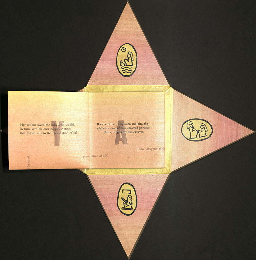
PHARAOH’S DAUGHTER
Alisa J. Golden
Berkeley, CA: Never Mind the Press, 2006
N7433.4 G65 P53 2006
From the colophon: “Never mind Caslon 471 & 471 linocuts, and wood type wading through acrylic ink washes on Lenox paper via letterpress. Book 89.” Encased in pyramid-shaped paper sleeve. Edition of seven copies. University of Utah copy is no. 5, signed by the author.
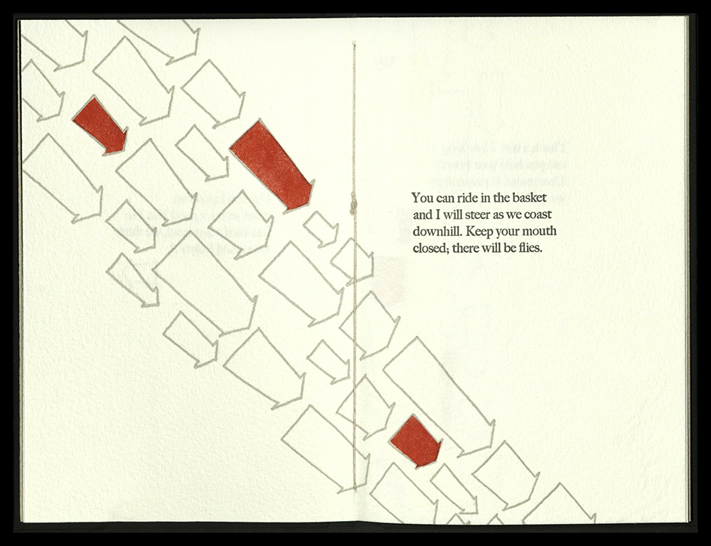
ORDERS
Emily Tipps
Tuscaloosa, AL: High5 Press, 2007
N7433.4 T574 O73 2007
A book of poems addressing reaction to the political atmosphere during the post-911 Bush administration and lies told by all governments everywhere.
Pamphlet construction. Letterpress printed from photopolymer plates on a Vandercook SP-15. Papers are Arches Text Wove and Stonehenge. Typeface is Big Caslon. Illustrations are pochoir. Endsheets are gray Bugra paper. Handsewn binding in black Stone Henge paper covers. Blind embossed with the title, author’s name, and illustrations. Edition of sixty copies.
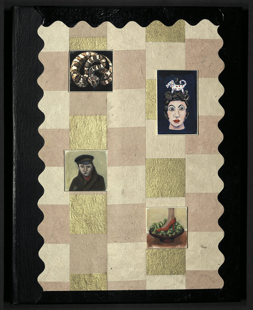
NONSENSE & NONSENSE…
Susan J. Allix (b. 1943)
London: Susan Allix, 2008
N7433.4 A57 N6 2008
Four etchings, one hand-colored and one with a second shadow printing, one linocut, block prints and various borders, dots and signs. The five small paintings were made relating to the text, then printed digitally using archival inks. Printed letterpress, with new intaglio plates and linocuts and old printer’s blocks on a variety of mould-made papers, including Arches, Somerset and Zerkall, which vary in size and sometimes have cutouts.
Typefaces include Grotesque, Granby, Gill and Gallia with Caslon, Bodoni, Engravers Roman, and altered and un-altered wood letters. Bound in quarter black morocco over decorative boards covered with paper of assembled squares. The edges of the boards are of black lacquered paper making a wavy-line frame for the printings which are mounted and applied off-center to the squares. Bronze paper fly-leaves, handmade bronze-flecked paper doublures. Housed in a cream portfolio-style folder with tie enclosures.
From the colophon: “The book and binding were …working together without the paintings necessarily being moveable, so this is the main edition binding, with a few copies made with magnets set into the front board over black and white drawings and the paintings were mounted on magnetized squares.” Edition of twenty-five copies, signed by the bookmaker.
CROWS AT HOME
Alisa J. Golden
Berkeley, CA: Never Mind the Press, 2008
N7433.4 G65 C76 2008
Designed by Alisa Golden. Structure is “check book” created from paper painted with many layers of acrylic ink and black gesso. Line drawings are printed from photopolymer plates. Text is handset Bodoni printed letterpress on collected paper bags. Black linen thread covers wire for “crow’s feet” closure. Edition of twenty-two copies. University of Utah copy is no. 9, signed by the author.
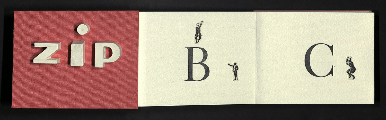
ZIP
Marie C. Dern
Fairfax, CA: Jungle Garden Press, 2013
N7433.4 D47 Z5 2013
Accordion alphabet book with ornaments from “Ornaments, Decorative Designs, Special Characters and Initials of the Gage Printing Company, 1914. 120 point Caslon type, plaster letters, collaged ornaments. Paper is Johannot, binding by John DeMerritt and Sandra Good. Edition of three copies. University of Utah copy is no. 3, signed by the author.